The lifestyle industry is booming. Thanks in large part to Facebook, Instagram, and other social media platforms, everyone seems to be living their best life ever. Plenty of lifestyle brands aim to jump on the bandwagon and get noticed by a legion of consumers.
One such lifestyle space that stands out amongst others is the beauty industry.
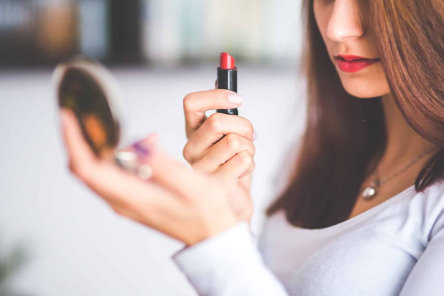
Cosmetics have long been a staple of women everywhere. They are used near-universally and kept close by and within reach at a moment’s notice. From purses and backpacks to bathroom cabinets and office desk drawers, beauty products have always been a ubiquitous part of everyday life.
It was a lucrative, though fairly straightforward industry.
Nowadays, however, the cosmetics business is expanding into new horizons.
First, it’s not just for women anymore. Plenty of men subscribe to the mantra that looking attractive and feeling attractive go hand in hand.
Next, cosmetic lines don’t just involve lipstick, eyeliner, and the like. Yes, make-up remains at the core of the beauty industry, but the industry is now just as much about personal care and hygiene as it is beauty, with hundreds of products in every segment.
Consider this abbreviated list of what’s classified as beauty or cosmetic products:
- Creams, powders, face masks, coloring for the eyes, skin, and mouth
- Soaps, body washes, exfoliators, or any other cleansing product for use on your body
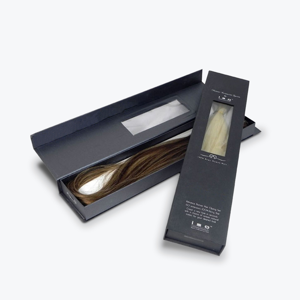
- Shampoos, conditioners, hair lotions, oils, dyes or bleaches
- Lotions for moisturizing, sun protection, or tanning of the skin
- Polishes, colors, and lotions for the nails
- Deodorants, antiperspirants, body sprays, perfumes, or other hygiene or aromatic prudence for your body
- Toothpaste, mouthwash, teeth bleaching or whitening, or other products for oral care
- Even baby care products such as powder, ointments, creams, and similar items can be considering cosmetics
So why the history lesson?
If you’re reading this, it means one of two things: A) you currently own or manage a cosmetic brand and are curious about how to stand out from an incredibly crowded marketplace; B) you’re currently considering getting into the cosmetic business and are curious about how to stand out from an incredibly crowded marketplace.
The actual product you sell always remains the single most important factor in consumers buying and remaining loyal to your brand. You pull them in, however, with your cosmetic packaging.
That’s right, packaging.
Consumers are looking for brands to latch onto. Brands that they feel are relatable and understand their needs. They want products that are reliable, accessible, and that provide them both joy and value. They also want brands that are consistent in both their mission and their messaging. Ultimately they want a brand they can trust.
The right packaging goes a very long way to catching a consumer’s eye and asking them to come along for the journey with your brand. After all, before ever trying your product out, the first thing a customer notices is how that product is packaged.
If it’s packaged right, they’ll snatch it from the shelf and look forward to testing it out for themself.
If it’s packaged wrong, they gloss over it in favor of a product more to their liking.
Which, of course, begs the questions, how do you design great cosmetic packaging? Let’s dive in.
First Steps to Cosmetic Packaging Design
Before jumping into the specifics of designing your brand’s custom cosmetic boxes, there are a few basic tenets you need to sort out: How do you define your brand? Who does your brand appeal to? How will consumers acquire your product?
Upon answering these three questions, you’ll have a better pathway to the type of packaging you’ll need to have the most success.
Define The Personality of Your Cosmetics Brand
It’s a simple task, right? Define who you are and what you represent.
For some, it is. For others, this can prove the most taxing exercise of the entire project. Regardless of where you fall, we suggest starting with the product or products you plan to sell and then go from there.
Is it strictly women’s make-up? Hair care products? A line of skincare? A combination of different cosmetics?
Ultimately, what you sell lays the groundwork for how best to define your brand. It also informs your messaging and the design scheme that communicates what you represent.
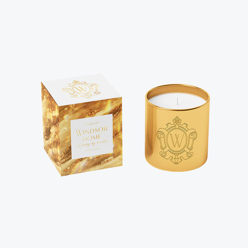
For example, if you sell high-end cosmetics, then upscale materials and a luxe experience is a natural fit. Marketing products specific to pregnancy or baby care necessitate a lighter, more nurturing touch. Men’s care requires an entirely different tack, as does a highly health-conscious approach to personal care.
Once that’s decided, the next step is figuring out what you want your brand to represent. For instance, luxury products mean luxury branding. But will it be luxury with a bit of an edge? Will it be glamorous? Accessible, such as high-end products at relatively low costs? Or would it be upscale with an eco-friendly mindset?
Finally, your brand drives a lot of your initial packaging design, as you’ll want it and your product lines tied closely together. That doesn’t mean you’re without creative freedom to distinguish your packaging, but consistency is critical to building a loyal customer base.
Taking into account all of the above factors will help you craft a company logo, color scheme, messaging, or other elements that provide your brand a cohesive uniformity. We suggest doing that first before anything else in this guide.
Whether you’re a startup, a company that’s rebranding, or an established firm trying to expand your appeal, defining your brand makes the packaging design process far more straightforward.
Who Does Your Beauty Brand Appeal To?
Continuing with the luxury cosmetics theme, just because you trade in upscale polishes, lotions, and face creams doesn’t always translate to a consumer base filled with deep pockets.
Your fingernail polishes might attract young female professionals. Your lipsticks might have the most mature shades of any brand. A lotion you sell might be surprisingly popular with athletic men and women of all ages.
Don’t just assume what initially seems attractive to one demographic won’t carry appeal for others. If you’re established, study purchase patterns to determine who’s buying what items. If you’re starting up, market research provides insight into buying patterns and habits so that you can make informed decisions.
Having that data in hand allows you to design packaging that appeals to your core audience while also attracting those outliers that fuel your growth.
Where Do Consumers Order Your Cosmetic Products?
The final step in your pre-design task list takes into account where your cosmetics are sold.
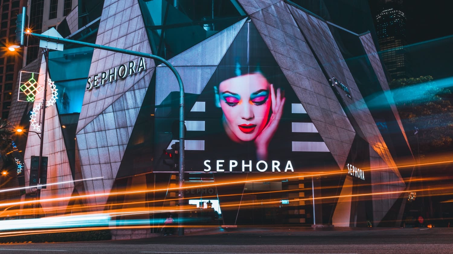
Does your packaging need to stand out amongst similar products in a grocery or big box retail store? Will your products be in a beauty-specific store like Ulta or Sephora? Will your products feature in a boutique or specialty shop, such as nail or hair salons? Or is your plan to sell exclusively online?
Where consumers engage with your brand has an impact on how you should present your product. The packaging used in a store environment has to attract attention, where it sits alongside competing brands.
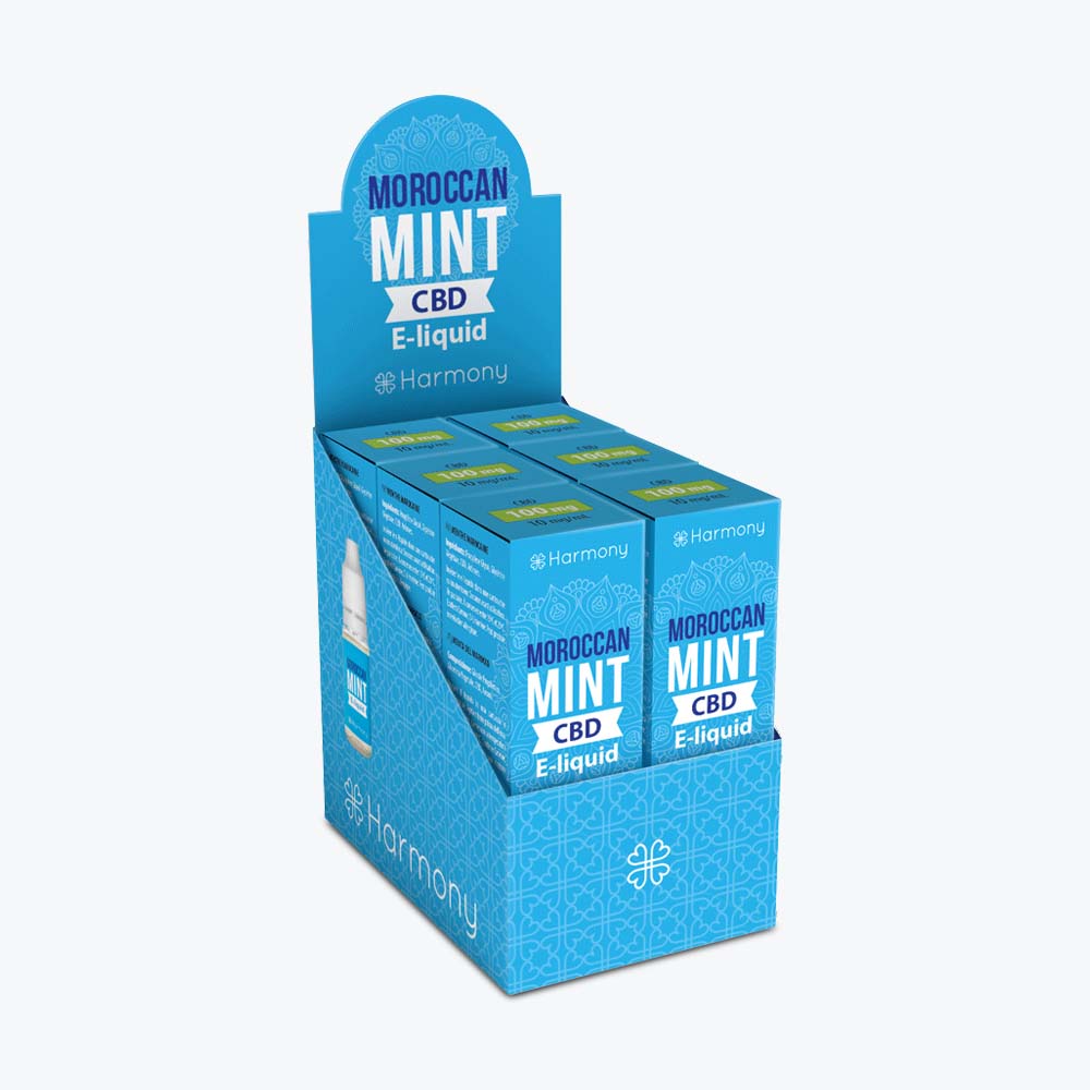
Also, consider the store itself. In some boutique shops, it might be necessary to package products together or dress up the outer shell more than you would for a pharmacy.
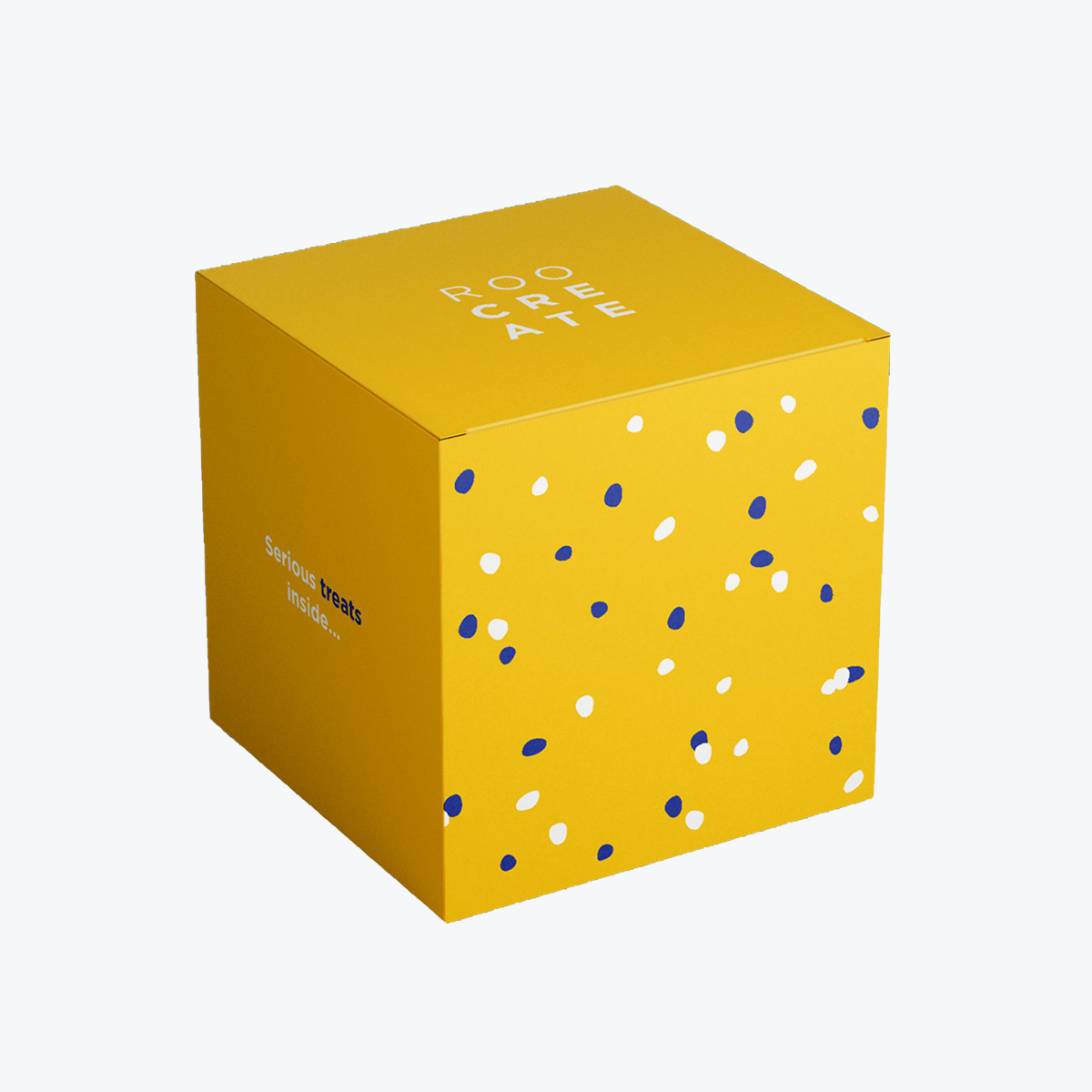
You have a little more freedom with online purchases. Your ecommerce packaging is less about getting noticed and more about the consumer’s experience with your brand.
While it’s not uncommon to produce different packaging for different points of sale, make sure your branding is consistent so your customers can always identify your products.
Understanding the Cosmetics Industry Marketplace
The cosmetics industry is crowded and hyper-competitive and on a rapid incline, soon to be valued at $532 billion. Before delving into the specifics of your packaging designs and committing to any design strategies, it’s beneficial to take a comprehensive view of the marketplace you’ll be entering (or reintroducing your product line).
Research is a critical element in this process. You should do this regardless of if you’re selling online, in-store, or both.
Pick a group of roughly five cosmetic companies that you feel will be direct competitors to your brand. Make sure they sell similar products to yours.
We suggest that from the brands you choose for your research to select three direct competitors, one brand considered to be a step above, and one a step below. Those latter two selections help you gauge the gap between being a premium brand and one seen as something less.
Take stock of what each company does and doesn’t do well, how they engage with their customers, and which shortcomings your brand can take advantage of. Look at their website, online stores, shareability on social media, and visit any stores that may carry their products.
Note the design aesthetics they use for their cosmetic packaging boxes and if any one item or product line sells better than another.
Ultimately, your goal with your research is to find where your brand fits within the market. The better you understand your competitors, the better chance you will have to position your brand for long-term success.
Get Inspiration for Your Product Line
With those basic, but super important, first steps resolved, you now get to move on to the really fun stuff.
Before getting too far along in the design process, it’s worthwhile to figure out what you like, don’t like, and the stuff in between that’s worth considering.
Thinking about what your brand represents, create mood boards or style sheets for each of your product lines using other trends in cosmetic packaging (or even beyond that).
Mood boards are great for capturing overall themes, styles, or things that inspire you. Style sheets (or style guides) help work on the specifics of how you want your specific branding or packing to look. As we noted, if you have individual product lines, you can craft a mood board for overall inspiration and style guide for each specific line.
Search the internet, comb through magazines, and walk store aisles to gain a sense of what works, what doesn’t, and different design styles that could benefit your brand.
Look at colors, fonts, and shapes. Pay attention to trends and take note of classic design schemes and those that come across as gimmicky. You’ll want to focus your efforts on the former, crafting a modern design that also looks like it could fit into any era. It’s also the approach that’s proven most effective in appealing to consumers over the long term.
Add what you like or what seems to work to your mood board or individual product style sheets. Take note of bad design choices, as well, to avoid your own during your design process.
Obviously, you’re not looking to mimic what others are doing. However, style sheets provide an excellent visual reference point on which to build your product packaging design.
Choosing Your Custom Cosmetic Packaging Containers
The foundation of cosmetic packaging design starts with the type of container you’ll use for your products. Based on the products you intend to sell, you’ll already have a starting point for your design.
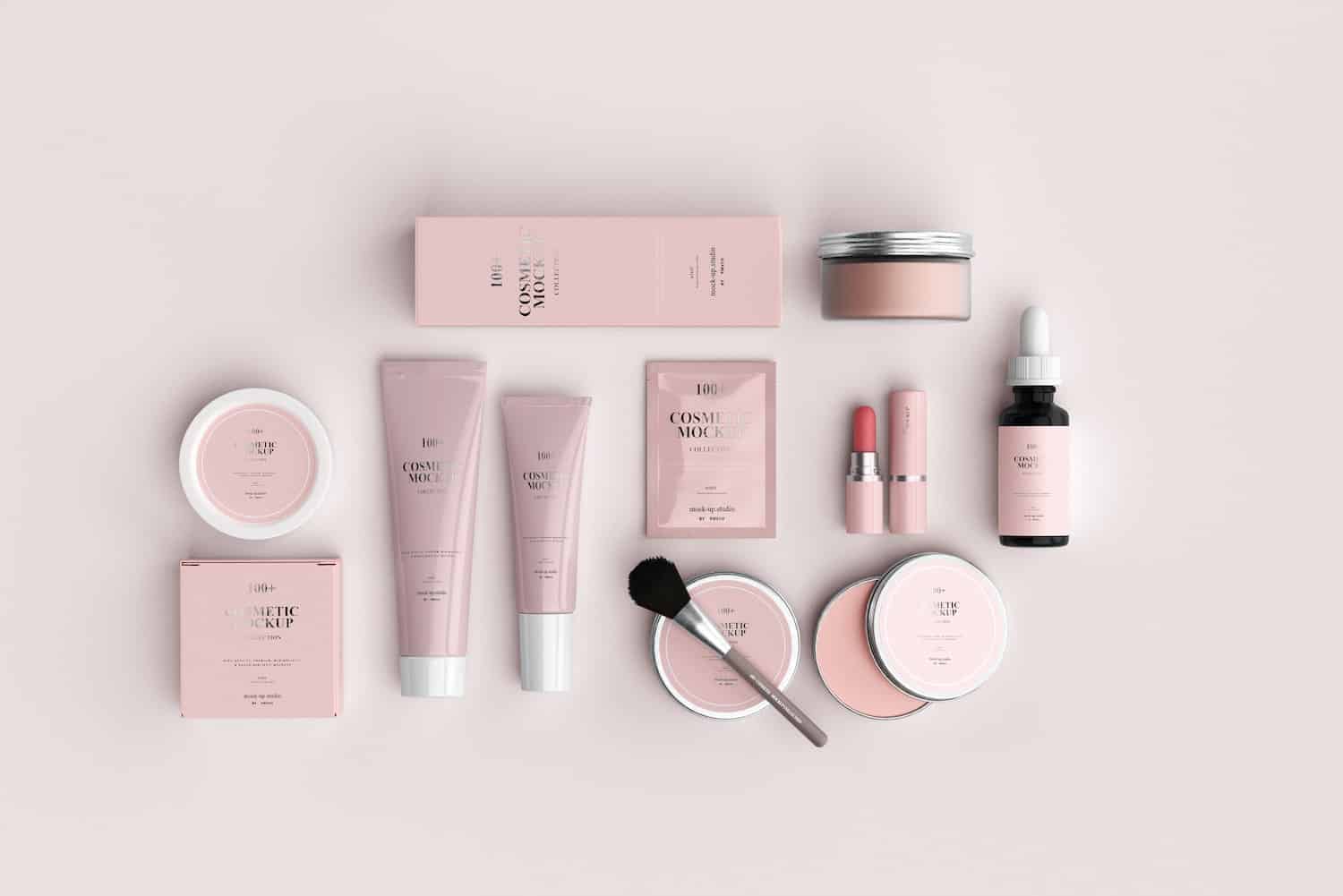
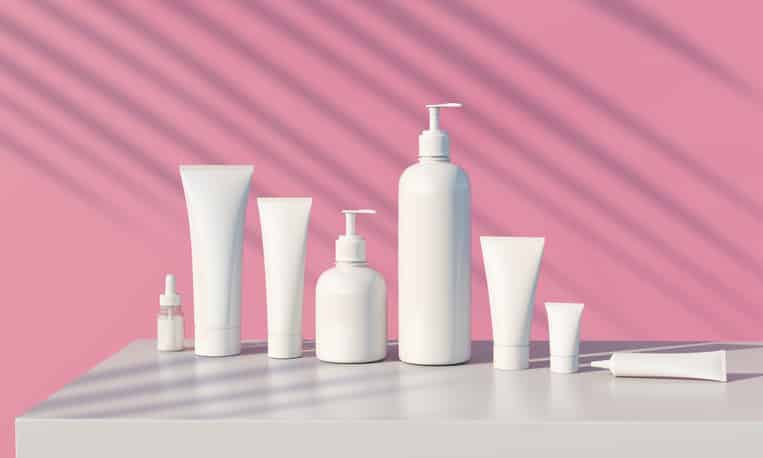
Container types include bottles (glass and plastic), boxes, compacts, droppers, jars, packets, palettes, pumps, sprayers, tins, and tubes.
To a certain degree, there isn’t much room for variation. Shampoo and conditioners almost always come in plastic, squeezable bottles; lipstick comes in lipstick tubes.
However, don’t shy from attempting different variations. Yes, they need to remain reasonably practical and useful. But if you believe it enhances your appeal and is something consumers might respond to, it’s worth trying out.
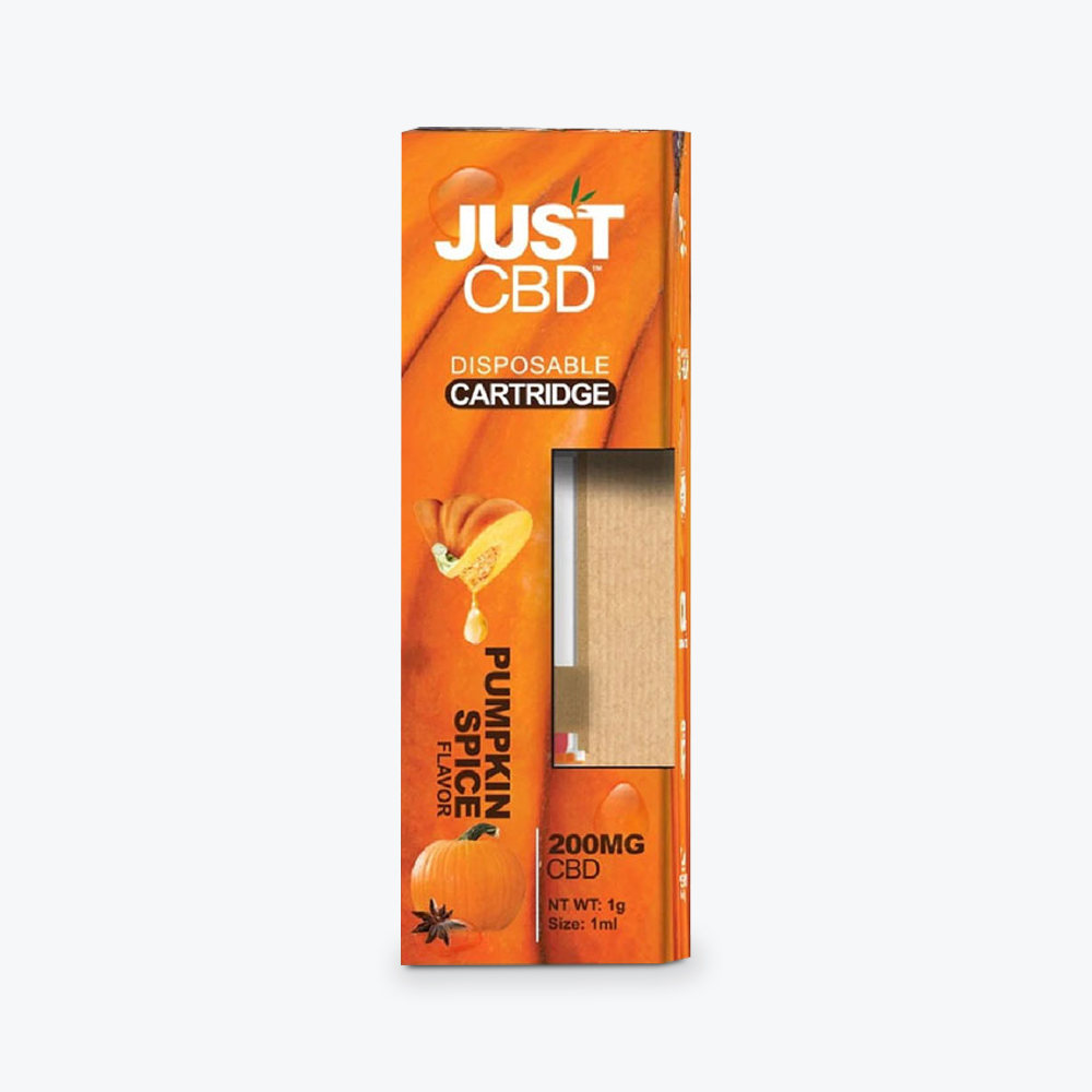
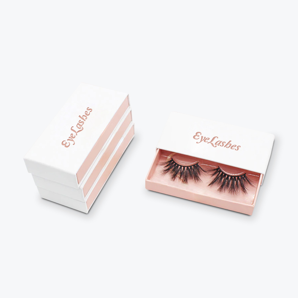
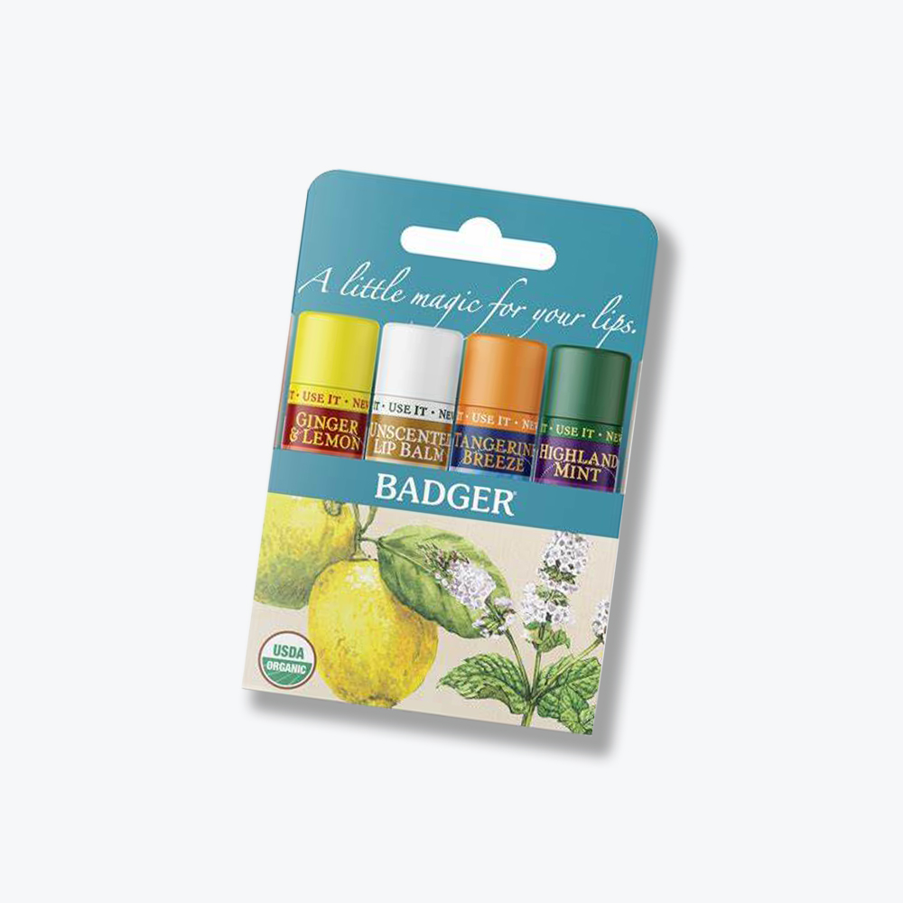
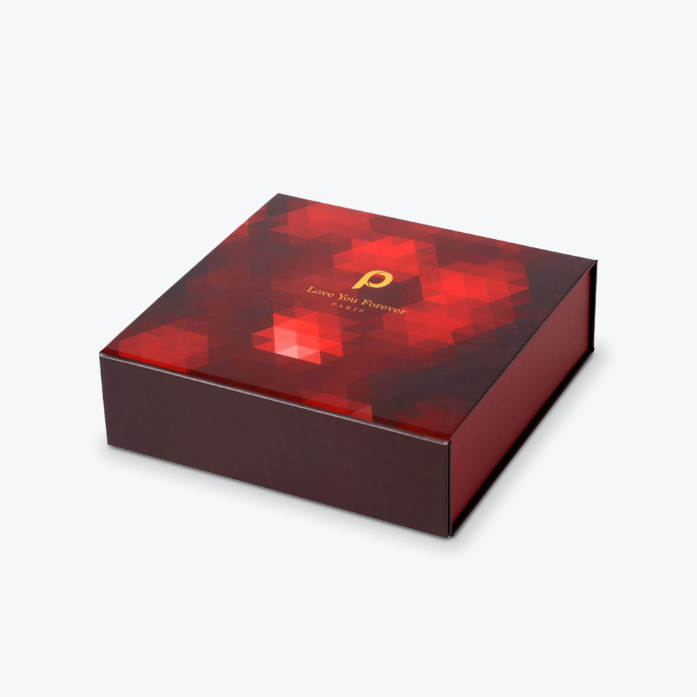
In addition to the actual product container, many beauty products need to feature additional custom packaging. A compact or lipstick tube can stand on their own, secured with a simple plastic or foil wrapping. A glass bottle of perfume or essential oil, however, may require an exterior box as part of the packaging presentation.
Beyond that, many cosmetics brands sold in boutique retail stores feature their own additional exterior bag. At grocery or big-box retail locations, additional retail packaging may be less personalized. Depending on where your products are sold, you’ll want to know which packaging works best in a given environment.
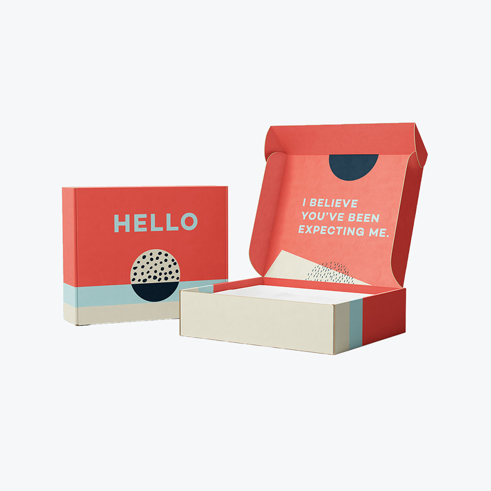
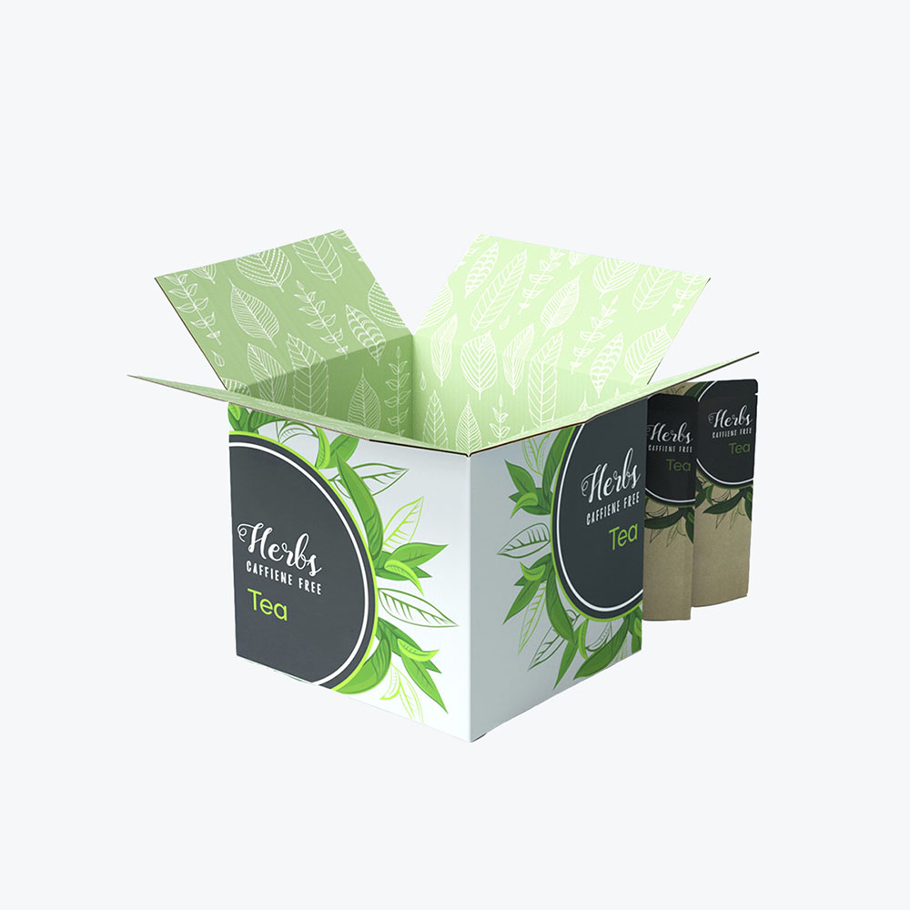
Selling your products online provides greater packaging freedom. For such orders, you may consider packaging that enhances a consumer’s experience with your brand.
Once you understand your container needs, reach out to packaging companies with experience producing cosmetic packaging boxes to help guide you through the design and ordering process step-by-step.
Elements of Good Cosmetic Packaging Design
Stroll down any cosmetics aisle in any store, and the infinite array of colors and patterns and textures and shapes is bound to be overstimulating. More so than most other product segments, cosmetics, and personal care packaging carries a decidedly creative flare.
And it makes perfect sense.
The goal of any of these products is to make the customer look beautiful and feel spectacular. If you’re to convince a consumer to give your lipstick, bath wash, or body lotion a try, you need to convince them that your product will take them on that blissful journey.
It’s also why certain aesthetics emerge and are often relied upon to create lasting and timeless packaging designs that make an impression with consumers. While your actual packaging colors may be driven in part by your overall branding scheme, you can incorporate different techniques specific to your product lines while maintaining consistent overall branding.
When seeking inspiration for your design, and when in the midst of the design process itself, remain mindful of several core elements. You should always look for new and creative ways to set your brand’s packaging apart.
However, employing a few proven strategies as a baseline helps you craft an excellent design that represents your brand and appeals to customers.
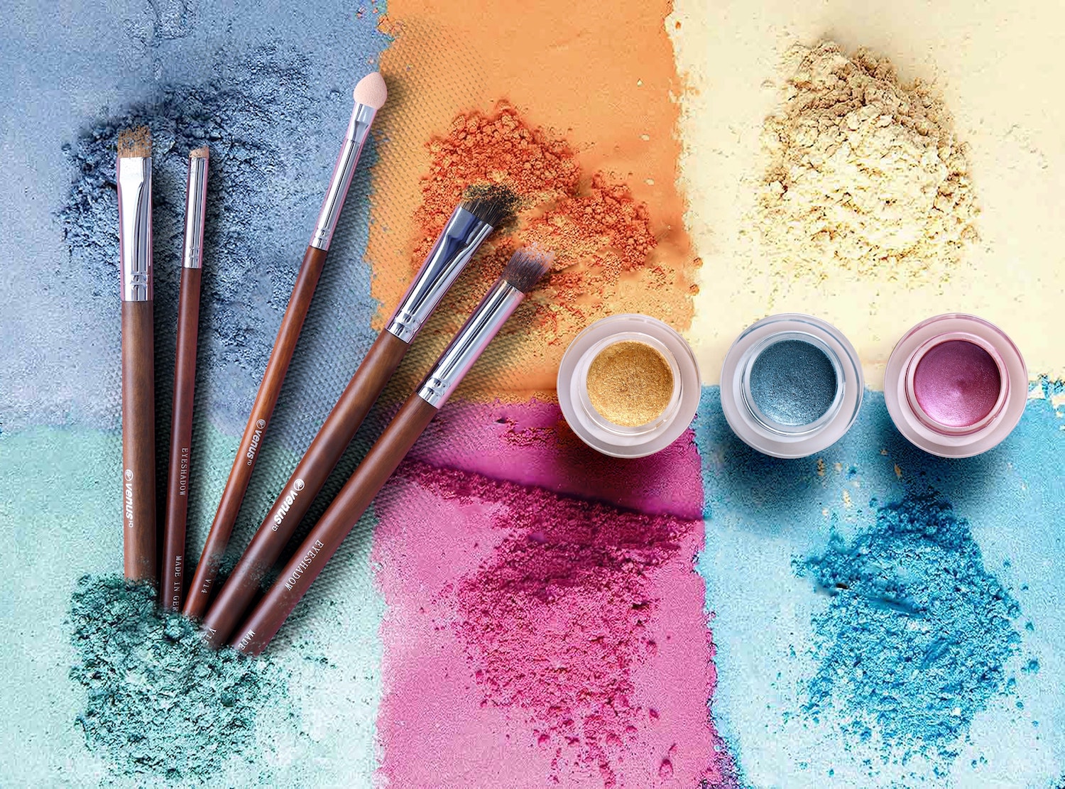
Colors
We’re sure it comes as no small surprise that colors play a huge role in cosmetic packaging design. The industry, by its very nature, lends itself to the utilization of a vast palette of colors. A handful of tried and true color schemes though popup again and again.
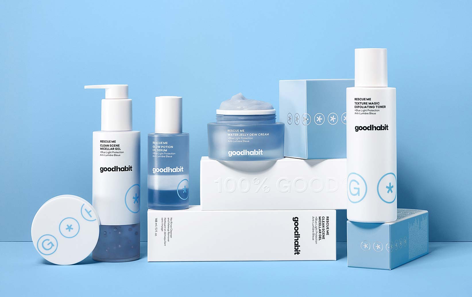
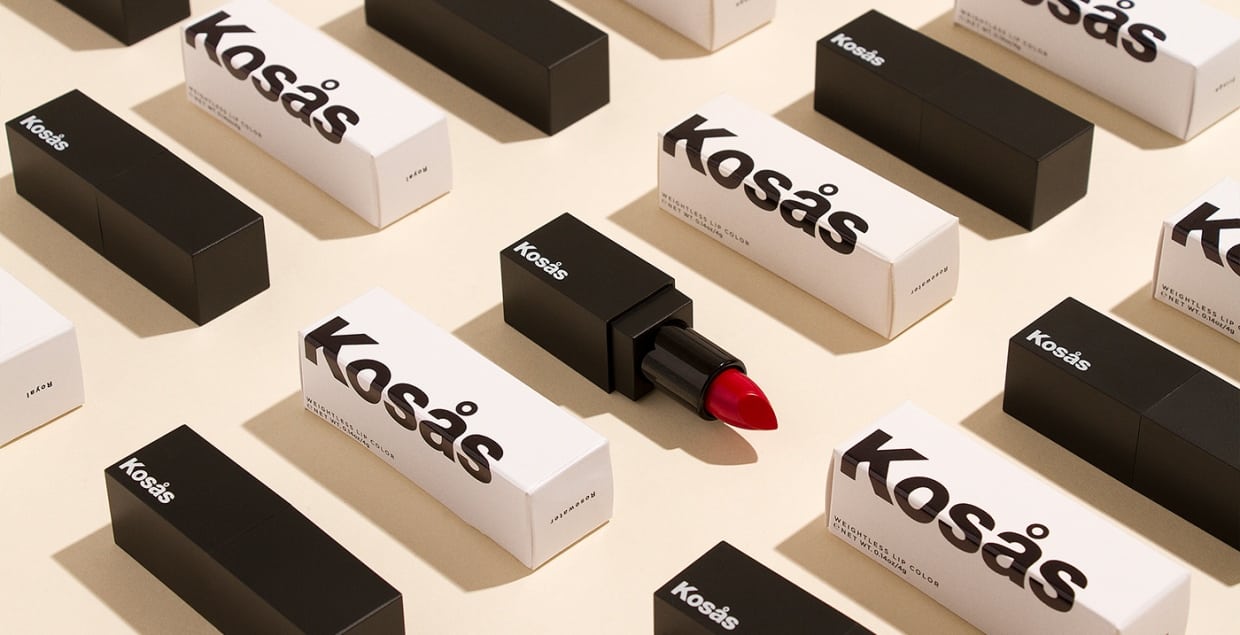
- Black and White: Individually, the colors black and white will always prove as standout choices for product packaging, regardless of industry. Black is a power color. It portrays a sense of luxury and sophistication and timeless elegance. It’s also useful in giving brands a certain hard edge, or broodiness.
White, for its part, often represents the height of minimalism. Its starkness also portrays elegance and sophistication. When used as a base layer, it serves the dual purpose of softening heavier hues and providing better definition to lighter colors. When paired together, black and white will always prove a winning, classic color scheme.
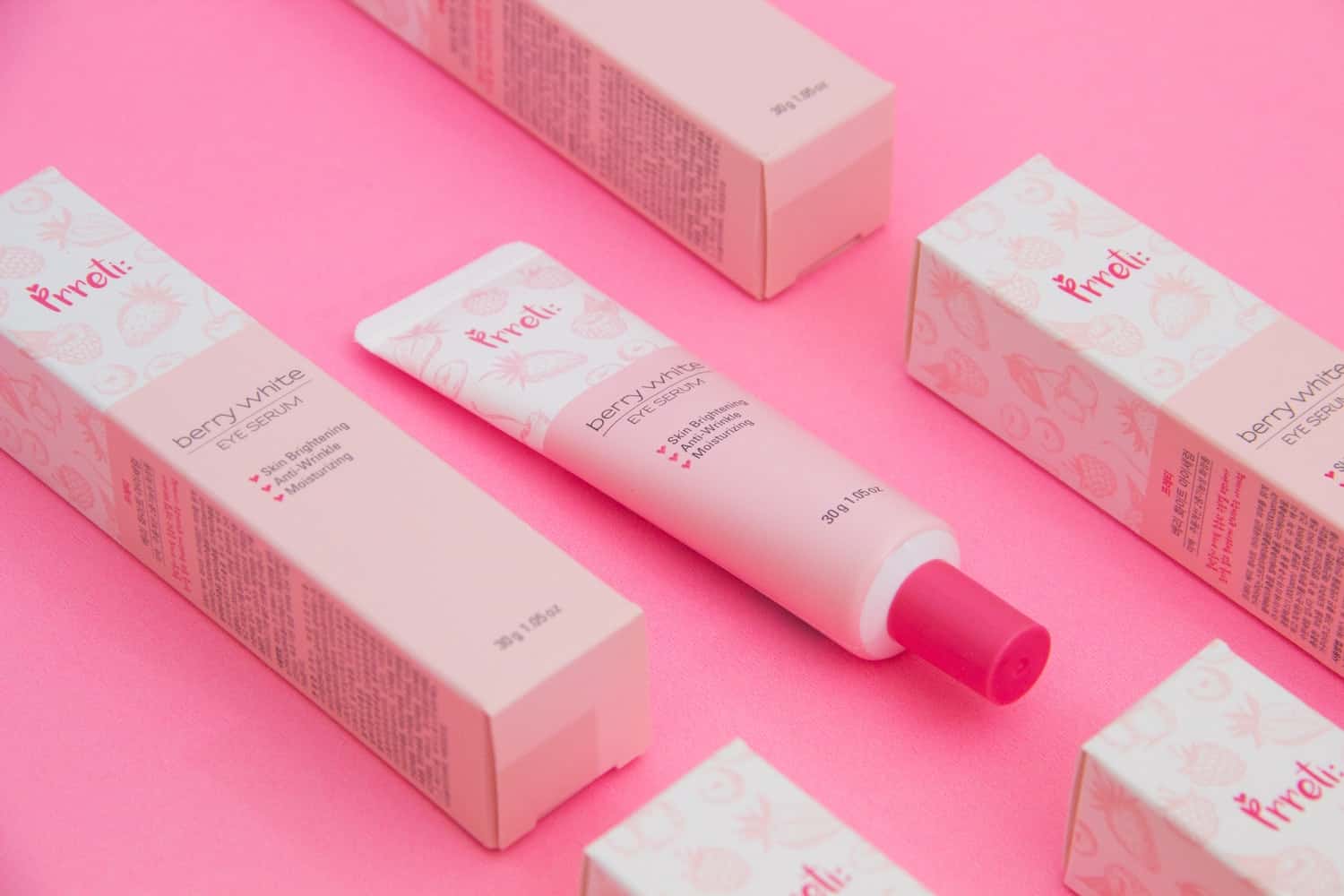
- Pink and Purple: Ever wonder why pink and purple are two of the most prevalent colors in cosmetics packaging? Well, pink evokes feelings of love and romance, beauty and femininity, and carries with it a sense of calm. Purple evokes royalty, wealth, and luxury. It also symbolizes extravagance, independence, and even a bit of mystery.
Both of these colors capture the beauty industry’s basic core tenants. As such, they are used again and again and again. It may prove difficult to distinguish your products from others who are trying to capture a similar vibe. If you must use either, it’s best to do it in tandem with other colors. You can still capture that core feeling of beauty and extravagance while paving your own branding path.
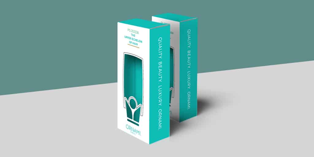
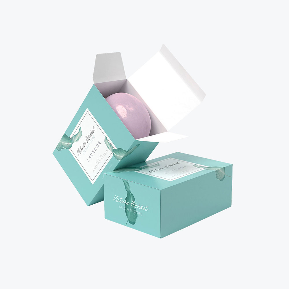
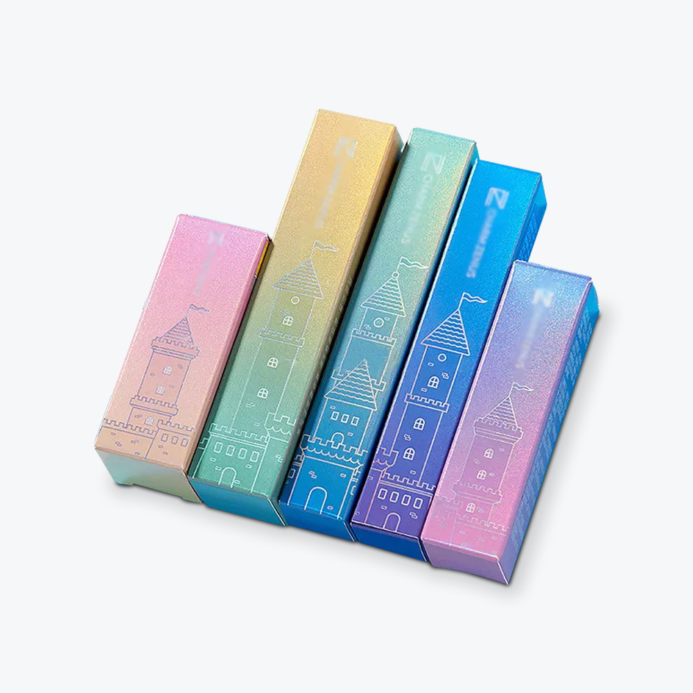
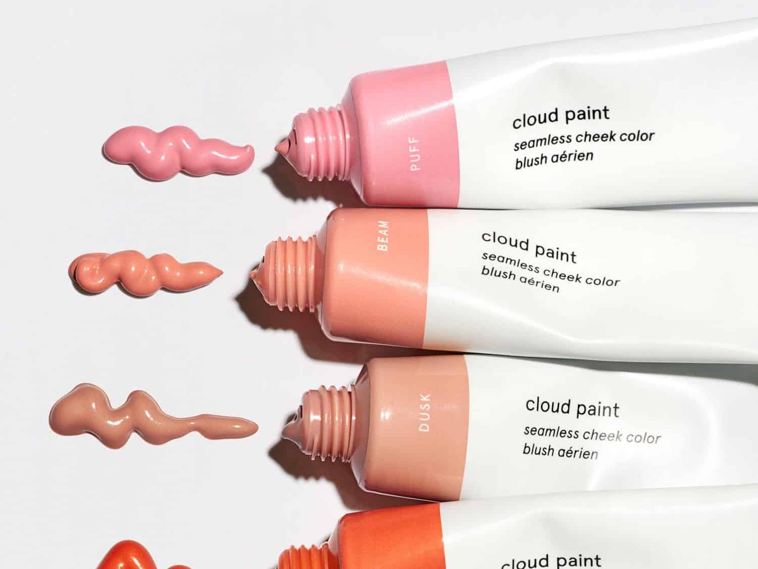
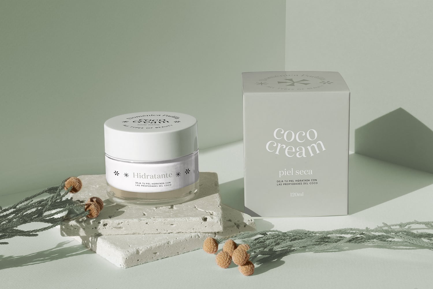
- Pastels: Pastels are pale hues of primary and secondary colors from the color wheel. Most widely associated with Easter and early spring, pastels reflect a soft, gentle mood. They are extremely popular in cosmetics packaging as they invoke tranquility, openness, femininity, and rebirth (spring).
Although you’ll find them named everything under the pastel sun – mint blue, pistachio or seafoam green, plum, antique white – they are most commonly found under the light or pale monikers (light pink or pale yellow). Similar to pink and purple, if you can find a new, unique twist on these popular schemes, it can help distinguish your brand.
- Other Color Schemes: The three categories above represent the most popular colors used in cosmetics packaging. There are, however, other options. Warm tones use a combination of red, yellow, orange, and pink to invoke enthusiasm, energy, and optimism.
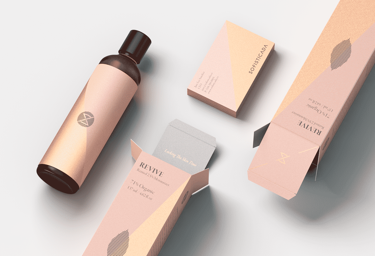
Cool tones – those that predominantly feature blue, green, purple, and similar hues – are meant to communicate a sense of relaxation or calm. Neutral or earth tones represent any shade of brown or closely related variances, anything from auburn to gold to tan. Often used in association with black, white, or gray, these hues evoke nature.
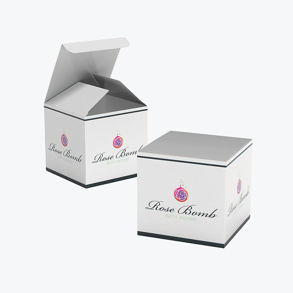
Although you may opt for your brand’s overall color scheme to take the dominant role in your packaging, experiment with different mixes. For example, pastel lavender or light purple is often associated with relaxation. If your line features soaking bath salts or bath bombs, it might prove beneficial to feature lavender as part of the packaging design for your custom bath bomb boxes, even if it’s not a primary part of your branding.
Your main goal with color is to appeal to a consumer’s senses.
Is your brand earthy or ethereal, with environmentally conscious products and packaging? Or is it more urban, with the goal to attract the fete set who attend black-tie dinners and charity balls?
Play around with different combinations. Find those that enhance your brand, entice your ideal consumer, and build a loyal customer base.
Fonts
Similar to colors, the fonts and typography (how your fonts are visually rendered) used in your packaging convey their own feelings and emotions. Not to overwhelm you, but there are approximately half a million fonts currently available for use.
Picking the right one, though, is not nearly as daunting as it seems.
First, there are some basic tenants with lettering. Serif fonts are the most traditional of font options and convey class or a sense of being established. Sans serif is a far more modern font. It’s both simple and straightforward.
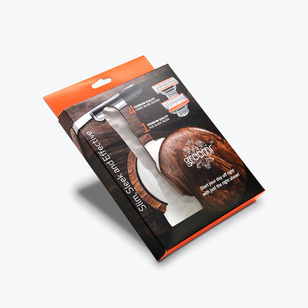
Cursive or script fonts or those set in italics communicate sophistication and elegance (and femininity). Bold letters or those in all caps invoke a strong, aggressive brand (often used in men’s beauty care product lines).
Regardless of the font and typography, the first goal is to ensure it’s easy to read. A critical factor to always consider is the type and size of packaging you plan to use when determining your text scheme.
Whether it’s artistic and whimsical or bold and brash or elegant and sophisticated, choose what best represents your brand and is unique and stands out from your competition. The better you can separate yourself, the greater chance you have in forging your own identity.
Patterns
The final major design elements of cosmetic packaging include patterns. And, as any trek through your nearest cosmetics and beauty store indicates, the world is truly your oyster.
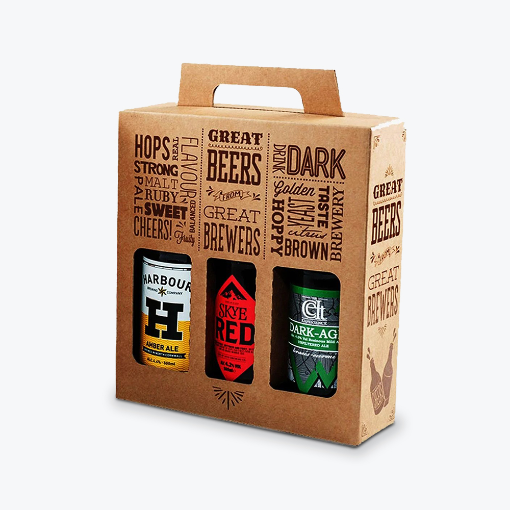
The predominant design styles you see elsewhere are often on display in cosmetics, from custom lip gloss boxes to foundation boxes. Minimalist, geometric, Art Deco, florals, traditional, contemporary, modern, natural, abstract – those are just the basic underlying styles. Plenty of brands combine elements to carve their own path.
Which is what we suggest. There is no right or wrong here – hand-drawn florals or bold, industrial geometrics can both prove successful based on brand goals and consumer reaction.
It may sound like a broken record at this point, but uniqueness stands out in an industry and marketplace where many brands seem like mirror images of one another.
When bringing all of these design elements together on your product packaging, you want a cohesive presentation. One that is true to your brand. Attracts your target demographic and will prove the most engaging wherever they acquire your products.
Additional Informational Elements
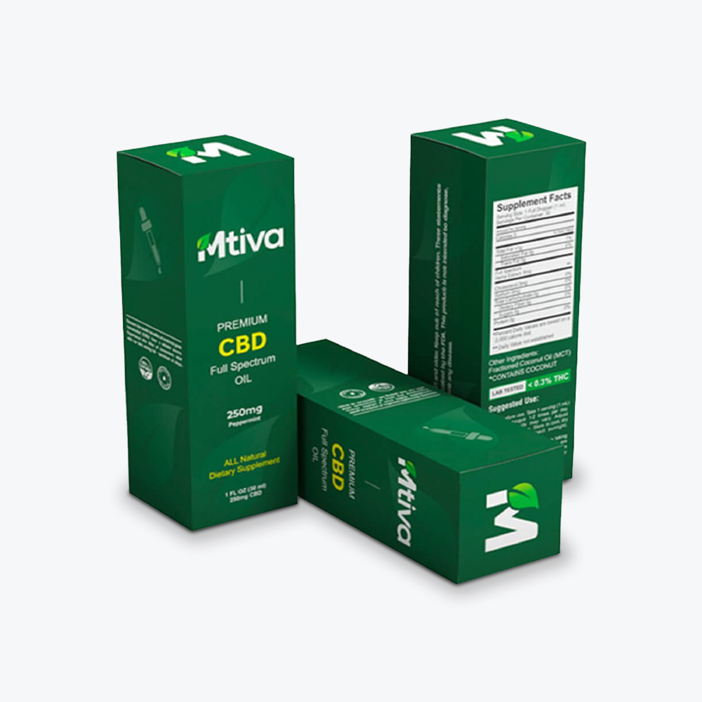
Along with your brand logo, copy, and graphics or images, the packaging may also require certain additional elements. This is specifically to satisfy FDA regulations that govern cosmetic labeling.
Depending on the product, your label may need to include ingredients, expiration dates, and government warnings. While it’s not a requirement, if your product is cruelty-free and not tested on animals, we suggest indicating that on your custom packaging as well.
Ready, Set, Go
Okay. Now you’re ready to start bringing it all together.
Assuming you’ve added and removed and tweaked your mood board and style guides accordingly, you should have a good overview of where your design is heading.
Unless you’ve got a team of in-house designers at your disposal, we strongly recommend working with a professional designer. Not only do they handle the heavy lifting of bringing your ideas to life, they prove worthwhile partners in perfecting the design before it’s finalized.
A few things to keep in mind during the cosmetic packaging design process:
What you highlight on the front of the packaging is what consumers notice first. Are you trying to build a brand or sell a product? The answer dictates your approach. If it’s a brand, make your logo and messaging the focal point. If it’s a product, keep the specifics on what makes it so great.
For both the front and back of your label, make sure it answers a consumer’s most immediate questions: product description, contents, whose it’s for, how to use it, instructions or warnings.
Also include any particulars that make your brand or the product worth buying: eco-friendly, cruelty-free, special ingredients, specific beauty benefits, or specific altruistic benefits (“a percentage of your purchase will be donated to…”).
Whatever route you take, ensure it’s clear, concise, and appeals to your ideal consumer and entices everyone else. Ask yourself these questions:
- Is the product identifiable? Clear what it’s for and what it does?
- Is it clear which brand is selling the product?
- Will it stand out on a shelf? Or blend it with competitor packaging?
- Will it create excitement among consumers who pick it? Will it provide an experience for those ordering it online?
Most importantly, does the design match the vision you have for both your brand and the products you’re selling? Ensure to create actual physical mock-ups of the packaging designs during the design process. This allows you and your team to experience what the consumer would in the store or during an unboxing.
Finally, even though much of your packaging costs stem from the actual containers, boxes, and bags, be mindful of the costs associated with your design. The more elaborate they are, the more you’ll pay. Work with vendors across the entire project – designer, printer, and logistics – to secure the cosmetic packing you want at a price you can handle.
Final Thoughts
Let’s look at the steps that brought you to this point:
- Defining your brand
- Who does your brand appeal to
- How consumers acquire your products
- Understanding the marketplace
- Inspiration
- Containers and packaging
- Colors
- Fonts
- Patterns and designs
- Additional information elements
- Ready, set, go (making your designs a reality)
The quick recap serves as a reminder of the various elements involved in your packaging design process. It’s not to overwhelm you, but to serve as a reminder, the entire process is interconnected.
- If you don’t have a clear idea of your brand and who it appeals to, you’re going to struggle with crafting cohesive packaging.
- If you don’t craft cohesive packaging, you run the risk of being overlooked or blending into a crowded marketplace.
- If your containers are mismarked or poorly packaged or sloppily designed, consumers won’t seek your product out in a store or trust anything you post or sell on your website.
- If you can’t pin down the elements that inspire you, there’s little chance you’ll create packaging or a brand identity that inspires others to try your products.
You get the idea.
As we pointed out, the cosmetics business is hyper-competitive. But it’s also an industry full of opportunity to make your mark. Whether you’re hoping to carve out a niche for your brand and products or become a one-stop beauty empire for all, the first impression you make is with your packaging.
Take your time and give the packaging design process the attention it deserves. Research the market, find your inspiration, and envision what your brand brings to the market that others do not. Then design packaging that conveys that message to consumers.
They’ll only know how great the product is inside if you convince them to buy it with great packaging on the outside.
Ready to think outside the box? Let's get started!
Get in touch with a custom packaging specialist now for a free consultation and instant price quote.


.svg)






Share