Not long ago, product packaging was just that – packaging. Sure, you had a few forward-thinking brands that dressed up the box or the bag their wares came in, but it was few and far between. For most brands and their products, the outer package was simply a vessel meant to protect the contents as they traveled from warehouse to customer.
However, with the rise of ecommerce and social media, that container has taken on new meaning. In some respects, product packaging might even be just as relevant as the items it carries.
But why does it matter? And more importantly, how do you and your brand design eye-catching (and at the same functional) product packaging that stands out from an increasingly crowded marketplace?
Read on as we take a deep dive into producing standout product packaging for your brand.
Why Does Good Product Packaging Matter?
Good product packaging matters for a few reasons.
Foremost, quality packaging protects the contents inside. Arguably, the most crucial step in the business to customer relationship is that a product arrives safely and intact.
Nothing will turn a customer off more than damaged goods that they have to return. For a business, the last thing on your list of to-dos, both physically and financially, is to process unnecessary returns.
But that’s an obvious point.
The less obvious, but increasingly more important reason that packaging matters is that it matters to your customers.
Consumers love being wowed. They want you to impress them. And let’s face it, there’s a segment of the consumer population that demands you go the extra mile to earn and keep their business.
Consumers are looking for an experience.
Ecommerce drives much of the sentiment. Shopping now is less about window shopping at a mall and more about endless hours of online research. Time on screen comparing products and brands. Reading blogs and reviews. Trying stuff on in augmented reality. Sharing the whole experience with everyone they know – and a lot more people they don’t.
If you don’t believe us, a trip down the unboxing rabbit hole on YouTube should be convincing enough.
Aside from the novelty of watching other people open their purchases for all the world to see, the packaging is just one more piece of the expanding product lifecycle.
For a large portion of the population, it’s no longer enough to find something you want, buy it, and be happy with your purchase. People want to take a journey with the brands where they spend their hard-earned dollars.
Considering the moment of unboxing is the singular touchpoint between brand and consumer for an ecommerce transaction, well, the customer wants that moment to matter.
Finally, packaging matters because it’s an extension of your brand. More than providing your customers with a worthwhile experience, great packaging can influence potential customers’ purchasing habits.
Stop and consider where your products and the package they arrive in might land:
- On someone’s kitchen counter while they host some friends or family.
- On somebody’s desk who prefers their orders be shipped to their office.
- On a person’s Instagram or Twitter feed or their Facebook page.
- On a YouTube unboxing video.
Let’s say five people are in that first scenario. Ten people see the box at the customer’s office. One hundred folks catch the Instagram post. As for YouTube. Well, you get the idea, killer product packaging design leads to social media shareability and increased awareness for your products.
Do you think those people would be impressed with a shoddy outer shell? Or would something with a bit more cohesion go farther in attracting their attention?
Packaging that reflects a strong brand reflects a company that thinks about how its brand is perceived – a brand that puts effort into creating a strong customer experience in every detail.
In other words, regardless of anyone who suggests otherwise, people do in fact, judge a book by its cover. All. The. Time.
Packaging is just as much your book cover as your logo, website, advertising, and product themselves. Here’s a guide to ensure your brand’s packaging design is judged favorably.
Before All Else, Know Thy Brand
So yeah, on its surface, step one here probably seems a bit ridiculous, right? After all, you know your brand, your company, inside and out. You (hopefully) already have logos, a color palette, and messaging established.
If that’s the case, great. Extending those schemes into your packaging should prove a natural next step. Just remember to keep your branding and packing consistent.
If you sell multiple product lines, each with their own marketing and design schemes, you may want to opt for individual packaging that reflects their unique identities. The alternative, of course, is to stick with a singular brand packaging scheme (your company, for instance) and allow the products to speak for itself.
Conversely, if you don’t have an established company motif, we suggest hammering that out first. And not just for packaging, but your brand as a whole. A firm whose website possesses one design style, marketing and advertising with a different theme and packaging different from either of those first two will not be viewed favorably.
Again, you want your branding consistent and cohesive, and have it tie into your overall marketing and sales strategy. Consumers will view your company as one that has its act together. Especially when they receive products in packaging that reinforces your brand and its ideals.
Understand Your Products and the People that Buy Them
Step two in packaging design involves your products, your customers, and the point of transaction between them. This isn’t a particularly difficult part of the process. But it does require some genuine analysis on your part. After all, packaging is worthless if it doesn’t fit the goods you sell, connect with the customers you’re selling to, or reinforce your brand and the products it sells are worth buying.
Products
Understanding your product is less about how your packaging is designed and more about what type of packaging your product will require.
Do you sell glass products? Large bulky items? Small paper products? Perishable items? What you sell inevitably drives much of the initial design process and helps you establish a starting point for your design.
For example, glass or other delicate items will need extra protection during the shipping and fulfillment process. Your design process will have to factor in the extra “padding” whatever form it may take.
Also, examine just how that product needs to be shipped. For instance, if it’s big and bulky, does it ship fully assembled? Or will the customer put it together upon receipt? Do you sell art or movie posters that you can roll up and ship in tubes? Or do your paper goods need to travel flat? Consumables, in particular those that have expiration dates, have their own logistical hurdles to consider.
The key is to examine all the variables – not just elementary factors like big product goes into big box, small product goes into small box.
Customers
As we pointed out earlier, both customers and non-customers are judging your brand. If you don’t already know your target market and the demographics your company and its products appeal to, you must do that first.
If you have that data and a decent track record of appealing to your ideal consumers, designing your packaging will prove much more manageable. Amazon and Target’s shipping strategy provide a good, uncomplicated example of how customer profiles inform your packaging design.
Amazon is the 800-pound gorilla in the room. They function on volume and practicality, and their most devoted customers know it. Box, tape, and just enough packing material to keep an item secure. They logo the tape and the box with the company’s messaging. Done. It’s not fancy, but it’s recognizable, relatively inexpensive, and gets the job done.
Target, on the other hand, takes it up a notch. It began shipping out online orders with a delivery truck occupying four sides of the truck and their dog mascot, Spot, driving it. It’s not elaborate by any means, but it plays up Target’s more whimsical approach to advertising. It also gives a plain brown box a slightly upscale feel – in line with Target’s reputation and clientele.
For their part, Walmart runs similar to Amazon. Its boxes are a bit flashier – web address and sun logo across a blue field – but retains a pragmatic quality.
Chances are you’re not yet operating at the level of Amazon, Target, or Walmart. The above, however, informs how to approach your packaging design from a customer standpoint.
If yours is a luxury brand, your target customer will expect a higher level of service and branding: custom printing, upscale materials, anything but a simple cardboard box.
If you trade in health products or feature messaging that promotes a natural lifestyle, you should strongly consider environmentally friendly packaging.
Your goal is to make sure you know your customers (current and future) and craft a design experience that compels them to purchase (or make repeat purchases) of your products.
Point of Purchase
Packaging takes on a whole new life based on where it’s sold. Are you strictly an ecommerce operation, or do customers engage with your product in a physical store?
If your product sits side by side with others in a grocery or major retail space, your retail packaging needs to be ready to compete for busy eyeballs. Your packaging design focus is about standing amongst crowded shelves with similar products.
Specialty stores or boutiques may require a slightly different approach. With many boutique environments, the experience is just as important as the products. You will want your product packaging to heighten that experience while drawing those more discriminating shoppers to your brand.
In either of these cases, your packaging is all about the immediate product. Your shipping packaging to the store doesn’t matter, as long as it is well marked and arrives safely and undamaged, and it is easy for the employees to handle.
Ecommerce packaging presents an entirely different challenge. While the product’s shipping package and labeling do matter, how it’s shipped commands equal billing. All the points we’ve covered so far apply here.
Is it packaged safely? Does it extend or reinforce your company brand and message? Does it fulfill the experience – from browsing your website to ordering your products to unboxing the items – that your customers have come to expect?
Keep in mind, you don’t have to go overboard with any of the above. Some of today’s best packaging is incredibly simple and straightforward.
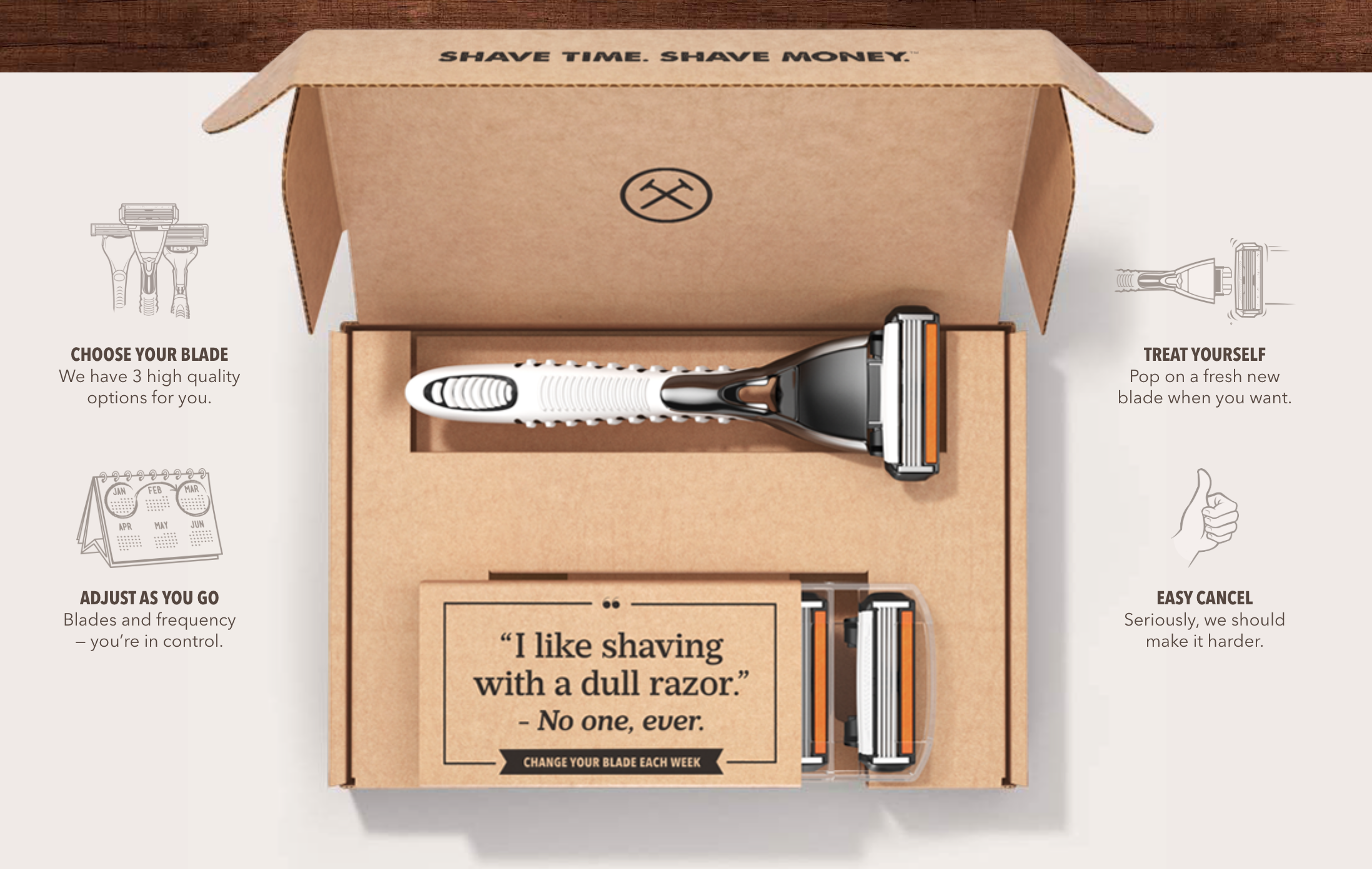
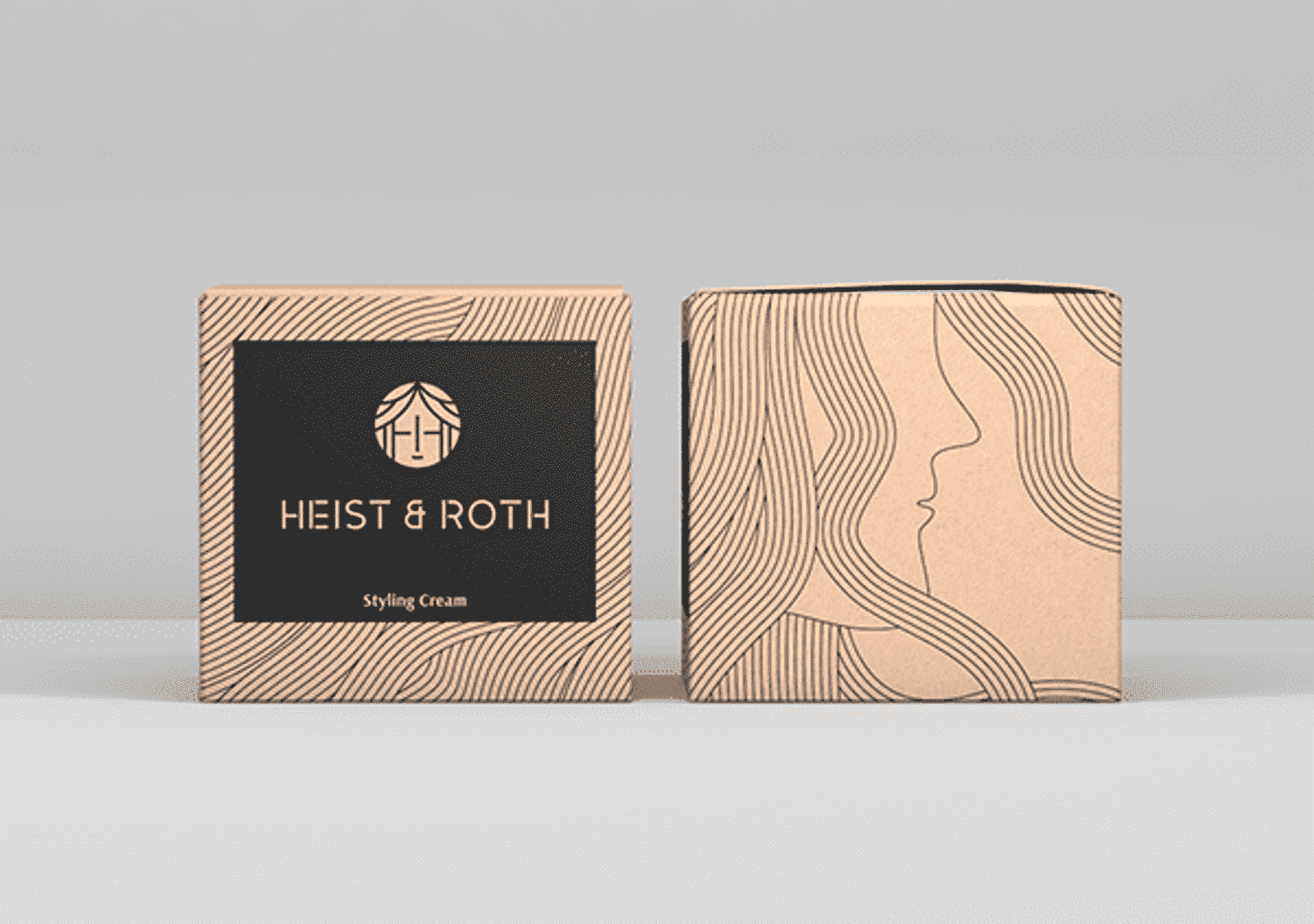
Apple. Dollar Shave Club. Ikea. And a number of smaller brands are taking similarly creative steps to get noticed by consumers.
They all have in common the packaging designs they produce are well thought out and reflect the company they’re originating from.
Custom Packaging Considerations
Before you go all-out on vibrant colors and big giant boxes with “Hey Looky Here World” spray-painted on the side you must sort through some basic packaging considerations. That involves reviewing some essential elements, accounting for costs, and narrowing down the vast array of packaging options available.
The Basics
We’ve already touched on this to some degree when thinking about the type of packaging your products will require. But here, you take that one step further.
Packaging durability and functionality are the two main starting points for your design. Together they dictate the design canvas with which you’ll work.
Next, take stock of your shipping requirements. Does your brand deal with large orders and mass shipping where speed and scalability are critical? Automating the shipping process, including simplified packaging that’s easy to scale, is probably your best bet.
On the other hand, if you run a boutique business, where white-glove treatment and unique experiences are part of your brand’s mission, scalability is less of a concern. Here you’re allowed a bit more freedom with how you tailor the packaging you use and the designs you employ.
Beyond that, account for any absolutes your packaging will require. These can include:
- Multiple packing layers. You may need to include multiple layers of packaging either for additional protection or a more elaborate presentation. Will you want to add design elements to every layer? Just the product packaging, or a combination? Layout your needs before starting your design process. More packaging may alter your design needs and will add to your overall costs. Read up on how to measure a box and find the exact box sizes and dimensions you’ll need before you start ordering.
- Infill. Protective materials such as Kraft paper, bubble wrap, or air pillows to cushion your products during the shipping and delivery process. While none of these materials are typically subject to the design process, consider your brand and how customers respond to it. If your brand focuses on environmentally friendly messaging, you probably don’t want packing peanuts as part of your overall presentation.
- Decorative infill. This includes packing materials, such as tissue paper, string, shredded cardboard, or crinkle paper for a more pleasing packing aesthetic. While these elements are less about protecting an item, it’s still important to gauge how they’ll fit in your overall scheme. Some materials, such as shredded cardboard, can both protect and enhance your design.
- Labeling and inserts. Labeling, and how you lay it out to distinguish your products from others in your marketplace, is a crucial factor in packaging. Of course, when thinking about your labels and printed marketing materials, you need to focus on copy and imagery, which we detail below. Inserts differ from the label in that there are usually freestanding pieces like a thank you note, coupon, business card, or other promotional items. If you choose to include them, make sure they follow your design scheme.
- Copy. Written copy is an oft-overlooked part of the design process. Although your brand or product name, logo and messaging are critical areas to scrutinize, so too are descriptions, instructions, or any other verbiage worth featuring on your packaging. Make sure you have written it exactly how you want and that it’s edited before heading off to the printer.
- Required copy. Similar to copy, required elements deserve just as much attention, if not more. This includes verbiage that may be required as part of what you sell. Governmental requirements, nutritional information, ingredients, expiration dates, safety warnings, industry or association identifiers, barcodes, or any other information that must be included on your packaging should be incorporated in your overall design.
- Images. This is relatively straightforward, but any imagery you want to be incorporated within your design needs to be sorted out beforehand. Depending on how you plan to present the images, check with your printer, logistics team, or design partner to determine file requirements and image quality. Adding a picture to the side of a cardboard box of your product photography or brand messaging may vary significantly from adding it to a piece of tissue paper or glass container.
Top brands factor every single element into their custom packaging and box designs, from the size and weight of a box to the font on the label.
Packaging Options and Costs
Let’s face it, if you can dream it up, there’s probably a box or bag or some other container to fit your products, whatever your design whims may be. The two questions to ask yourself – does it fit your brand, and can you afford to go custom. That latter point is three-fold.
First, you’ll want to account for the cost of the packaging itself – shipping box, merchandise bag, the container for the product itself, and any extra packaging it may need. The more elaborate your design and the more packaging you require, the higher your costs will probably be. Depending on where your company is regarding its growth, it helps assess if custom packaging is necessary.
If you’re a startup, and marketing dollars are scarce, don’t be fret over starting out small. Note that many brand’s packaging evolves as they grow and become more successful. And watching your bottom line doesn’t mean sacrificing creativity.
Custom boxes, bags, and bottles can add to your overall design costs, but there are usually options to fit your packaging budget. And while they may be cool and unique, it may not prove worth it in the long term. Depending on how your brand positions itself, your customers might care more about the product than how it’s packaged.
Basic packaging with some minor customization – think branded labels, stickers, or simple print demands – is usually enough to attract plenty of attention. As your brand grows and you look to expand your customer base, it is an excellent time to test if more detailed packaging will vault you to further success.
Second, you’ll want to account for shipping and storage costs, especially if the bulk of your business stems from ecommerce transactions. The heavier your packaging, the more it will cost you to ship it.
Okay, so that’s a bit of a given. However, if you’re packaging involves unique or awkwardly shaped elements, that may impact shipping requirements as well. The same goes for what it might take to store your materials before they leave the warehouse.
Finally, you should evaluate if your packaging will possess any sort of reusability factor. It’s not a necessity, and not every product’s packaging lends itself to reuse, but if you want more bang for your marketing buck, it’s worth considering.
Perhaps most obvious is if any of your products can be sold in or with a tote bag. These typically have a very long life, and with your logo on the side, so will your brand.
For custom boxes, it’s a bit different. There’s the obvious reuse of an outer ecommerce box for shipping. So it may be worth it to at least have your company name and logo there. However, if any of your other packaging can be used again – think a custom box being used as a keepsake container – it could be worth the investment to further appeal to your consumers.
Designing Your Custom Product Packaging
Now that you’ve hammered out the specifics of packaging, costs, and what to brand and what not to, it’s time to move to the actual design phase. There’s no real secret to a winning design. Crafting something true to your brand carries a broad appeal that will capture both your target customer and attract new consumers.
Unless you or someone on your team possesses a high-level design acumen, we suggest working with a professional designer. They simplify the process considerably and do a lot of the heavy lifting to get your design just right.
Inspiration
That said, the first step in designing your packaging involves you finding packaging inspiration for your designs.
We’re big fans of creating mood boards and style sheets or guides for each of your products. Factor in what your brand represents and then head out into the marketplace in search of elements that fit within or inspire your vision.
Search through magazines, on the internet, or visit stores to gauge other brands that get it right, as well as those that get it wrong (so you steer clear of making similar errors). You’re not trying to copy or recreate what others do, but understand commonalities in successful packaging and craft your own identity.
Pay close attention to colors, fonts, and materials used. Examine the packaging of your direct competitors – both those that outsell your brand and those that do not (or those that are higher and lower quality than your brand). Is there something you can do to distinguish yourself within your market space?
Ideally, you’ll craft an identity that is both modern and timeless. Packaging and messaging that remains in vogue no matter the season, year, or era. Are there any industry leaders in your segment? Brands that have stood the test of time? Knowing their design inspirations can prove beneficial in informing yours.
Add your findings to your product style sheets. Let them serve as a reference point you can turn to throughout the final stages of designing your product packaging.
The Design Process
The final stage in package design is truly the fun part. You get to see your ideas take shape and see how they measure up before heading off to the printer and ordering your materials.
This stage is also where you evaluate the viability of your ideas and whether any tweaks need to be made before everything is finalized. Several points to consider:
- Is the design clear? Will consumers know what the product is, what it’s for, or what it does? How quickly will they know it? It’s estimated that consumers spend fewer than 20 seconds evaluating a product for purchase (in many cases, it’s even less). Make sure your product is identifiable within that window.
- How does the design show? This can prove a bit tricky when everything is being viewed through a computer screen or on flat sheets of paper. Whether it’s from your design team or through your printer or package supplier, create physical mockups to evaluate what your packaging will look like in the real world.
The other aspect of this is how your product will show on a store shelf or when it’s being unboxed by ecommerce consumers. For the latter, it’s pretty simple, have mock-ups created and perform your own test unboxing. Maybe even video it for YouTube. With the product selling in stores, you’ll visit those in person and gauge how your packaging stands up (or stands out) versus the others it’s displayed alongside.
- Is the design flexible? When designing your packaging, it’s important to look beyond its immediate use. Yes, you want packaging that sells your product and your brand effectively today. But will it do so should your product line expand? Can the design be easily altered to fit a different environment (for instance, when displaying the same product in a grocery store and a boutique)? You want flexibility when new opportunities present themselves or upon the release of a new product. You won’t have to reinvent the wheel. You can easily tweak with minimal cost and effort.
Finalizing Your Design
Before hitting send to the printers, there are a few final housekeeping tasks to address. First, make sure your new packaging designs are seen and evaluated by, at the very least, your leadership team and brand stakeholders.
But don’t stop there. Share it with other employees or friends or family who have no stake in your brand. Gather feedback on the design, the branding, the messaging, and take note of any common themes or concerns that crop up in their feedback.
If you have the means, and the time, arrange for market testing or research to get a genuine opinion from the very consumers you hope to appeal to.
If you pegged your brand and your product correctly, you shouldn’t need to worry about wholesale changes. Just make sure to accept compliments and criticisms in equal measure and approach any potential tweaks with an open mind. And make sure it’s what you want. When your packaging design is finalized it can prove very expensive to change everything from the ground up.
Looking to the Future
Congratulations! Your standout product packaging design is complete. Now you can sit back, sip champagne, and watch the dollars roll in.
So maybe it doesn’t play out exactly like that. But it’s a big accomplishment to get through the design process and see the fruits of your labor hit store shelves or ship out from your warehouses.
Even though your initial design project is complete, that doesn’t mean the design process is ever completed. Great brands are constantly evaluating every aspect of their business, including their packaging. Market conditions are never static, and neither should your product packaging be.
On whatever timetable works best for your brand (or as your market dictates), regularly evaluate the following conditions regarding your packaging:
- Is it meeting expectations?
- Are consumers still responding to it?
- Have new competitors – and new design schemes – entered the marketplace?
- Are there new market conditions to take advantage of?
- Are there physical improvements to make – streamline, recalibrate, freshen up?
- Does copy need to be added? Can copy be taken away?
- Are there internal brand conditions that require an update (dropping a product, adding a product, new verbiage, or logo or messaging)?
The best packaging designs are those that keep up with the times and remain in tune with the brand it represents and the consumers it’s attempting to attract.
Ready to think outside the box? Let's get started!
Get in touch with a custom packaging specialist now for a free consultation and instant price quote.


.svg)






Share