Does creative packaging design still matter at this time when most consumers shop online?
Statistics show that it does, even if today’s shoppers are primarily concerned with fast and low-cost to free shipping.
Although nearly half of ecommerce patrons across all age brackets currently prefer sustainable brand packaging, about the same percentage pay attention to package design. Dotcom Distribution reports that 49% of shoppers aged 18-29, as well as 30% of sporting goods customers, are drawn to gift-like packaging.
What Is Product Packaging Design?
Product packaging design has become nearly as important as the item the package contains. The choice of material, structure, and finish should not only look and feel good on the product, but it should also look and feel good to prospective buyers and loyal customers.
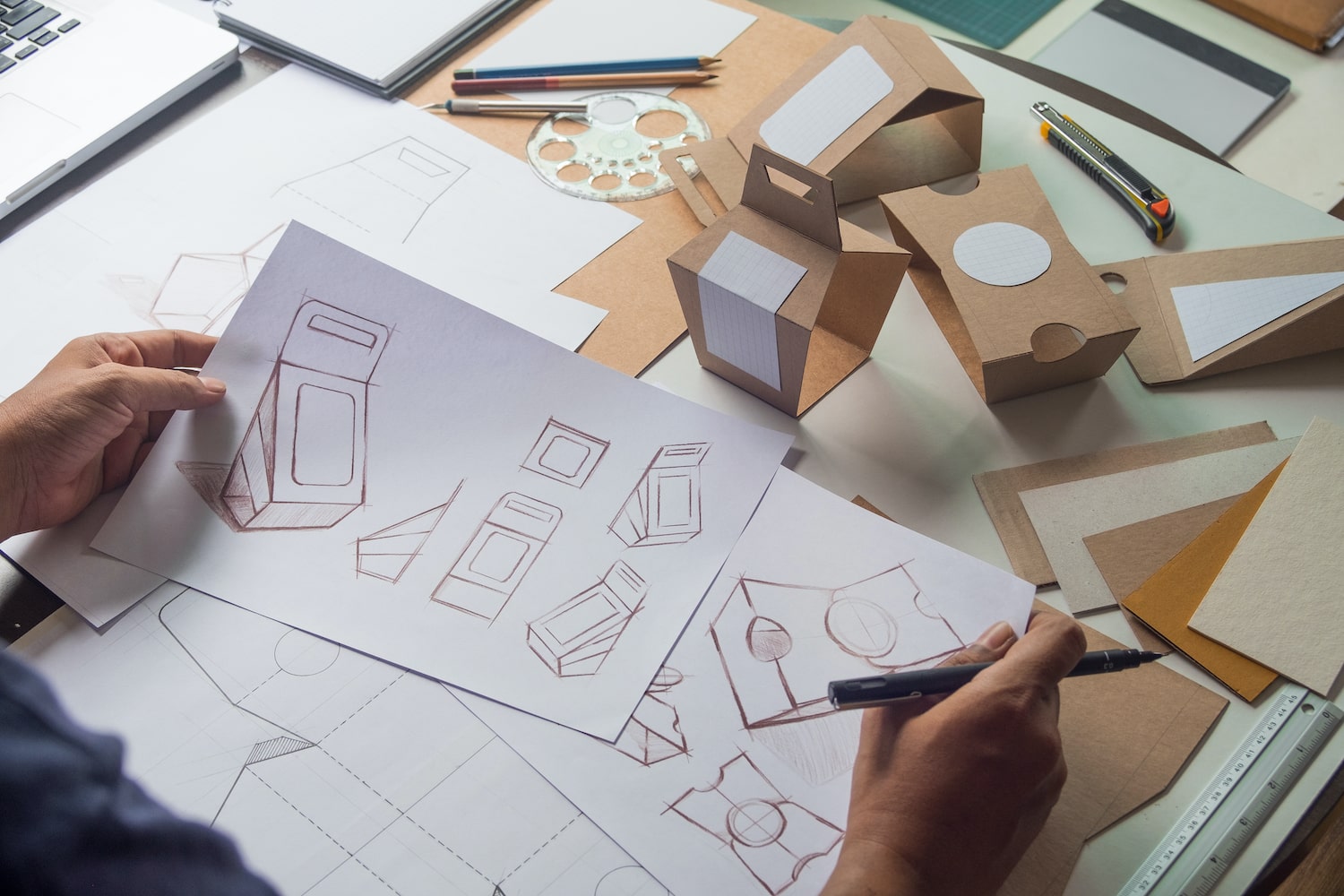
Product packaging design is the process of conceptualizing and giving form to the exterior part of a product. It has four main functions: product security, visual appeal, product and brand information, and differentiation.
Now, let’s cover the four primary aspects of quality product packaging design.
1. Product Security
Product packaging should first keep the product clean, intact, and dry during shipment, storage, and display. Its material and construction should be durable and tamper-free as much as possible.
The best packaging design aims to lower or eliminate damage costs—as well as risks to user safety—that come with transportation, drops, or even theft. Creative box designs also aim to find a perfect balance between child-resistant containers and accessible packaging for aging customers.
2. Visual Appeal
Once you have a solid structure, the second top priority of every package design is to raise a product’s presentation quality. Its appearance should look irresistible to your target market. This includes the color, size, typography, illustrations, or imagery on the label or the packaging material itself.
Choose design or style elements that reflect your business values and at the same time connect with your customers’ values. They should evoke the emotion that you want your target audience to experience, such as nostalgia, comfort, or rejuvenation.
Creative packaging designs also strengthen your brand identity. The placement and shape of your logo, the use of company colors, and the size of fonts should help make the brand memorable to customers.
3. Product and Brand Information
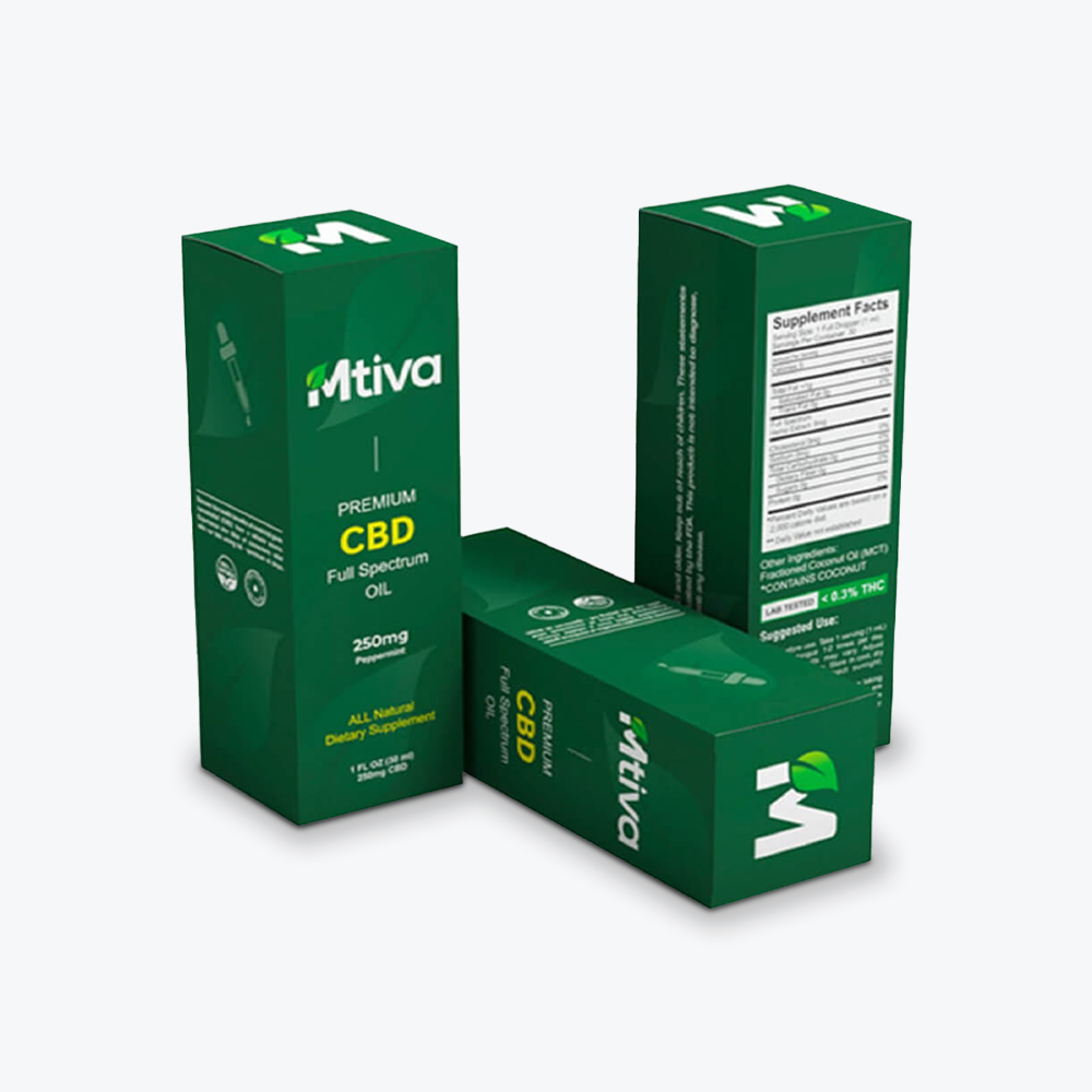
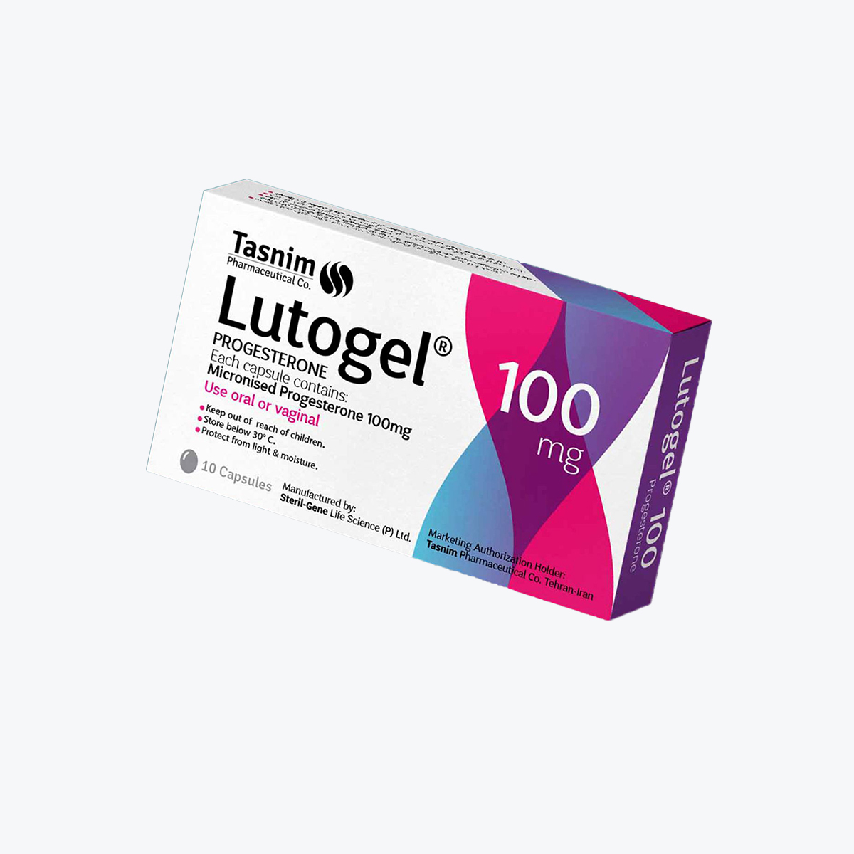
Your product’s package design should educate shoppers about how they’re going to benefit from your product. It should include product contents, directions for use, expiration dates, and safety warnings.
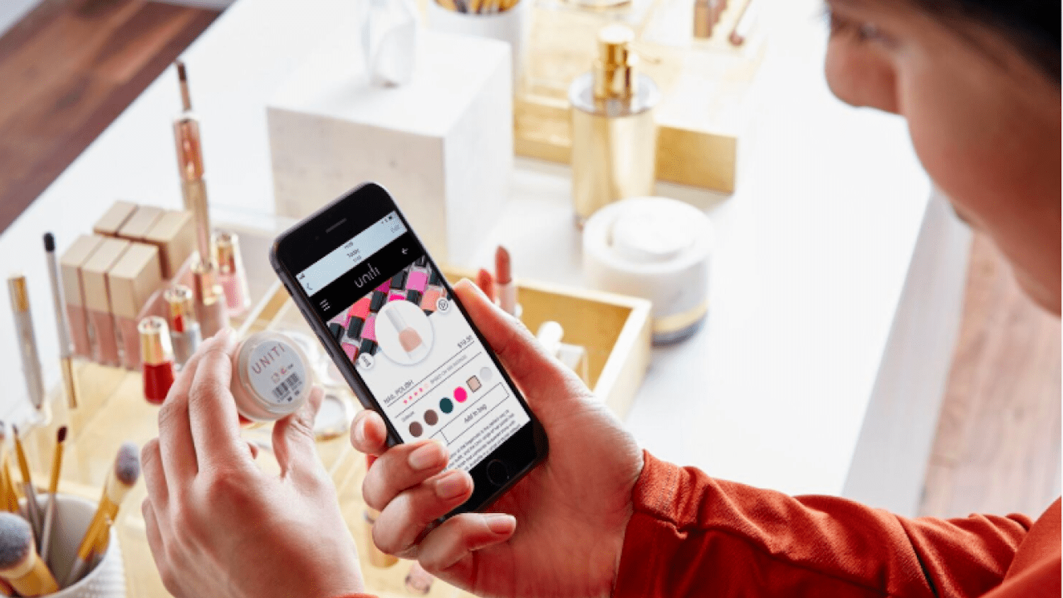
You can also use your package designs to tell more about your product and how customers can engage with your company through social media or your official website.
4. Differentiation
To attract customers, your brand packaging design should stand out when your product is placed on a shelf or appears on an app or website page beside other brands.
|
Functions of Packaging Design |
Tangible Benefits |
Non-Tangible Benefits |
|
Product security |
|
|
|
Visual appeal |
|
|
|
Product and brand information |
|
|
|
Differentiation |
|
|
How Can Product Packaging Design Increase Market Value?
Unique product packaging design can help your products sell better by fulfilling the needs of your customers. These include:
1. Practicality and Safety
Shoppers will find a reason to buy your product and become loyal to it if it’s easy to use and convenient to handle or carry around. Conducting research on creative packaging ideas can help you identify which materials and shapes to use for your boxes or containers so that they’re more suitable to your target shoppers.
Customers also feel that a brand cares about end-user safety when they see that the company uses sanitized, high-quality containers or boxes with a polished exterior and sturdy construction. Customers appreciate labels that don’t stain or get easily detached or washed off.
With the growing awareness for sustainable shopping, today’s customers also tend to pick brands that use reusable or recyclable packaging as well as containers that can help extend a product’s usability or allow customers to get the most content out of them.
2. Fun and Memorability
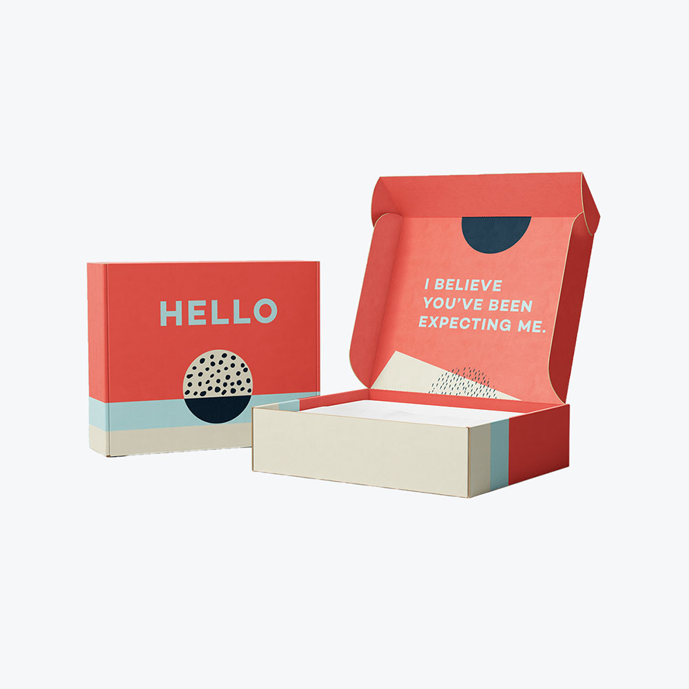
You can use creative packaging design to build a deeper connection with your clients by making the unboxing experience something they’d want to look forward to. Today’s social media influencers usually include this experience when introducing new products to their followers.
3. Honesty and Trust
Being explicit about your product—its ingredients or contents and exactly what it can do—builds a foundation of trust.
Customers appreciate brands that don’t exaggerate their product’s quantity or volume and capabilities, which explains the current trend toward clear product packaging or packaging with windows for a sneak peek into the product inside. This type of packaging, in a way, lets the product speak for itself.
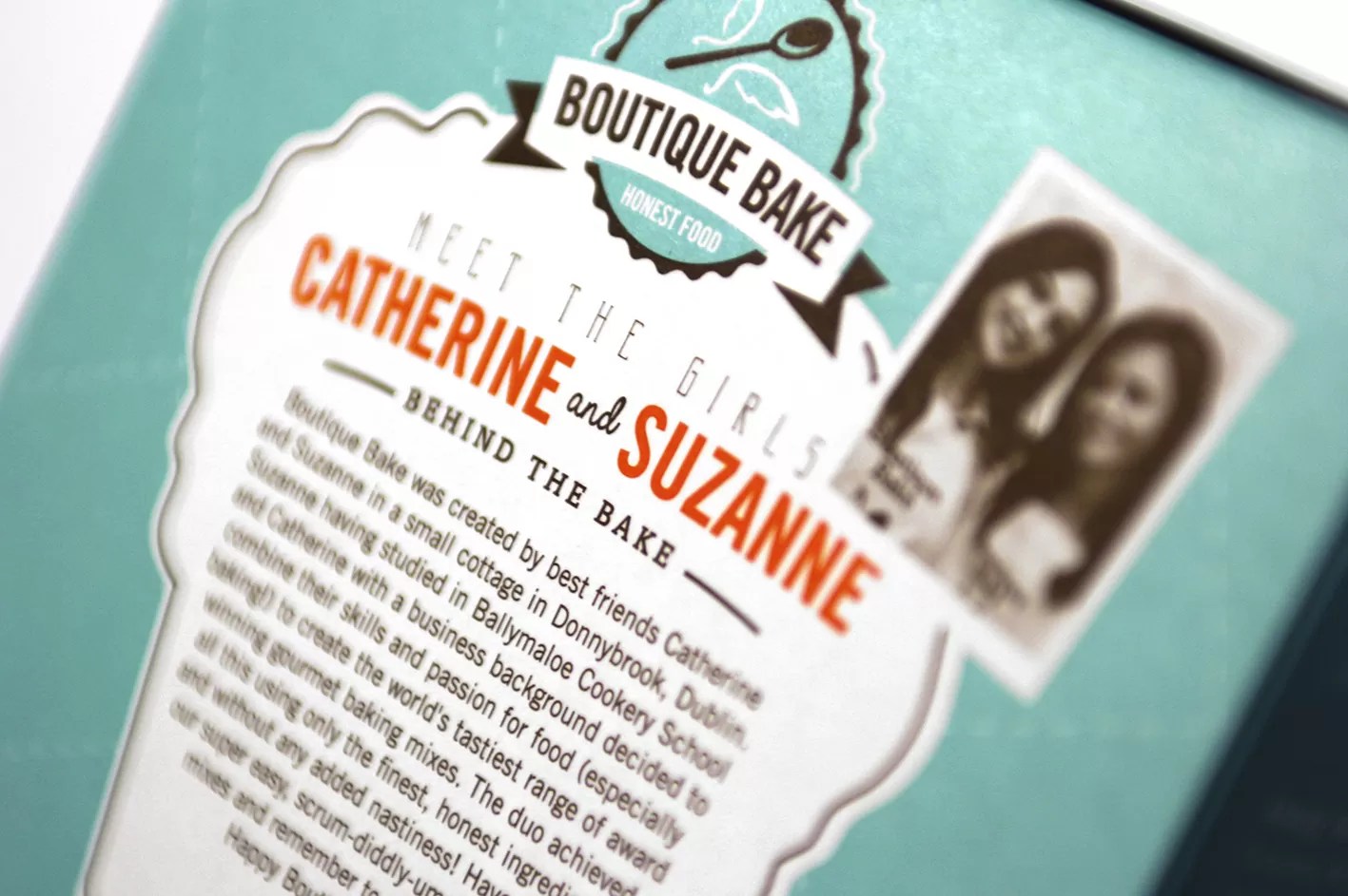
Explaining the production process and including the place of origin also gives plus points for transparency.
4. Distinctness
Well-designed product packaging will help your product appear distinct when placed on a shelf with other products. Research and testing are necessary to achieve a unique package design.
Recognizable packaging can be simple but can eventually have a strong loyalty base as it pops in an environment of similarly colored or patterned products.
16 Creative Packaging Design Trends
With in-store shopping still widely restricted, today’s package designers and brand owners are working hard to give customers an immersive brand experience they can enjoy anywhere. Creative packaging design is still powerful, influencing 81% of consumers to try something new and 52% to switch brands. Why? Observers say that designs are shifting from a commercial look to a more creative, artistic approach.
For more packaging ideas, here are 16 of the most popular current trends in brand packaging design:
1. Protective Solutions
With customers conscious about protection amid viral contamination risks, marketers and shippers are expected to prioritize protective packaging. Examples of these are hygienic sleeves for canned drinks and antibacterial surface coatings, such as Touchguard for carton boxes. Because paper-based products are made of porous materials, they’re considered less hospitable to viruses compared to plastic and glass.
Meanwhile, as a growing number of brick-and-mortar stores shift their operations online, they’re expected to partner with a creative packaging designer to safely ship their unusually shaped products to customers, as in the case of plumbing supplies.
2. Sustainability
A growing number of companies are looking at product packaging materials that are not just recyclable but also require less energy to produce. Additionally, some brands are responding to calls for non-plastic alternatives that can be repurposed.
Carton designs are a popular option and can become an essential backbone branding element, with 73% of consumers considering the material as sustainable packaging. Eco-friendly packaging also affects consumer perception, with over 40% stating that such package types evoke “premium-ness.”
3. Miniature Formats and Tiny Patterns
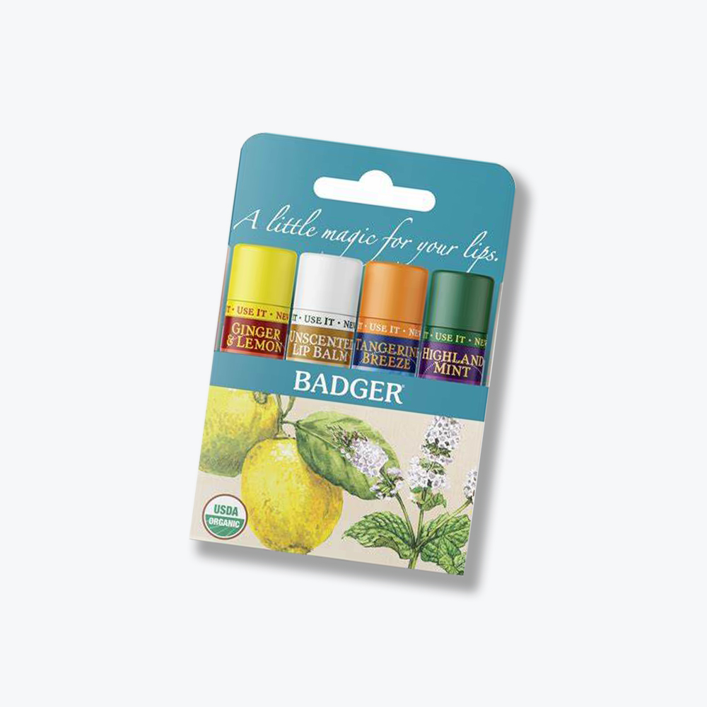
From food to cosmetics to coffee packaging, brands are trying to lure shoppers through miniature portions or versions of their products. Small and compact that can fit in your pocket or bag is a great example of packaging that’s perfect for travel. Affordability is another high selling point of these portable products.
Also, small and intricate illustrations and patterns symbolizing the packaging’s contents will replace the former trend of having overwhelming images on the package.
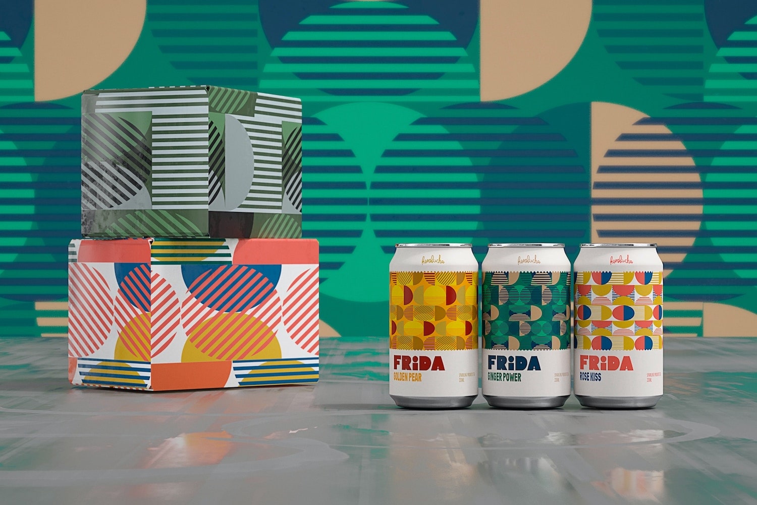
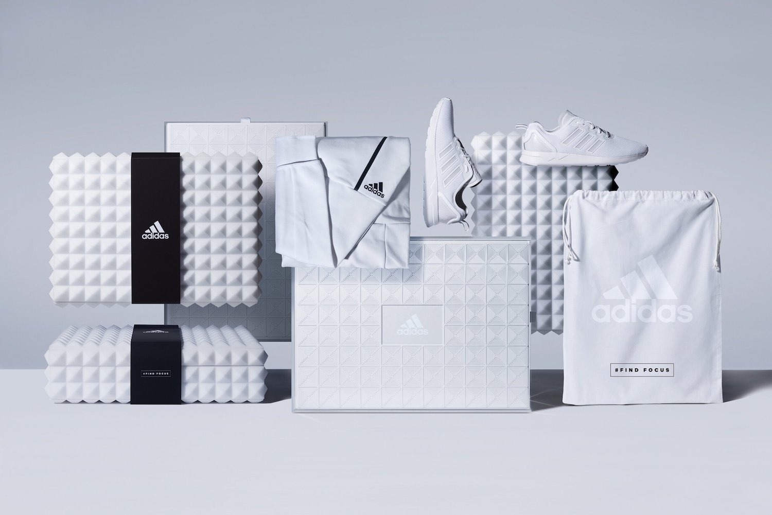
4. Simple Geometry
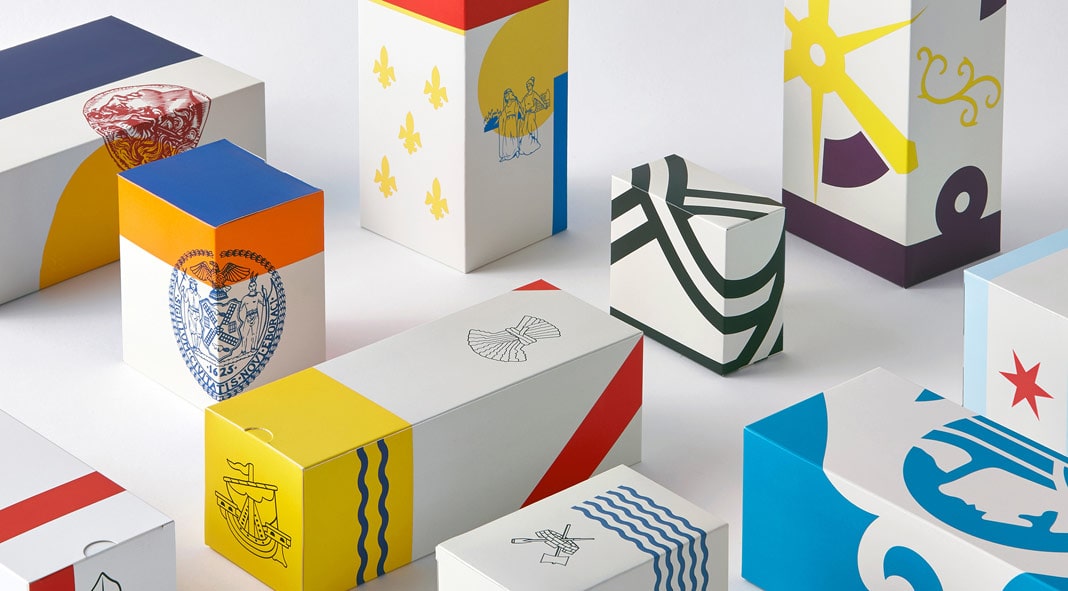
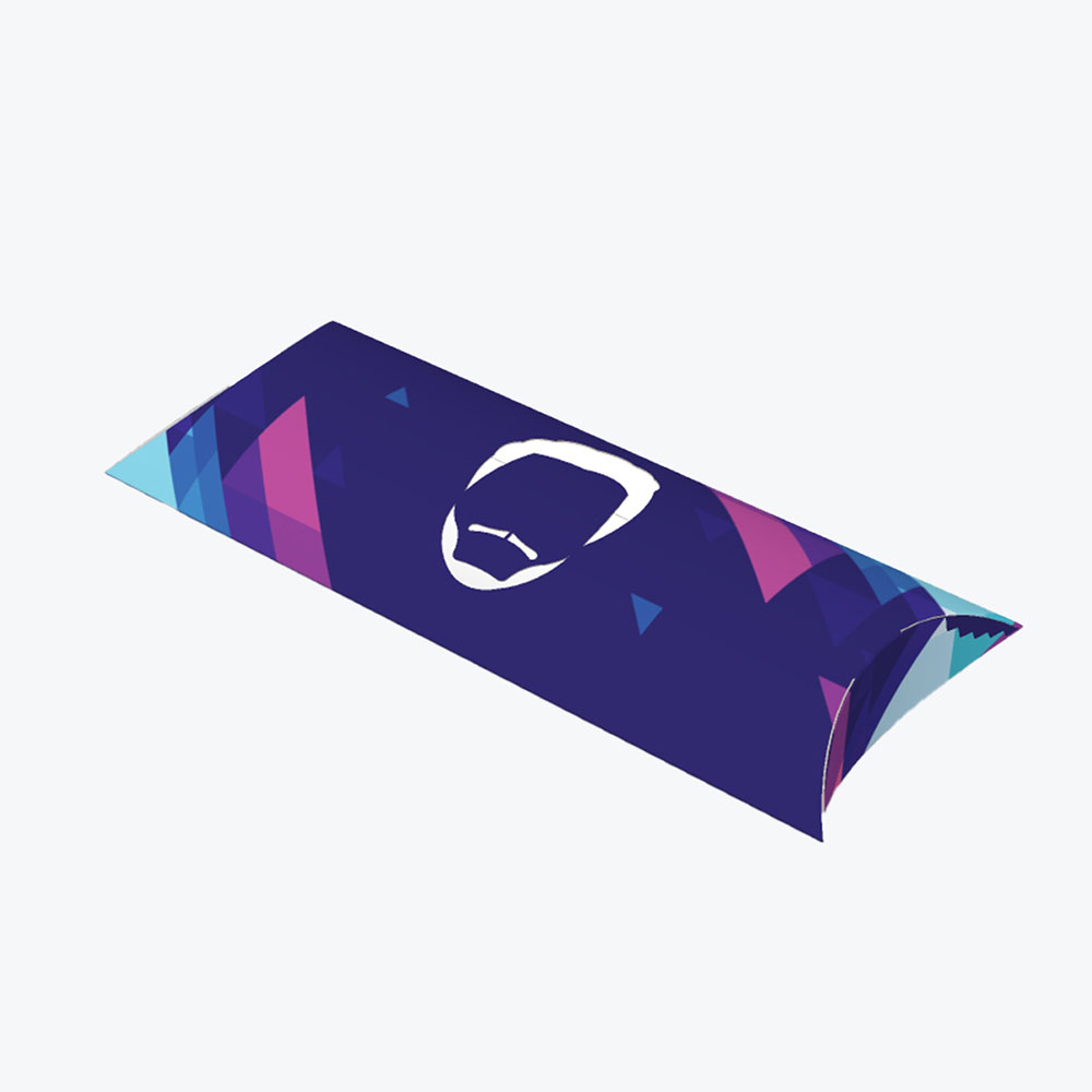
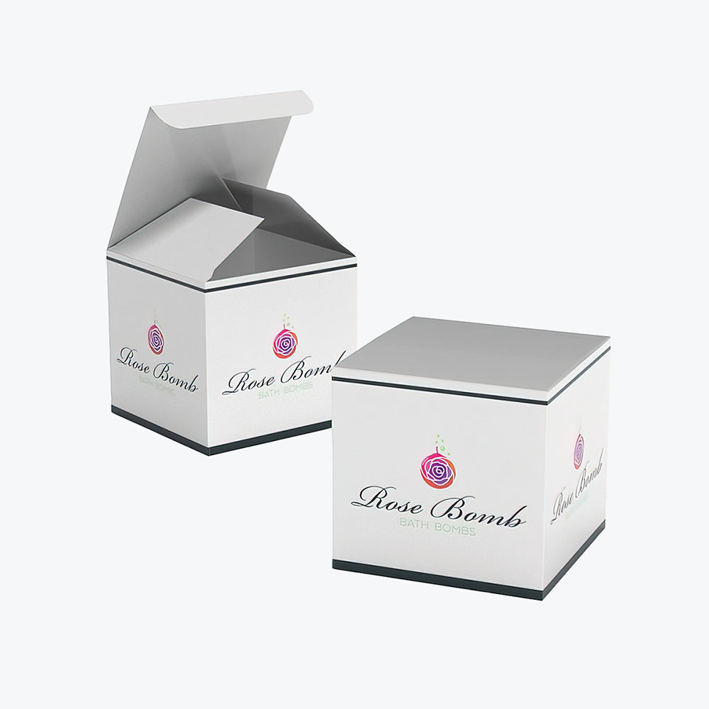
Customers can expect businesses to incorporate abstract designs – simple but bold colors, fluid shapes, sharp angles, and clean lines—into their packaging design elements to create an impact.
5. Solid Colors
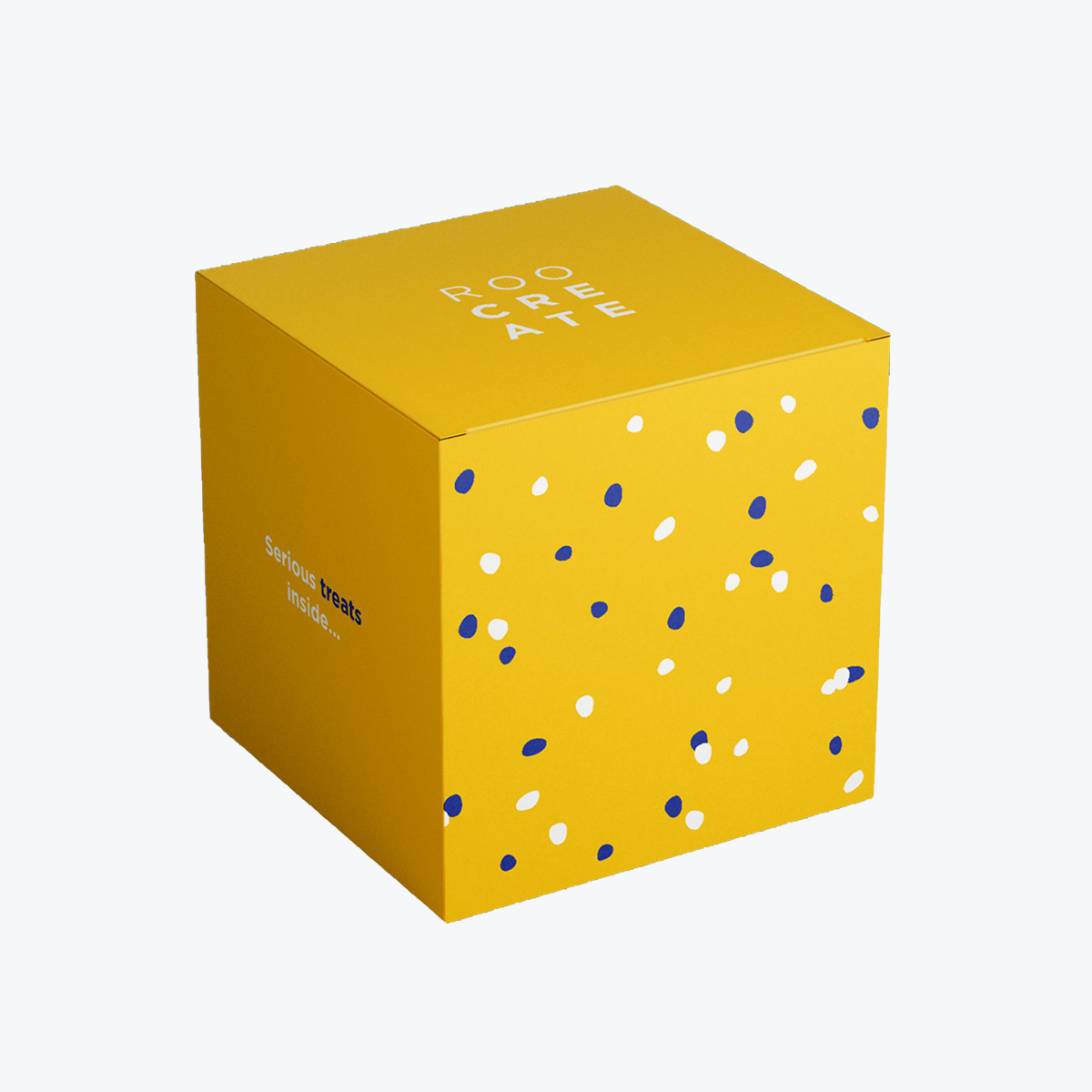
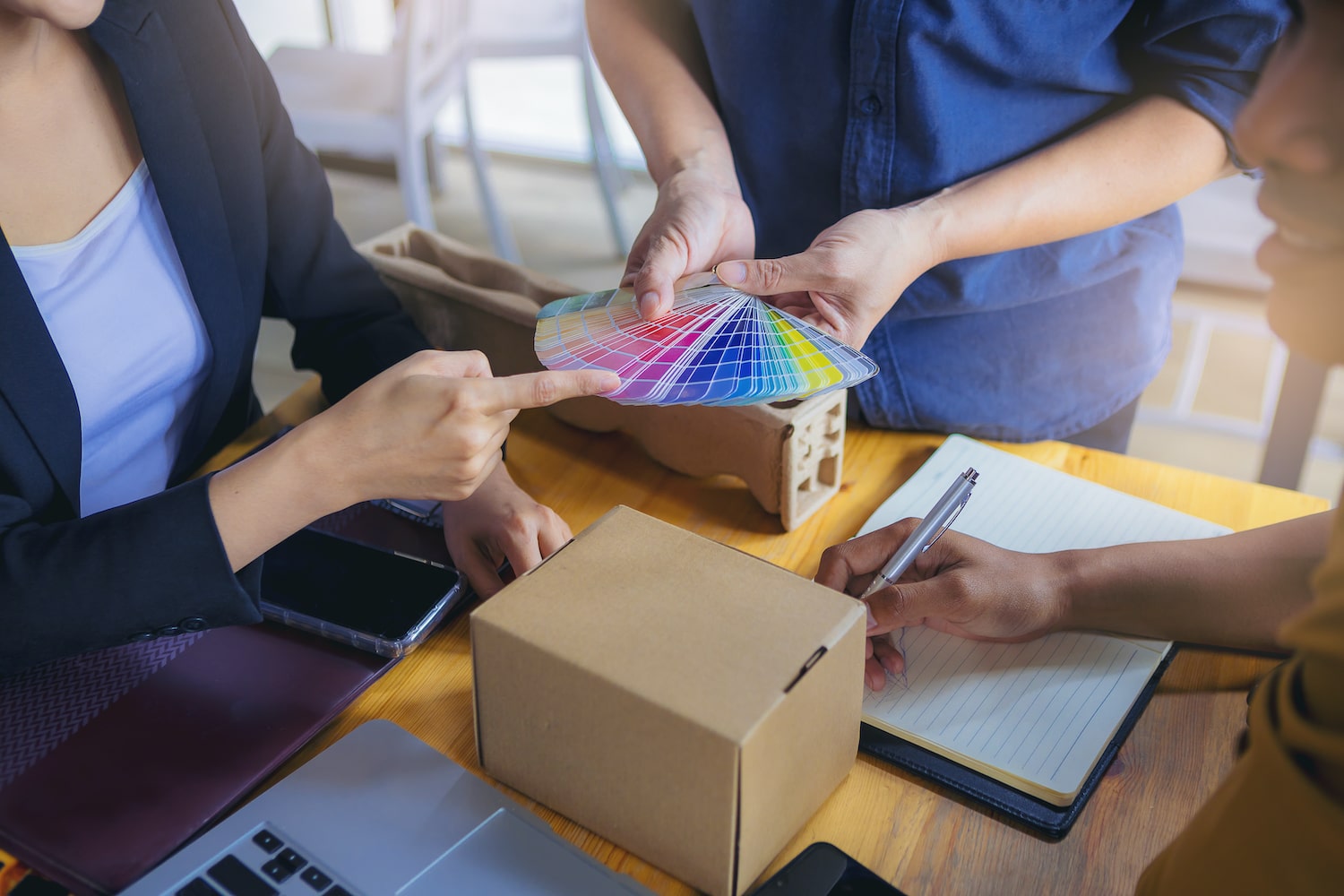
Brands are also using the power of color psychology, incorporating one bright and bold color with big typography (although slim fonts may also work) into their packaging design projects. In some cases, the use of an unconventional shade can quickly direct the shopper’s eyes to the copy.
The right combination of color and font style powerfully invokes a certain mood or feeling. How text styles and colors correlate also builds up excitement for seeing the product contents. Up to 90% of consumers’ perceptions regarding a brand are based on colors.
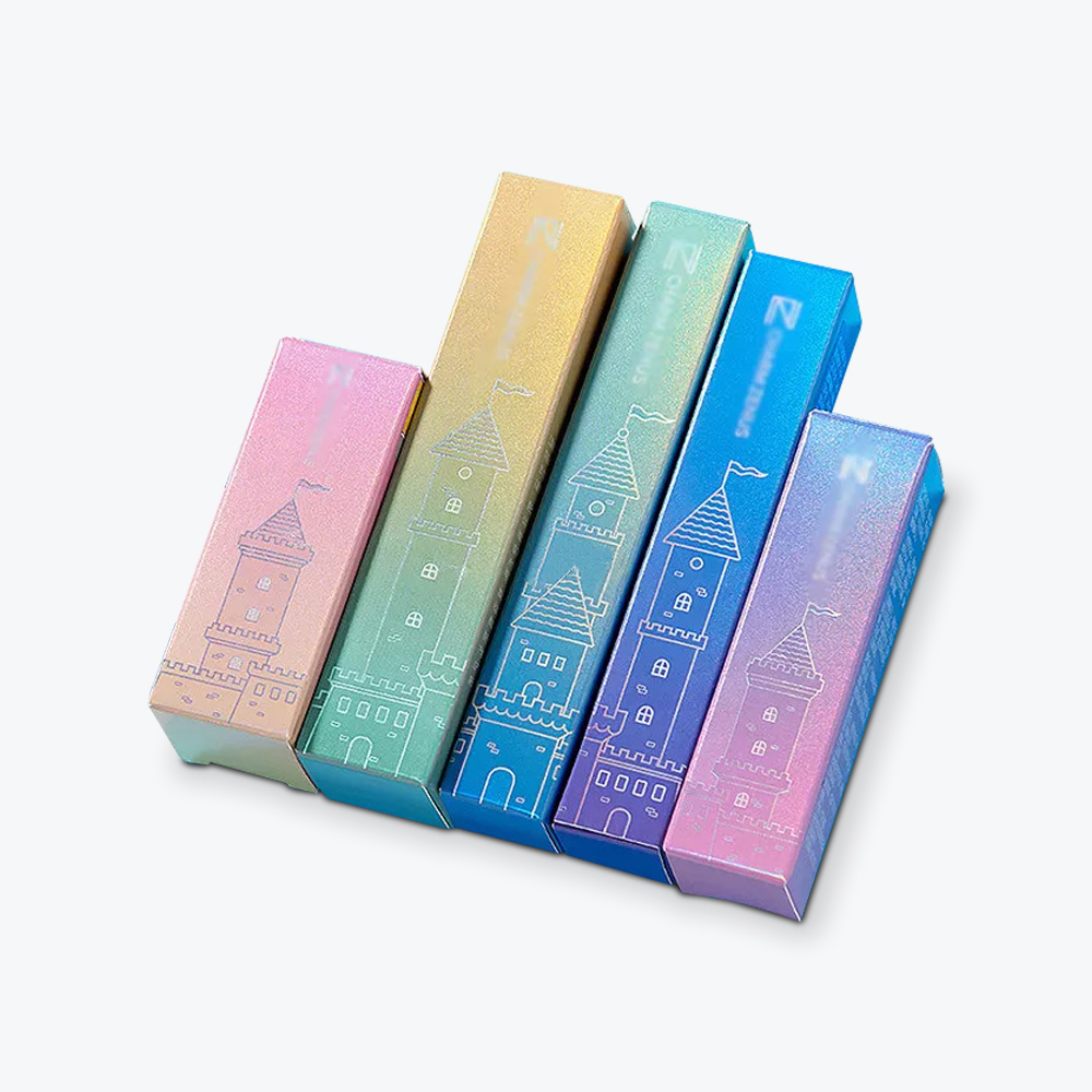
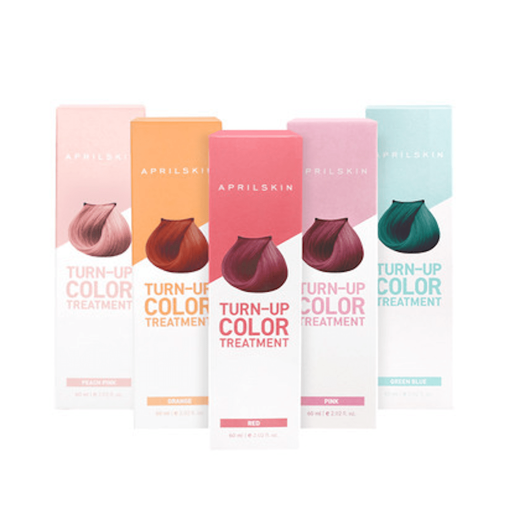
6. Color Blocking and Gradients
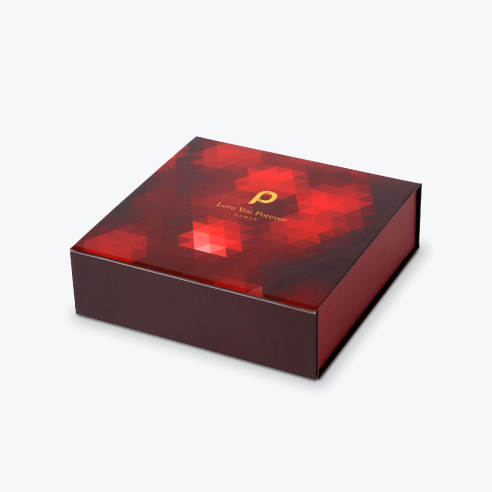
Color blocking is putting together two or three different colors—opposing or not under one tone. Instead of straight-edged boxes of color, you’ll find random-looking blobs, uneven shapes, and flowing lines.
This technique is found in the product packaging and logo design of many organic brands, which uses contrasting, nature-inspired colors.
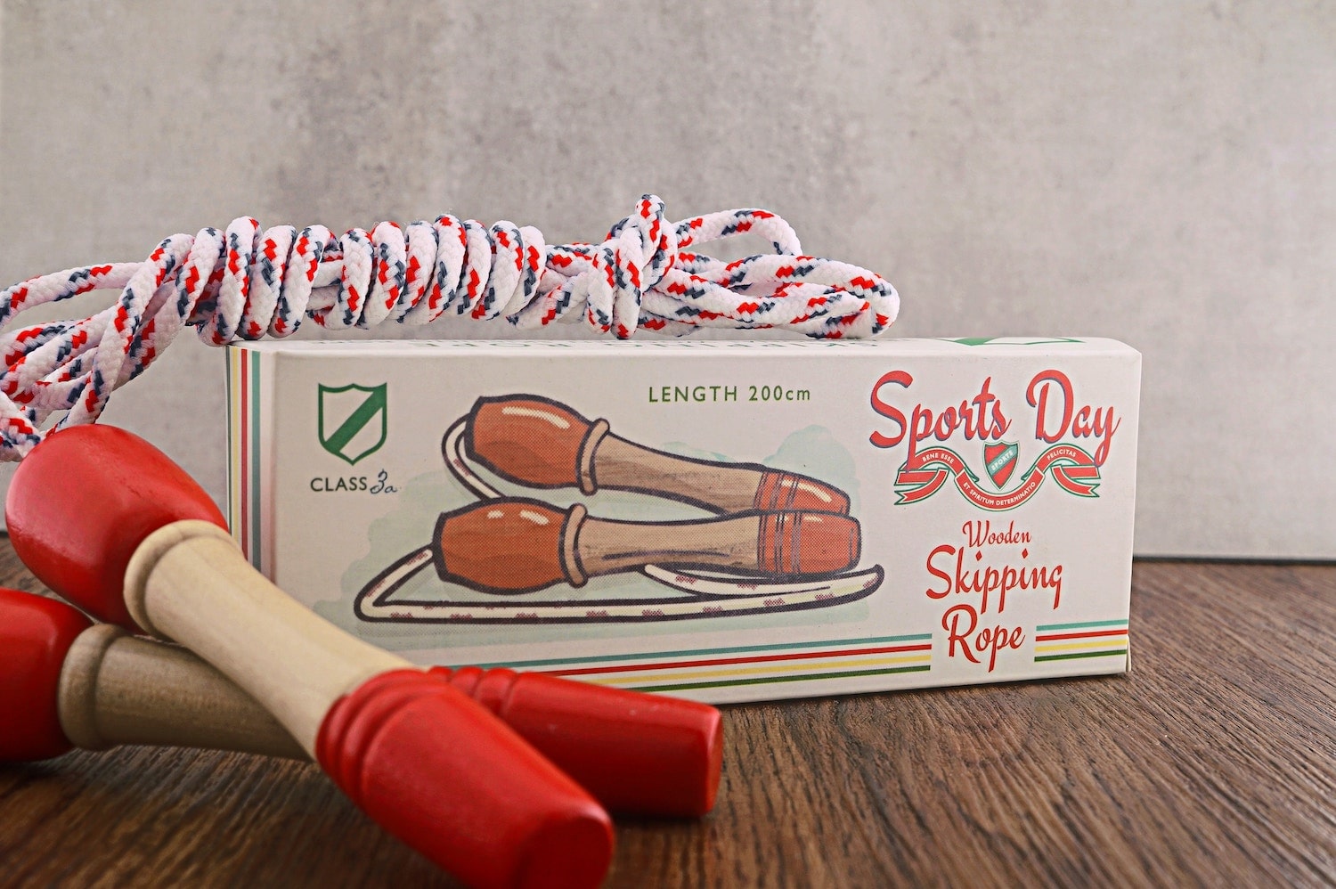
7. Vintage
With this trend, not only do parts of a packaging—logos, fonts, and colors—look old-school (19th to 20th century), but the entire material, label, and sometimes even the shape looks vintage
You can use this creative packaging approach to conjure nostalgia or to create a sense of longevity and proven quality. Products can also acquire an air of luxury through the use of traditional lettering, motifs, and a retro color palette.
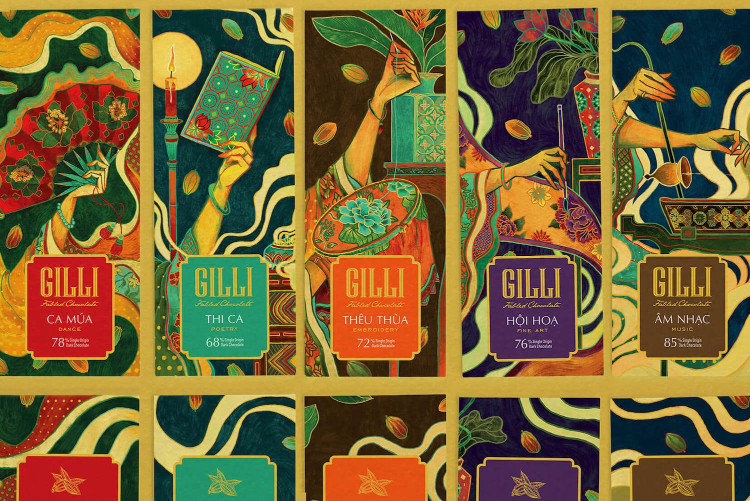
8. Fine Art
Creative packaging design experts also draw inspiration from the realistic portraiture or abstract paintings of the Old Masters as well as fluid art techniques. Popular designs try to capture the effect of freshly poured resin and textures on newly painted canvas or long-dried oil paintings.
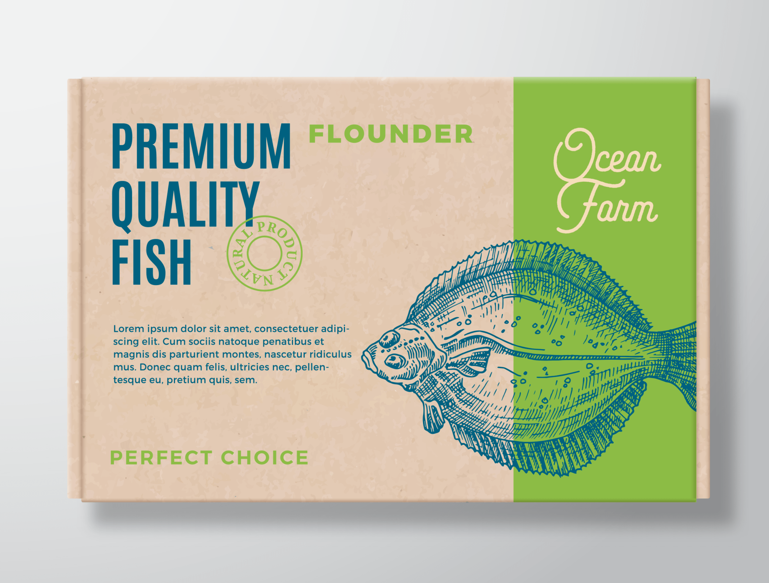
9. Anatomical and Technical Drawings
This refers to detailed pencil or ink-drawn illustrations that are reminiscent of books with yellowed paper found in museums or the library’s archive section.
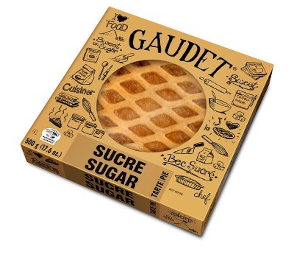
10. Transparency and Windows
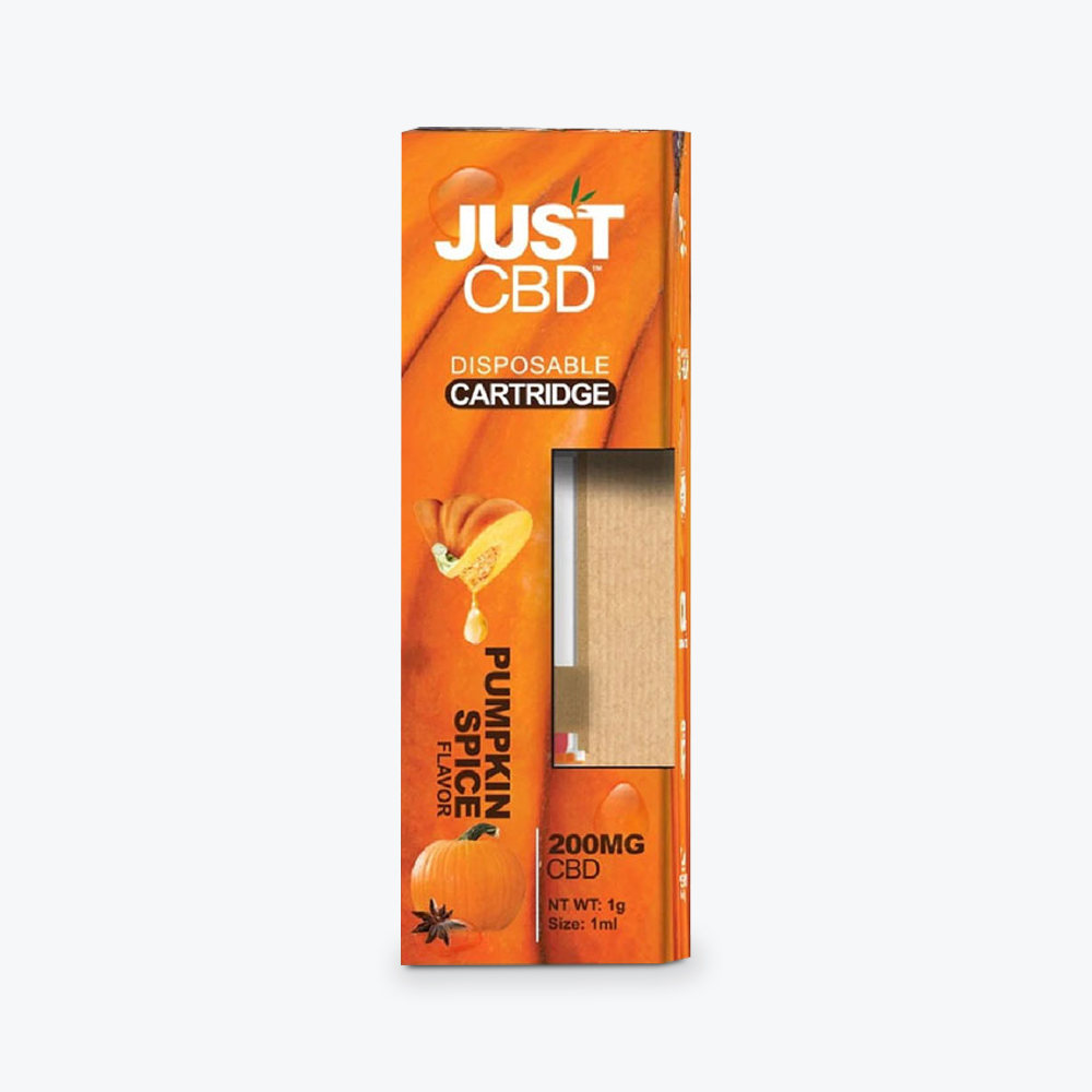
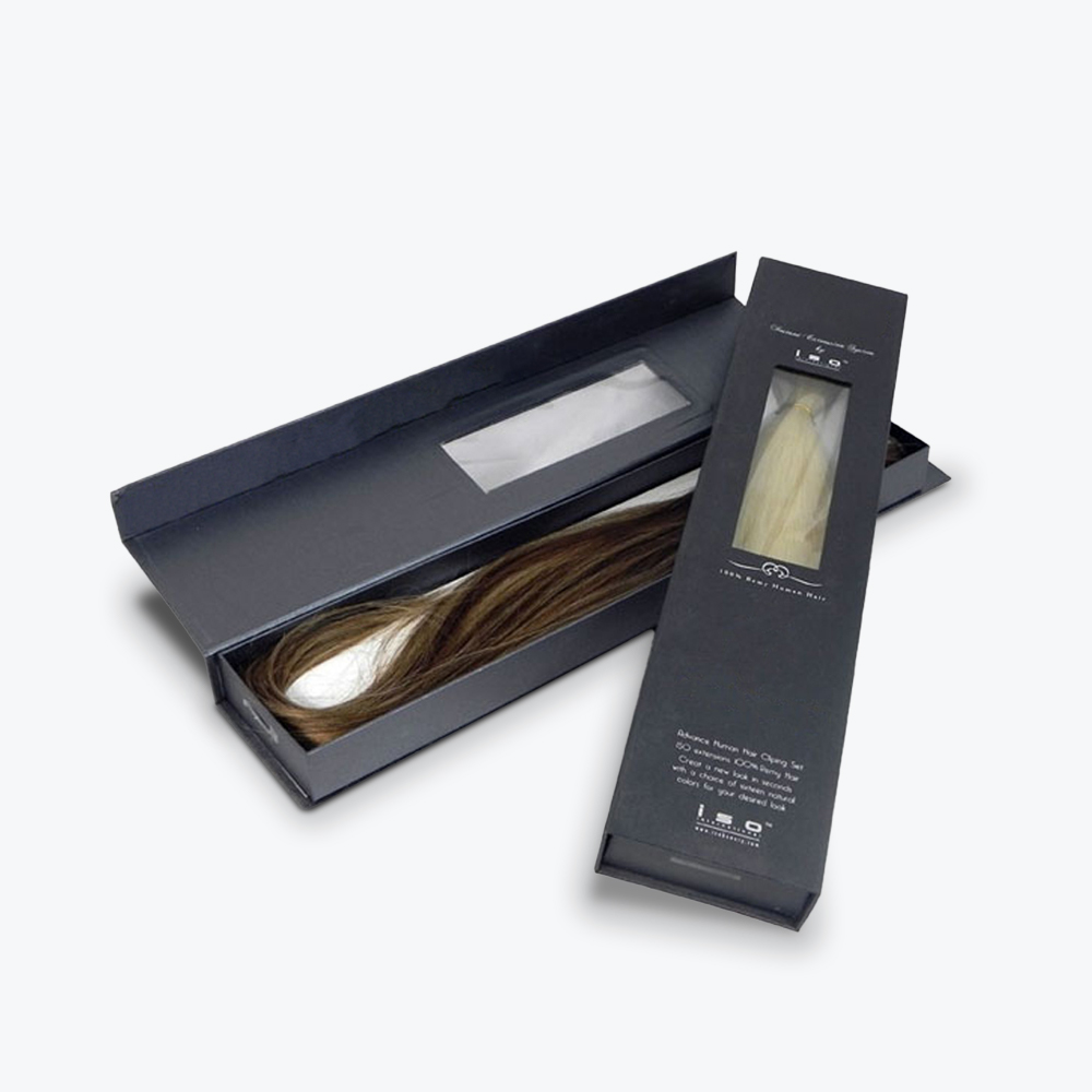
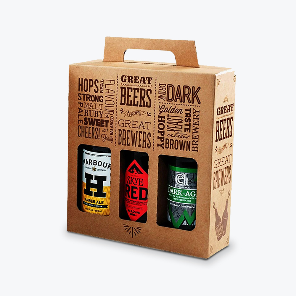
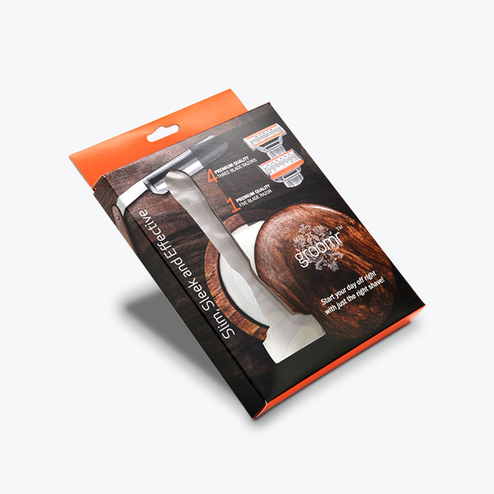
To achieve the opposite effect of solid color packaging, you can use see-through materials, so buyers will know exactly what they’re getting. You can also opt for a package design or style that incorporates windows to give customers a glimpse of your product. Revealing packaging can dispel doubts that shoppers may have about the content’s freshness and safety.
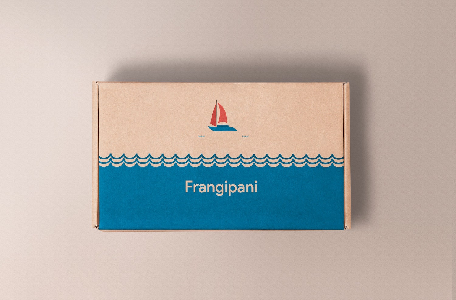
11. Flat Illustrations
Flat illustrations use two-dimensional drawings with simple, minimalist shapes and bright colors. The absence of shadows makes the elements appear clean and sharp.
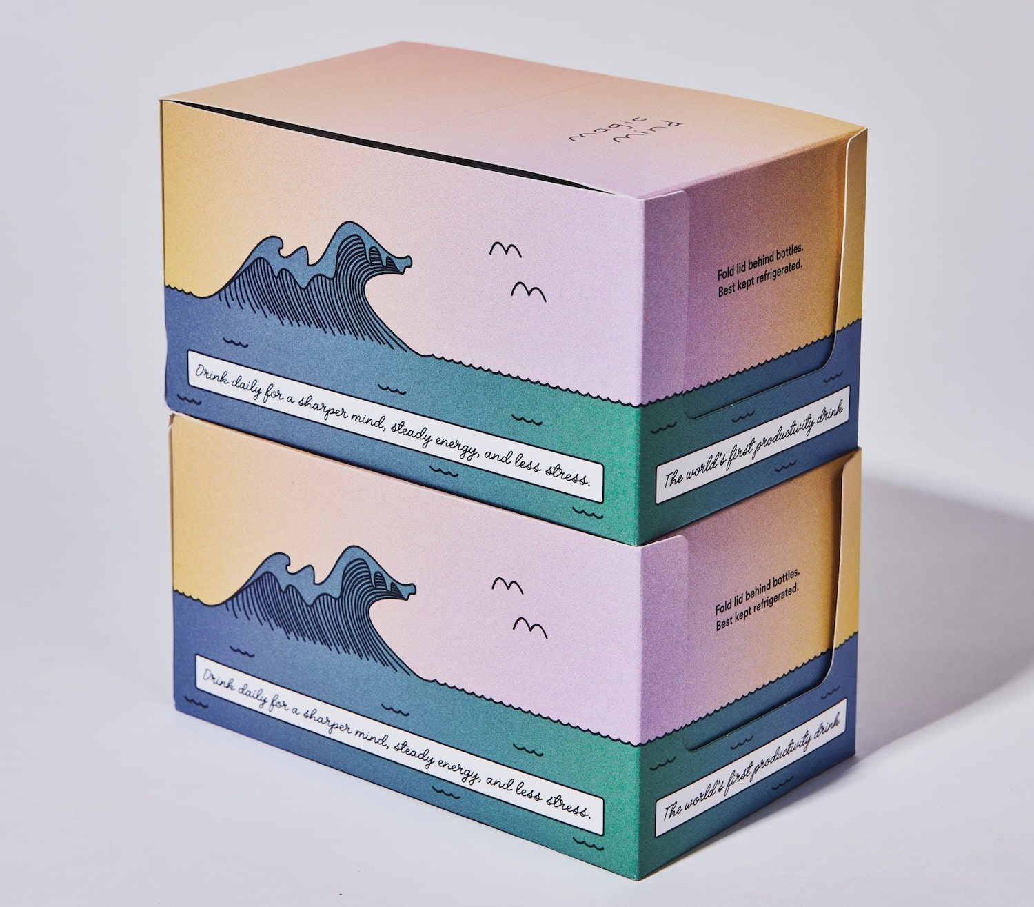
12. Soft, Natural Colors
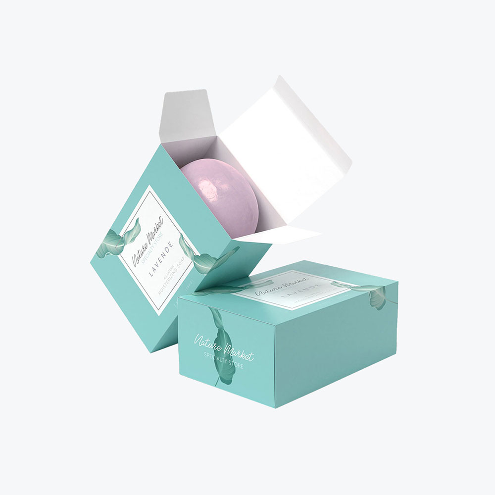
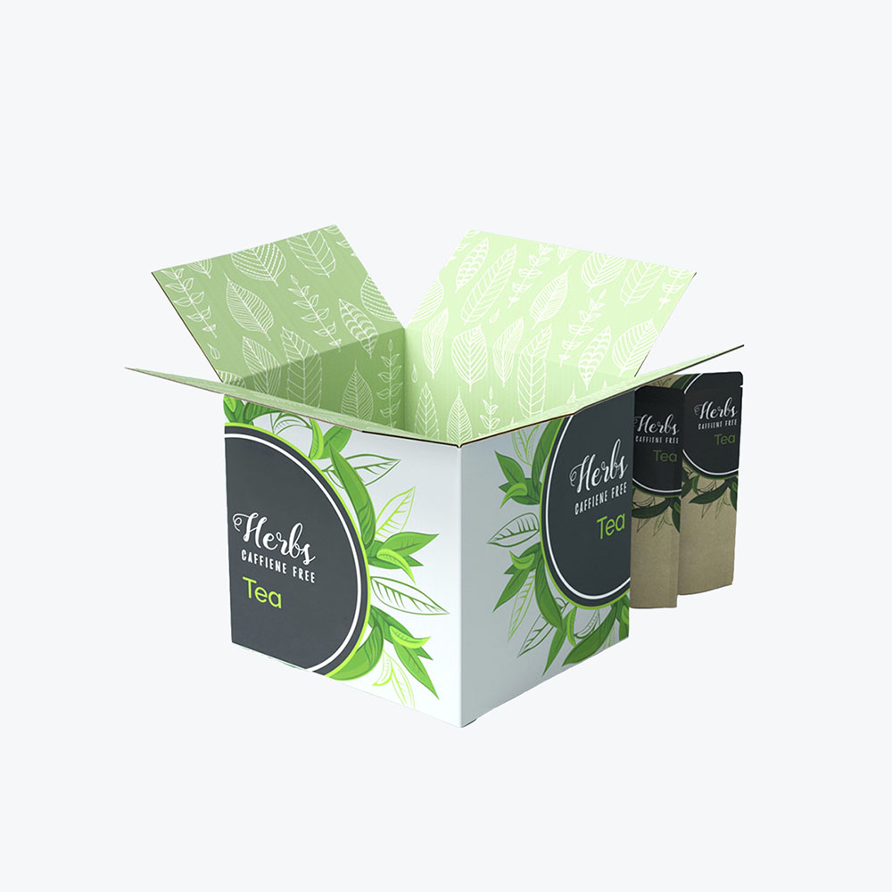
Soft pastel hues can be visually refreshing. Colors and textures resembling stone, foliage, and nature are great packaging design inspirations with a calming effect. Throw in some contrasting elements to add inspiration to your gentle color palette.
13. Storytelling
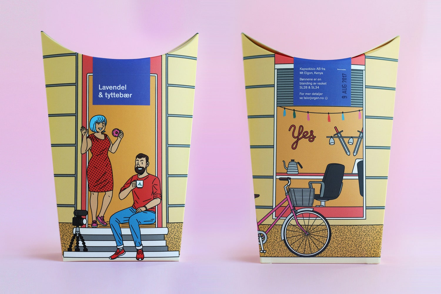
Brand mascots can tell the story of a business, many times doing the job faster and in a more engaging way. Many companies have presented their characters in cartoon form, turning their unique packaging ideas into what look like panels of a comic book. A business can also share its history or values through a series of illustrations on its package design to bond better with its customers as part of a unified brand strategy.
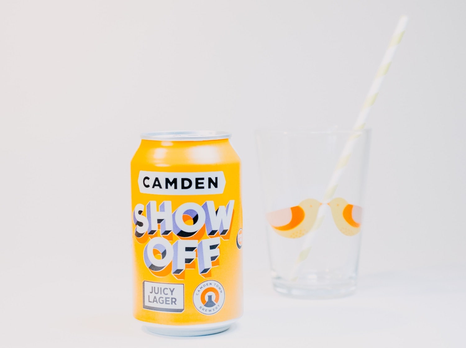
14. Experimental Fonts
Bold fonts are taking the place of images to grab attention. Many packaging designers will experiment with 3D fonts and typefaces with gradients.
But at the same time, buyers are also more likely to warm up to products with fonts that are easy to read, even from a distance. Clear typography helps customers decide more quickly, allowing them to shop faster during in-store trips.
15. Textures
The power of sensation has been used in marketing as far back as the 1930s, when psychologist and design consultant Louis Cheskin coined the term “sensation transference.” He said that perceptions are directly related to aesthetic design.
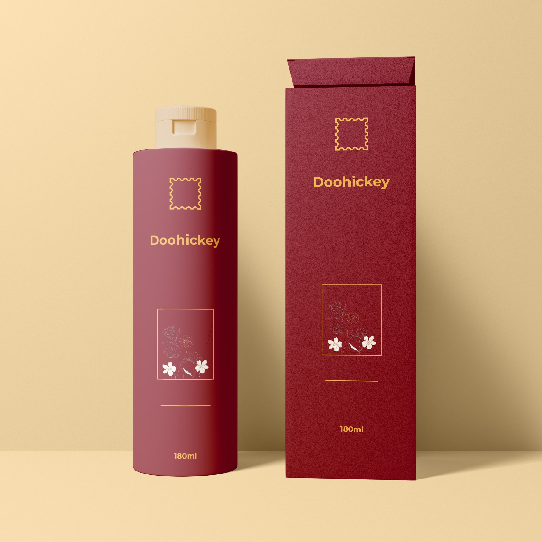
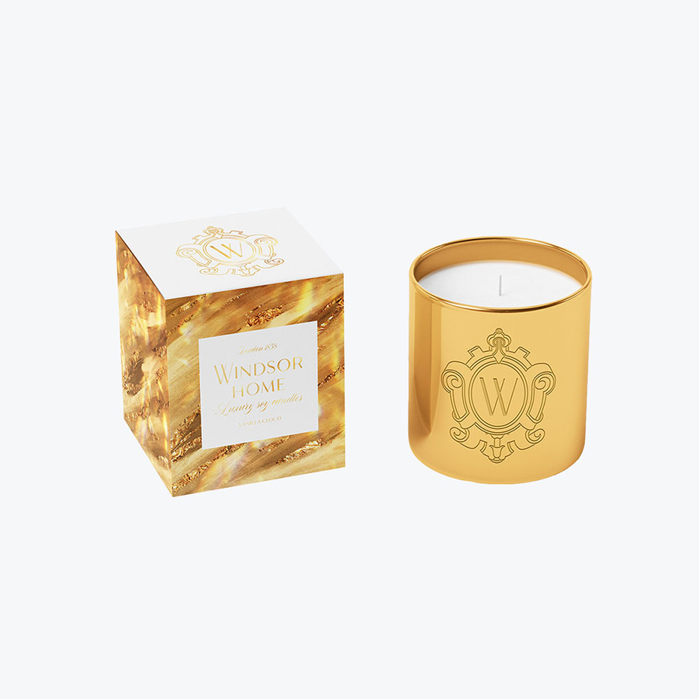
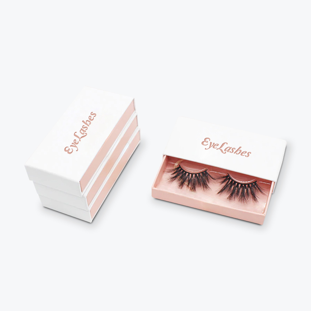
Brands targeting a higher-end market aren’t only aiming for visual identity but also a tactile experience to reinforce luxury values. An embossed treatment, gold and silver foil, smooth and glossy finishes, or velvety surfaces are classic examples.
Offering a positive tactile experience is also applicable for non-premium items, particularly packaging designs for products made for children or the elderly. Depending on one’s target age bracket, packaging designs should be convenient to handle besides looking fun or safe.
16. Tech Integration
Fun and unique packaging and labels can become customer engagement tools by featuring interactive content that shows off moving visuals, games, and more using augmented reality. But these cool packaging ideas aren’t just out to entertain the tech-savvy crowd—the elements should still support the product or brand’s story and purpose.
Companies can design these phone-scannable labels to animate your logo and label elements or give more information about a product, whether it’s behind-the-scenes production, directions for use, special product features, or how to enjoy promos. The inclusion of QR codes can also support the ongoing campaign for contactless transactions.
Also referred to as connected packaging, this modern packaging design is expected to grow 7.4% until 2027
Creative Packaging Ideas: 8 Pitfalls to Avoid
Brand packaging plays an important role in persuading your target market to choose your product over others. When developing your brand packaging, it’s important to note these eight common pitfalls:
1. Complicated or Hard to Open and Close
User experience is supreme when it comes to product design. So you need to consider a durable but simple packaging design to avoid frustrating customers, who might take their wrap rage to social media. Over 90% of online shoppers said their top pain point was opening a product or packaging.
Include unboxing in your package testing process and take customer feedback to heart. Make your product package tool-free as much as possible and reduce the number of steps to access the product inside. If your buyers are older adults, ease of use should be a primary consideration. Create a package design that’s easy to close and open.
2. Not Eco-Friendly
In a recent poll, 73% of respondents noticed that the packaging of products they received was twice the size of what’s inside. Meanwhile, more than 90% received packaging with a lot of wasted space. This practice can erode shoppers’ trust and degrade their unboxing experience, not to mention dent your transport expenses.
More than 50% of consumers check for sustainable packaging when making purchases. To support waste reduction, measure your product and choose the right box size. Most importantly, use compostable and reusable packaging and inner protection, such as recycled paper.
3. Errors in the Copy
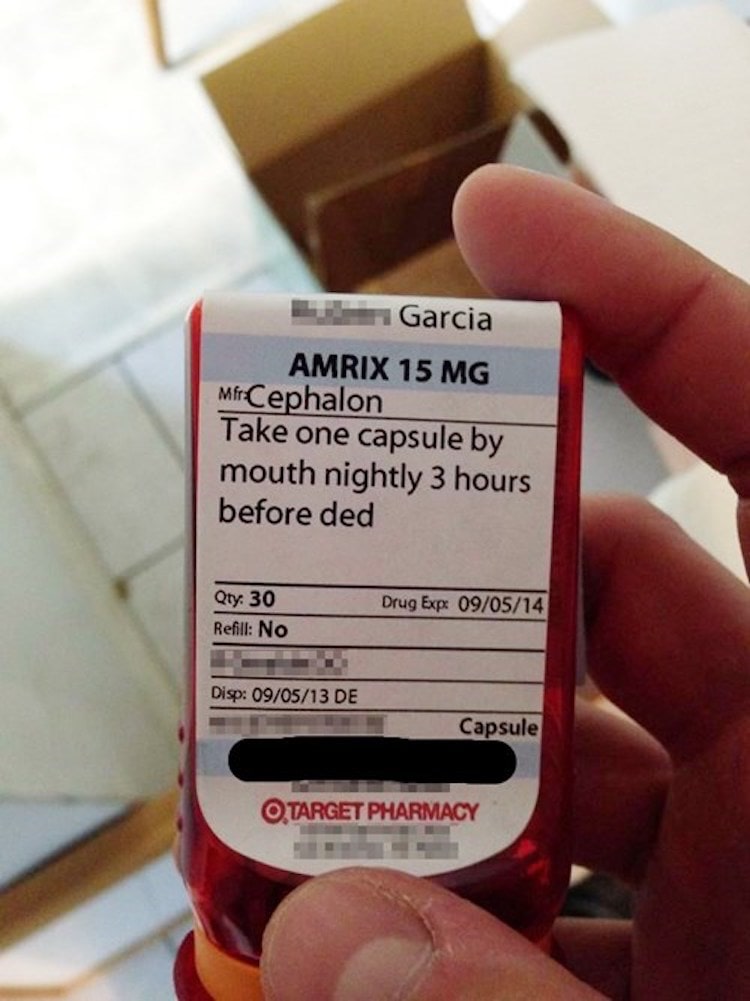
Spelling and grammar mistakes can ruin a solid design layout. Don’t rush the copywriting process—work with a professional with proofreading experience.
Then get two or three others to review your packaging. It’s better to spot the errors before bringing your packaging concept to the printers for mass production.
4. Misrepresentation of Products
Companies can mislead customers in other ways besides using oversized packaging. These include exaggerating contents or benefits, excluding health risks, unclear pricing, faking qualifications, and not putting pertinent business information. The latest report of food packaging provider Shorr shows that 34% of consumers avoid products with popular terms on their labels due to fear of being misled.
Check advertising guidelines issued by the US FDA and other standard bodies to avoid facing lawsuits, bad press, and criticism.
5. Forgettable Design
The last thing you want to happen to your product is to see it “blend into the shelf” or look very similar to your competitors. While others turn to copycat packaging in hopes of riding on the look of successful brands, companies with integrity will design unique packaging around their own brand identity. Some points to consider include:
-
How you want consumers to remember your brand
-
How you want to convey your unique selling point with visuals
-
What tagline you should use to represent the main benefit of your product
Conduct market research to check what your competitors are doing and what the current packaging trends are in your industry.
Your findings will help you determine what packaging size and material to use to make your product stand out. Purchase licenses for any outsourced visual assets, whether they’re images, fonts, or both.
6. Overwhelming Elements
Your choice of typeface, images, and colors should align with your consumer expectations. Too many colors and a wide variety of wacky fonts can make your packaging look cluttered. With fewer but more substantial elements to focus on, consumers can interact with your product better.
7. Artwork Mistakes
One common artwork mistake is using low-resolution image files. Images that look clear on a website or computer screen can look blurred or fuzzy when printed on paper. For printing purposes, images should have a resolution of at least 300 dpi. Images downloaded from the web are 72 dpi on average and won’t look crisp during printing. Images shot from digital cameras or mobile phones, which are usually saved in RGB mode, should be converted to CMYK format for commercial printing.
When outsourcing graphics, make sure to buy licensed images. This is a better option to take than getting images from ClipArt, which aren’t formatted for commercial use.
Another mistake to avoid is to lay out copy and artwork in Microsoft (Word or PowerPoint) or Corel Draw. These programs will do for desktop printers, but for commercial printing, artwork should be designed in Illustrator, Photoshop, QuarkXpress, or other professional applications.
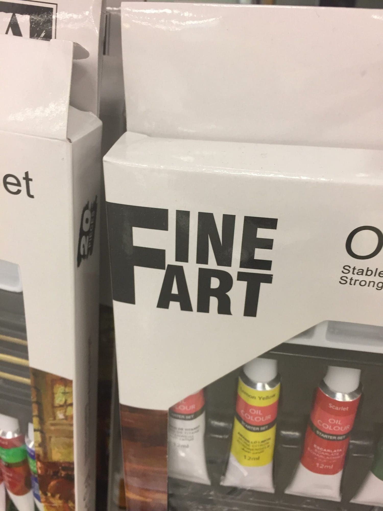
You also need to review your font choice and layout to ensure that shoppers won’t misinterpret what you’re really trying to sell. The hilarious packaging above could’ve been easily avoided with some design adjustments.
8. Lacks Product Protection
Performance testing is necessary once you’ve developed a prototype for your brand packaging. It should be durable enough to withstand the trip to your buyer’s delivery address. Otherwise, you run the risk of incurring costs due to returns, refunds, and replacements.
While over-packaging is not advisable, it’s equally unwise to minimize protection. Consider your product’s weight and how fragile it is. Besides picking the correct box size, select sturdy material. Include protective cushioning when necessary. To reduce ink smears, select the right packaging materials, labels, and printing ink formulation.
Creative Packaging Tips: Importance of Getting a Prototype Before Production
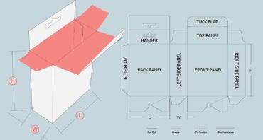
A prototype is a sample of what your final packaging will look like. Requesting a prototype from your packaging supplier can save you from getting into any of the pitfalls listed in the previous section. Here at Refine Packaging, we proudly provide 2D and 3D mockups at no additional charge for all customers.
At the same time, asking for a prototype or mock-up can help you achieve the following:
-
Proper Fit: Receiving a prototype allows you to test if your product actually fits in the box according to the dimensions you set. It also lets you check if it can support your product’s weight as you envisioned it.
-
Printing Verification: While 2D mock-ups are great for very minor design tweaks, 3D mock-ups can give you full visibility, especially for ordering new packaging in bulk. A custom digital sample can help you check how sharp your graphics, fonts, and images appear on your chosen packaging material. The look and feel of the artwork, colors, and finish are usually different on the actual box compared to what you see on a screen or a 2D mock-up. A 3D sample gives you full visibility, as you can view it from various angles.
-
Content Proofing: A prototype gives you a chance to read the product description, instructions, and other text in a fresh way. You can check for errors in text alignment, spelling, and grammar. If you’re able to order several samples, try to send some to a small, loyal client base to get feedback.
Ask Yourself: Is Your Packaging Up for a Redesign?
Does your product need to change its packaging? You may want to consider redesigning your product’s packaging if your business is encountering any of the following:
1. Company Rebranding
When you’re renaming your company or product, your packaging has to follow suit. A redesign should also be integrated into your marketing plan if you’re targeting a new target audience, introducing a new product line, or overhauling your current product or service offerings.
For instance, there’s a growing redesign trend that caters to those with disabilities. This comes amid data showing that only 1% of ads represented people with disabilities. Accessible packaging includes features like Braille on labels and special handles on the primary packaging, so users with disabilities can decipher and use them on their own.
2. Change in the Content or Structure of a Product
You can announce changes to your product’s ingredients or components by releasing the fresh batch with brand new packaging. Use your packaging to promote how the modifications will improve your product’s functionalities.
3. Advanced Technology
Modern labeling, printing, or folding can speed up packaging production besides updating your product’s image. Some materials are also worth trying if they offer better protection against the elements and prolong a product’s shelf life. Taking advantage of new technology is a wise move, especially if it can also save you money in the long run.
4. Retail Packaging Requirements
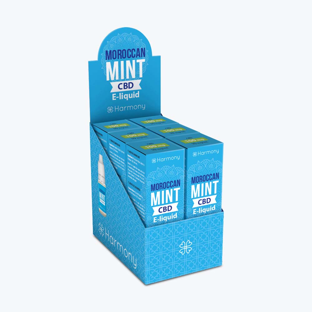
Three-quarters of manufacturers surveyed by PMMI said that they’re already pursuing shelf-ready strategies due to its popularity. Retail-ready packaging or RRP makes it easy for retail establishments to display your items in bulk once they receive your delivery.
When working with retailers, your design team needs to know details such as shelf dimensions, automated warehouse system design, pallet type, and so on. By customizing your packaging to the store’s layout, you help reduce the time needed for your products to be set up on the shelves.
Here are several reasons why many brands are going for RRP:
-
Secure and Cost-Effective Shipping: Individual items are well-fitted inside retail-ready boxes. RRP makers use pressure-resistant materials that can hold the products together throughout shipment and even the restocking process. Some packages are multi-layered, letting you ship larger quantities safely.
-
Easy Restocking: With RRP, it’s easy to replenish stocks. Employees just need to open and place a new box on the shelf, as all the items inside are stacked and ready for display. Knowing your retailer’s shelf specifications will help ease this process.
-
Easy Opening: Most shelf-ready packages come with perforated sections that allow packaging to be opened without using scissors or a cutter. Also, some products come with PDQ or “pretty darn quick” display trays or stands. Often found near checkout counters, these special boxes carry sets of eight small items or more.
-
Easy Identification: With their large and clear product names outside the boxes, RRP helps retail employees and customers easily identify your brand from a distance.
-
Convenient Shopping: Shoppers normally find it easy to pull out items arranged in shelf-ready boxes. The professional presentation can also entice the public to give the products a try.
5. New Regulations
Redesigns are necessary when new laws force you to change the way you produce your product, your packaging, or the content of your packaging. To make the most out of this kind of change, include any certifications or manufacturing changes in your labels, packaging, and digital assets like your website, app, or social media.
6. Outdated Design
If it’s been years since you last changed your packaging, it’s definitely time to compare your design with the most popular products in your segment to see how you can improve. To stay recognizable, revisions should be consistent with the brand’s identity and values. Nearly three-fourths of marketers rank consistent branding as the top priority when communicating with the current client base.
You don’t have to replace your brand colors and other elements just to match or upstage a competitor who seems to be succeeding with a total package design revamp. Maybe all that’s needed is a simple “refresh” of the logo, tagline, and other brand symbols that your loyal followers have an emotional bond with. The product volume or serving size, flavor, and any critical claims should stay intact.
7. Publicity Blunder
Changing your packaging design is one way to help your company recover from any negative publicity that your product may have recently received. A fresh redesign can be part of a new brand image along with improving your core product or service and customer engagement.
8. Budget Constraints
If you need to cut down on packaging costs to help your company weather a financial crisis, you can do a redesign that will simplify certain aspects of your packaging. This may include simplifying your colors, reducing the size of your packaging, and changing the type of materials used.
Creative Packaging Ideas: Steps to Take Before Redesigning Your Packaging
Think you need to revise your packaging design based on any of the conditions discussed above? Here are some steps you need to do first:
1. Decide On the Extent of Your Redesign
Sometimes all you need is to tweak your design. A designer would refer to this as an evolution change—it seeks to retain and enhance visual or structural elements that are working. Meanwhile, weak elements will be abandoned or replaced.
You’ll need more time and planning when you’re letting go of many elements that your current clientele are emotionally connected to – like the color of a box or the way in which it opens or gets folded. A revolutionary change in packaging usually involves more preparation, including pre-launch campaigns.
2. Know Your Customer Base More Deeply
Revisit your buyer personas or segment profile details and get input from your sales team. You can use this information to create a questionnaire or survey that will help you understand the current attitudes of your customers toward your brand.
You can also use social listening tools or hire professional marketers to gather public perceptions from Facebook, Twitter, LinkedIn, and other platforms. This can help you discover how your consumers view your brand (possibly in relation to your rivals), what their expectations are, and if your product meets their wants and needs.
3. Get Your Company Executives’ Buy-In
Inform and get the consensus of your business stakeholders to gain the necessary resources to turn your redesign plan into a reality. Report on the results of your research and any trends that serve as the basis of the redesign project. Then be clear about your goals and the scope of your planned revisions, particularly if it involves logo and color changes.
Also discuss any possible obstacles and growth opportunities that can come with the redesign.
4. Choose the Right Packaging Designer
A professional marketing agency can redesign your packaging using any preliminary research you’ve done. Or you can ask the agency to conduct the research needed to determine how your new packaging can stand out. Their grasp of trends and your industry—including the other players in your segment—will be valuable to your redesign process.
Validating Your Packaging Ideas: Eye-Tracking for Market Research
With 95% of human decisions being made in the subconscious, it’s important for brands and their marketers to use modern ways in making their products more appealing to customers. Eye-tracking has been used to test advertising and packaging since the 1980s. Thanks to digital technology, eye trackers can now do more than just record your customers’ gaze points when they shop. Eye trackers also help analyze shopping behavior and preferences. Insights from these devices offer 90% accuracy in terms of mapping human nonverbal cues.
Eye trackers are equipped with cameras that measure the pupil movements of the wearer. They come in three forms: wearables (eyeglasses or goggles) for in-store use, webcams for online use, and automated solutions (predictive eye-tracking). Tobii, Pupil Labs, and Eye Square are some examples of eye-tracking platforms.
Eye-tracking devices and their software gather the data below for analysis. They suggest how effective a packaging layout or design is. They also hint at the packaging elements that influence consumers to buy a product.
-
Scanning Patterns: This information shows how users looked through your packaging or scanned and interacted with a webpage.
-
Fixation Count: This metric indicates up to how many times the user gazed at your identified areas of interest during a test.
-
Fixation Points or Saccades: This information reveals which elements of your packaging were the most engaging or eye-catching.
-
Dwell Time: This metric refers to the length of time a user spent on an area of interest.
-
Revisits: This metric points to the number of times a user went back to an area of interest or other point in the packaging or webpage during the test. This can indicate a user’s pain point if a user experienced some difficulty in completing an action during website testing.
The most common eye-tracking technique is heat mapping. Heat mapping platforms use colors to show the areas of an in-store display or webpage, letting you know which areas a shopper interacted with the most. Areas with red spots are where users focus their attention the longest. Meanwhile, the lightest-colored spots receive the lowest engagements.
Indicators of Successful Packaging Redesign
You may see improvements in essential aspects of your business as a result of a successful redesign job. These include the following:
-
Sales: It will be natural for sales to dip initially after redesigning your package. But it will eventually rebound if it meets your goals and once customers get used to the new packaging.
-
Reviews: There’s a lot to glean from the feedback of your customers online. If you ran a social media campaign before the launch of your new packaging, expect a lot of reviews to come your way. You can use the comments for further refinements. You can also consider your packaging refresh a success if people promote your products or services to others. Being tagged in people’s social media posts is another positive sign.
-
Website Visits: You can expect your website to attract higher traffic volume if you did a great job at redesigning your packaging.
-
Returns: If your packaging redesign is successful, you should have fewer customers or retailers returning your products due to damages during shipment.
Turn Your Creative Packaging Design Ideas into Reality with Refine Packaging
Good design is essential for business success, from the design of your product down to your product’s beautiful packaging.
Refine Packaging has an experienced in-house design team that can help you launch your new product or refresh your current package design. We also produce 2D and 3D mock-ups for your review. With super fast production times, affordable pricing, and a sky’s the limit attitude, we’ll help you turn your custom packaging into a competitive differentiator.
Contact us today and a dedicated packaging specialist will guide you through every step of the custom packaging process without breaking a sweat.
Ready to think outside the box? Let's get started!
Get in touch with a custom packaging specialist now for a free consultation and instant price quote.


.svg)



Share