We’ve all heard the old adage, “don’t judge a book by its cover.” Good advice – no doubt. But, by human nature, we’re a pretty judgemental group. You only have one chance to make a first impression.
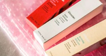
That’s why design is so important. A stellar design can set the whole tone for how your product is perceived. And it all starts with the initial packaging box design your customers see.
Sure, you may have an awesome product, but if your packaging is lackluster, you probably won’t see your product flying off the shelf.
An inadequate and underwhelming packaging of goods originating from your online store can disappoint your audience as well.
Presentation counts, whether your consumers purchase your products in a store or wait with anticipation at a package being dropped off at their front door.
Don’t underestimate the importance of compelling box design for both your product packaging and shipping boxes.
Consumers want a first-class buying experience – even if it’s through the most mundane of product purchases.
Placing some thought (okay, a lot of thought) into how your products are packaged and presented speaks to your customers, sets your brand apart, and leads to increased sales and success.
Set Your Company Apart With Box Design
Your design needs to represent you and what makes your company special. Here are some things to consider when coming up with a unique box design:
Your Brand
First off, you need a clear idea of your brand identity. Without one, you’re just another faceless company trying to sell something. Don’t do that. Start finding our brand identity by considering the following questions:
- What exactly are you trying to convey with your packaging box design? It should be consistent with your company’s overall vibe.
- Are you looking to be sophisticated or playful?
- Is being eco-conscious or having sustainable packaging a priority for you?
- Are your customers expecting a high-end feel? Something uncomplicated? Vintage or modern aesthetics?
Your brand identity is your jumping-off point when it comes to boxing, packaging, and overall design. It drives the whole process.
Figuring out what your brand is, and more importantly, what it represents will lay the foundation for the remainder of your box design process.
Your Products and Your Customers
Okay, you know who you are. Now consider what it is you sell and who it is buying those products.
Products and box design for your packaging carries two considerations. First, it’s all about practicality.
You want packaging that suits what you’re selling. More importantly, what you’re shipping. We’ll get into this in more detail later, but great packaging design is just as much about protecting as it is showcasing what’s in the box.
Next, you need to match the expectations of your clientele. Do you sell cosmetics? Sporting goods? Kitchen supplies? Whatever your wares, you’ll want a scheme that reinforces your brand and your product lines.
For example, suppose your kitchen product business serves multiple skill-sets, from beginner foodie to master chef. In that case, your packaging’s box design might reflect the diversity of your audience. Accessible and straightforward for the former, classy and sophisticated for the latter, even as both product lines fall under the same branding umbrella.
Speaking of customers, now you’ve got to figure out your target audience. A few questions to consider:
- Are they old or young, male or female?
- Where do they live?
- Is being socially conscious a priority for them?
- Are they looking for simple handmade goods or luxury items?
Your packaging should reflect what drew your customers to your products in the first place. Consider it an extension of what you sell.
This is particularly important if yours is a lifestyle brand that sells more than just products, but also an experience. You want a box design that will capture customer’s attention. Aesthetics that keep them focused on your brand and creates a desire within them to share their experience with others.
Also, consider where customers buy or interact with your product lines. In-store, you’ll want a package that stands out on crowded shelves. Online, it’s about getting it to them safely and making the unboxing an enjoyable experience.
Your Logo
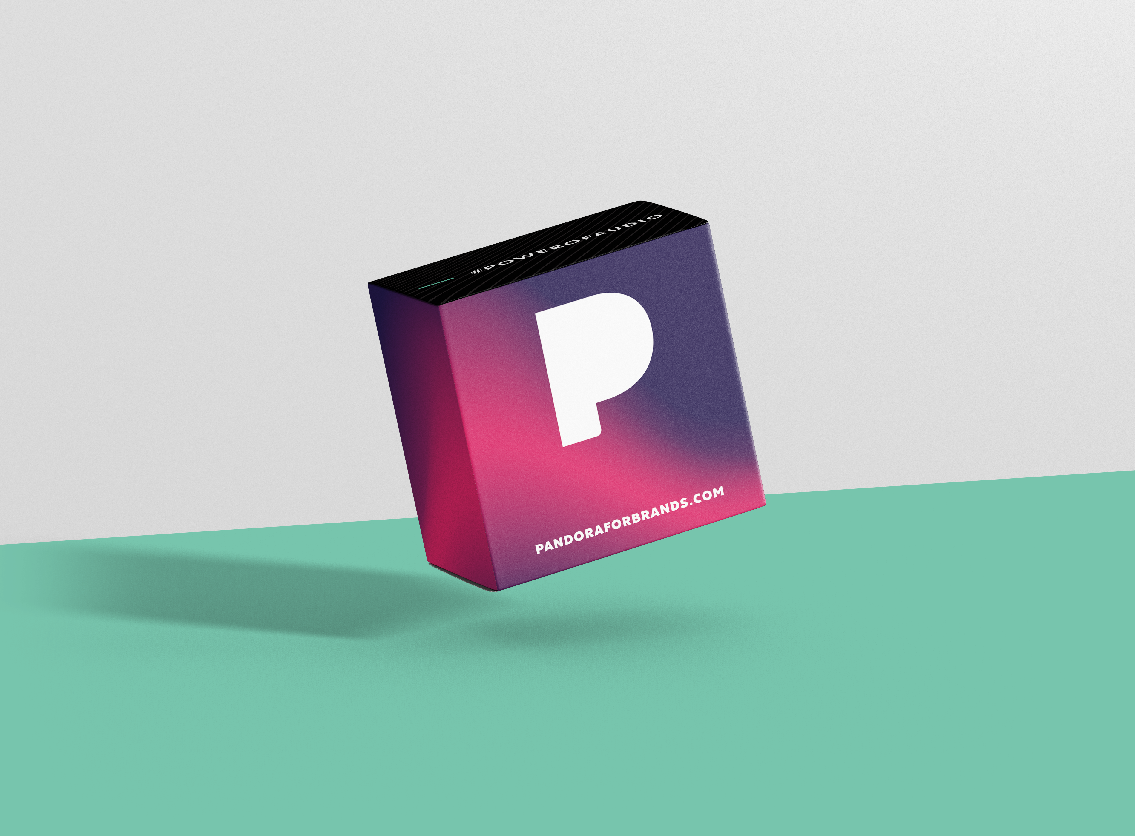
Arguably the most essential design element for your packaging is your logo. Your logo should be easily identifiable and set you apart from your competitors.
A great logo pulls double duty as an excellent representation of your brand that also looks great wherever it appears. Specifically on your product packaging.
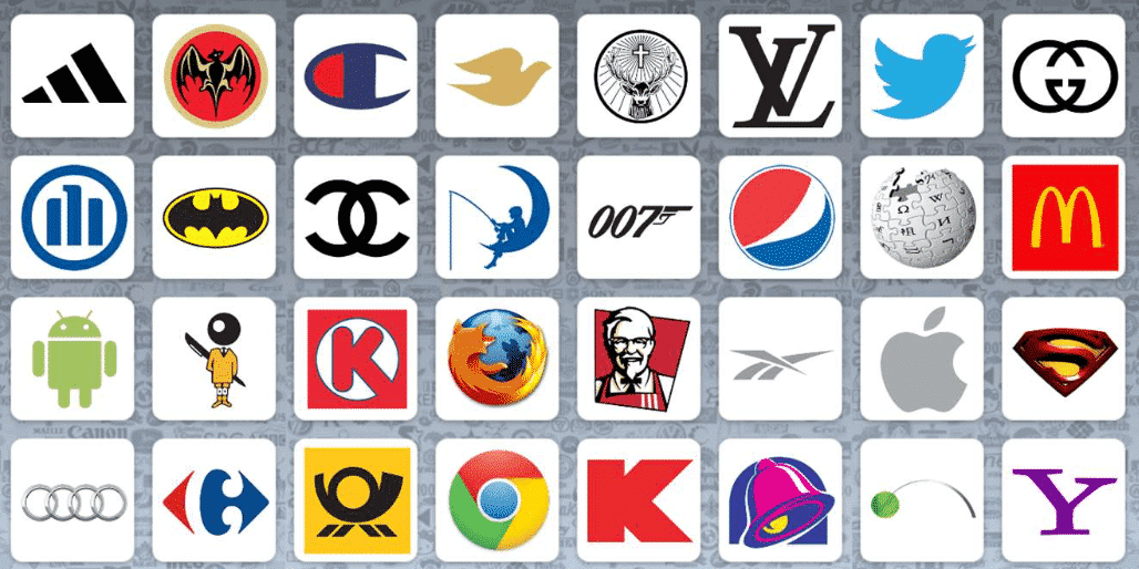
Just think of some of the most recognized logos in the world. A mere glance will have you recognizing brands like Coke, McDonald’s, and Microsoft.
There are even games where you can guess the logo. Bet you know a lot of the logos shown below:
Now, not every business has a multi-million dollar budget to spend on logo development, but that shouldn’t stop you. There are all kinds of websites where you can design your own. Sites like Canva and Hatchful are easy to use and can help you generate a logo in minutes.
Once you have a logo design you’re happy with, don’t let it go to waste.
Start by using your logo on the outside of your shipping boxes. With digital or offset printing, you can have your logo printed directly on your box, or invest in some logo stickers, a logo stamp, or even packing tape emblazoned with your logo.
Use Colors
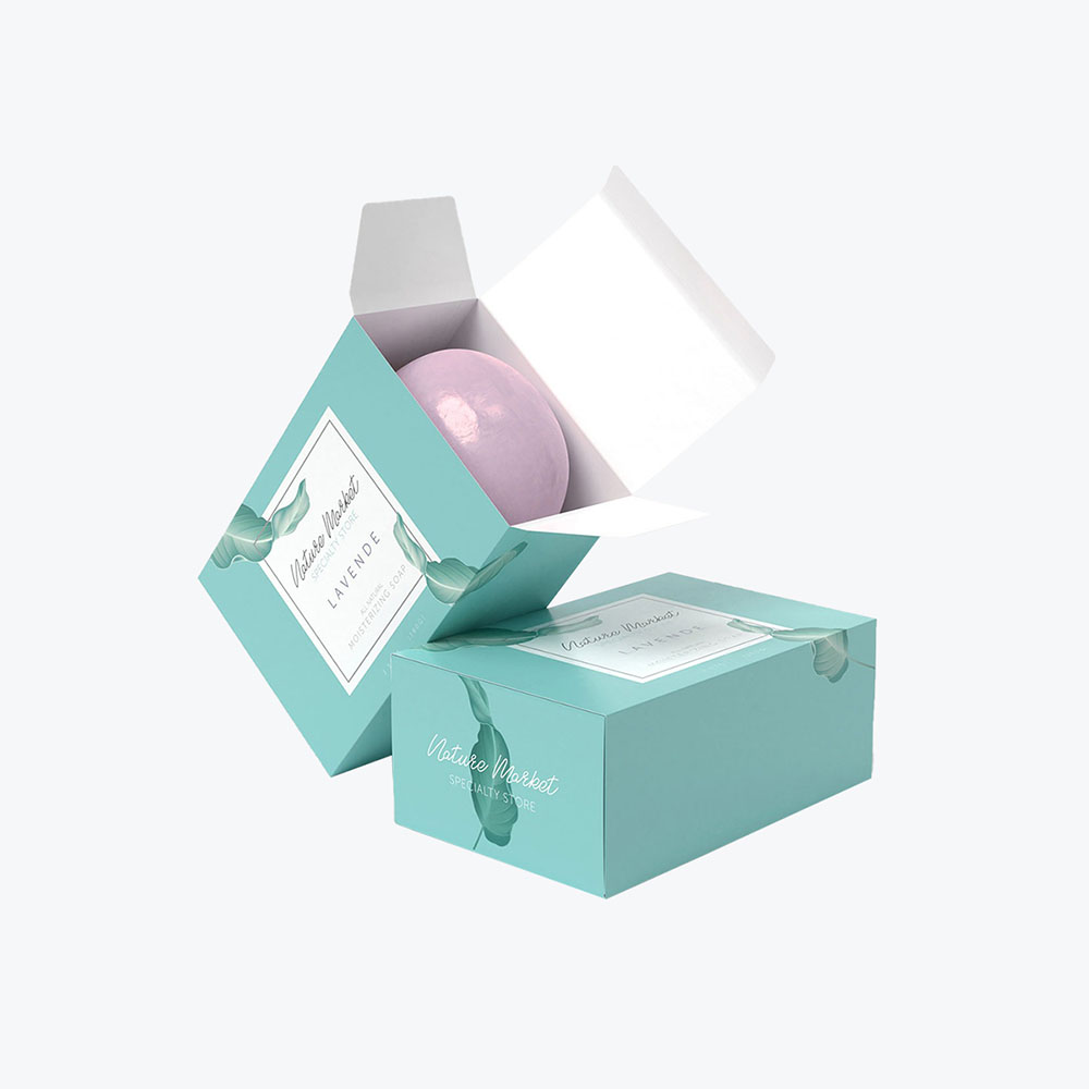
Colors are another way to promote your brand identity. They help evoke a certain mood. Moods that draw people to your offerings and enhance the overall design of your packaging boxes. Your customers may feel different emotions, depending on the colors you choose to use.
Black and white are timeless, sophisticated colors. Warm tones like red, orange, and yellow are most often associated with energy and optimism. Cool hues such as blue, purple, and green help to relax.
Don’t believe us? Yellow is thought to make people happy, whereas blue is said to be calming. Yes, color – and for that matter, many other design elements – can attract a customer or quickly turn them away.
Think about what you want people to feel when they see your packaging.
Is there a prevailing color trend in your product segment? Check out what successful (and non-successful) competitors use in their design schemes. Learn from what they do well or where they might fall short and apply those lessons to your own design.
Again, don’t necessarily mimic what others do. Find the CMYK or Pantone (PMS) colors that match your brand and messaging. But recognize that consumers are creatures of habit. Some schemes are popular because they just plain work.
Consider Your Fonts
Even the fonts you use on your packaging boxes convey something to your target audience. Though there’s plenty to choose from, keep your approach to the letters and numbers on your packaging design simple.
Serif fonts are traditional. Sans serif presents a more modern style. Want to offer a certain level of sophistication? Cursive or script lettering is the way to go. You’ll appeal to a bolder crowd with an all-cap approach.
Chances are, you already knew all this through the fonts that appeal to you. Like we said, keep it simple. You want to make an impression, and you want to do so quickly.
Most critically, keep it clear. You want your fonts easy to read and understand – whether for your brand or product name or additional packaging copy like ingredients or warnings.
Use Patterns
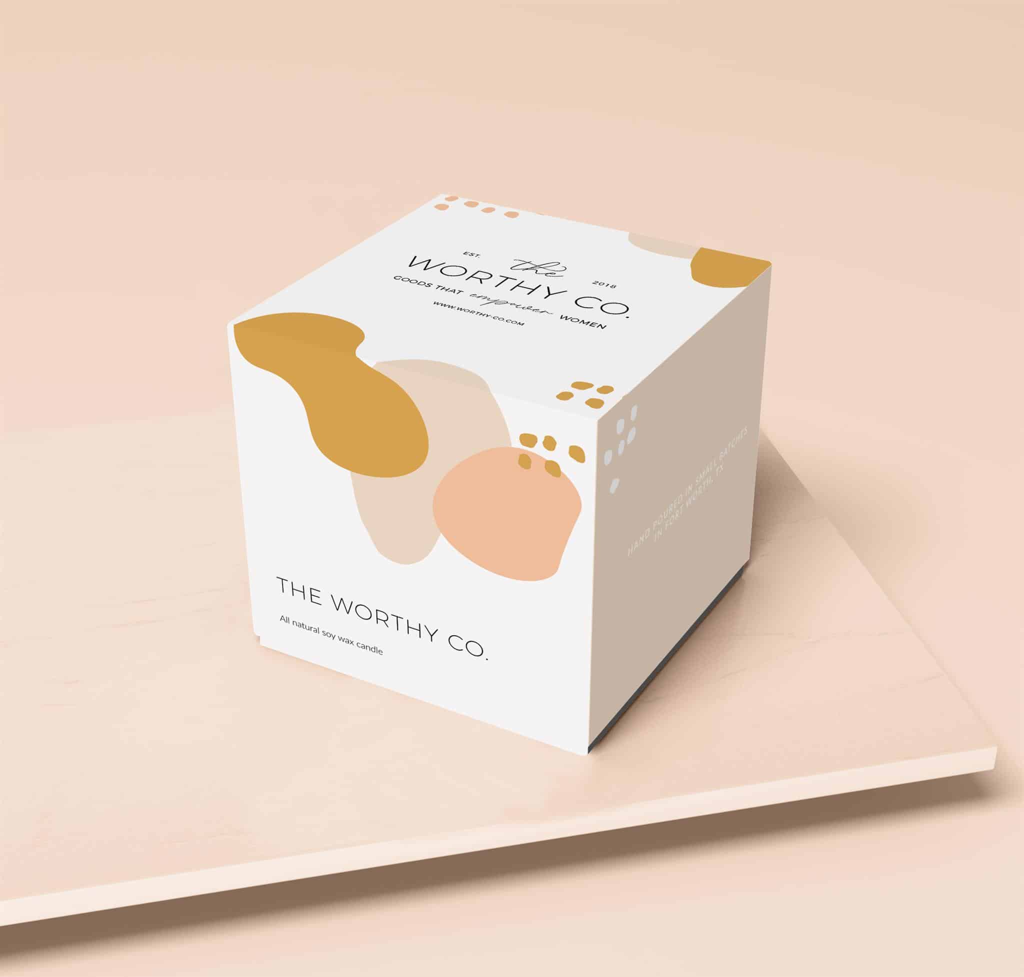
Patterns are an excellent way to add interesting focal points to your box design.
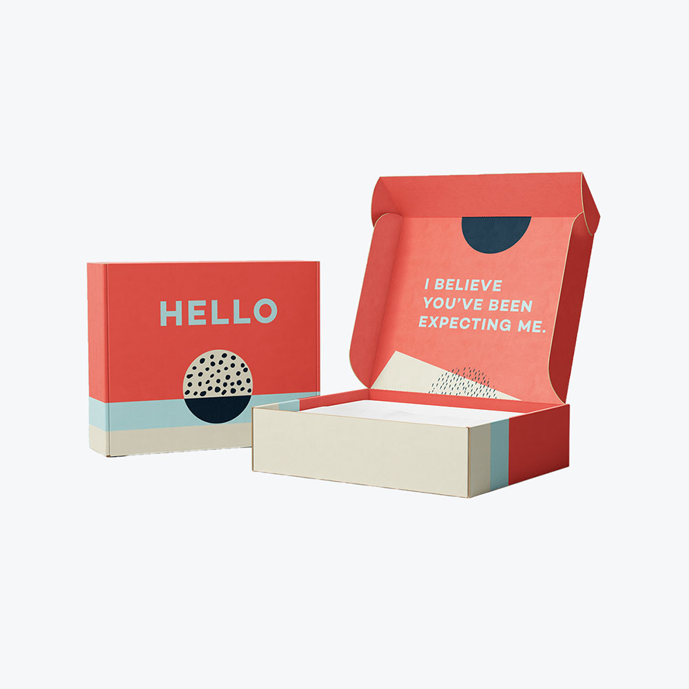
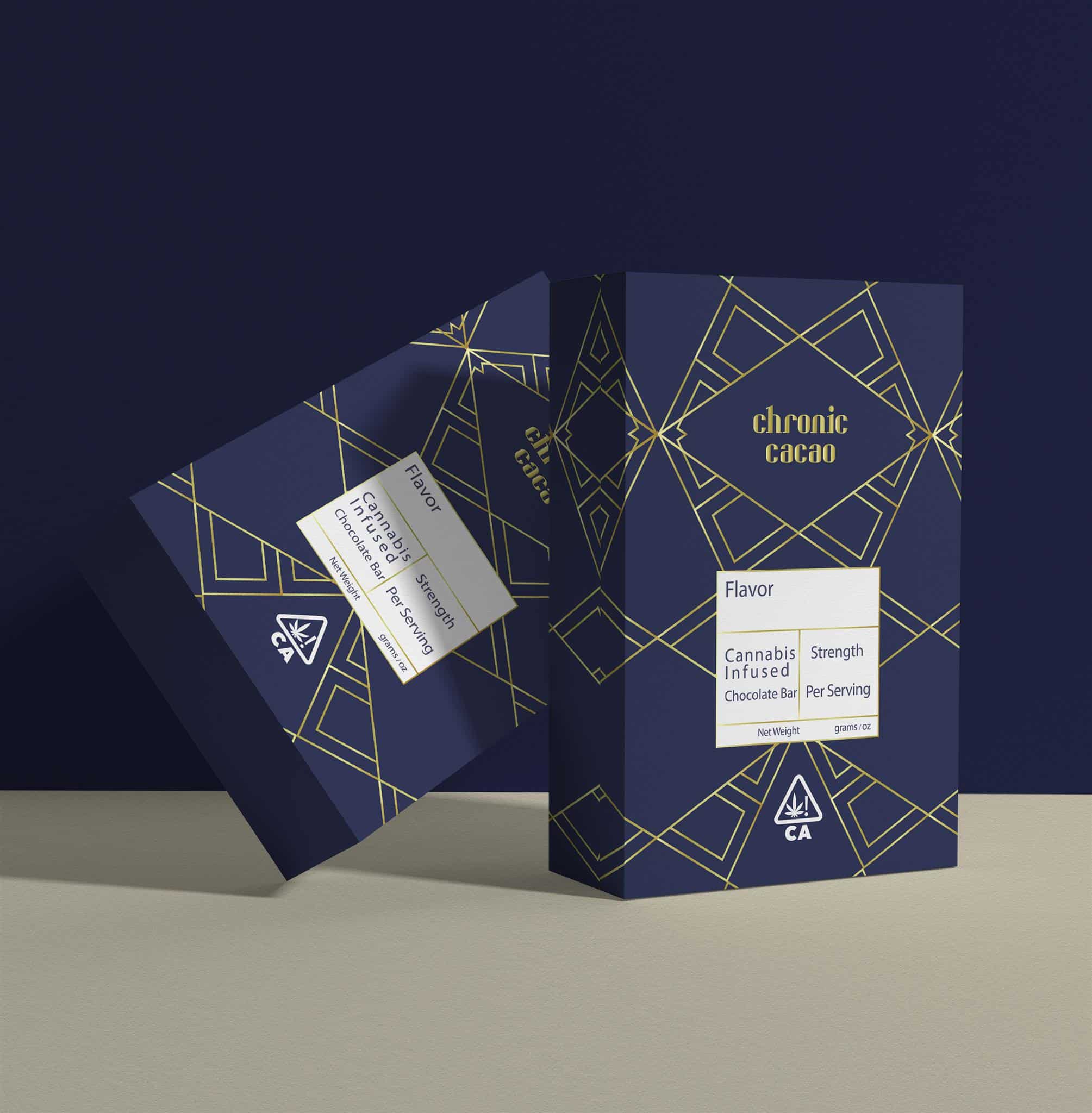
Try different size polka dots for a little whimsy, a classic striped pattern to appeal to one’s conservative side, or a trendy chevron pattern for a youthful look. Art Deco patterns are popular for creating a vintage feel. Line art that resembles circuit boards helps convey a forward-thinking style for your brand.
You might even choose to combine styles and make your brand stand out amongst a sea of sameness.
Whatever route you take, don’t be afraid to get creative with your design.
Check out what your competition is up to to see what’s working. Or how companies in other industries use patterns to create a unique brand image. It’s a good way to get the creative juices flowing.
Sites like Pinterest and Instagram are also virtual treasure troves of design inspiration.
Spend time on researching your specific industry too. Find out what attracts folks to your segment, or what’s most appealing to consumers who purchase your products, or those similar.
One word of caution with patterns is that it’s easy to overdo it. Take care to create a cohesive design that pulls all of the disparate elements together – logo, colors, fonts, patterns.
You want an overall packaging box design scheme that is easily recognizable and one that immediately draws in your customers.
Packaging Box Design Recap
Getting your box and packaging design right can prove a lot to take in, especially if this is your first time defining your brand and its messaging. Before we move forward, let’s do a quick recap of the most vital elements.
First, define your brand and your goals, and the products you sell. In many instances, the packaging will be the first thing consumers notice. Are you selling your brand or the product? The response drives your design approach.
If it’s a brand, spend more time ensuring your logo and messaging (and what you want your company to represent) stand out. If it’s a product, keep the focus on what’s in the package, what makes it great, and why a person would want to purchase it.
Next, know your consumers. And not just who they are and what will appeal to them. Understand their shopping habits, and likes and desires, and where they’ll engage with your brand and product lines.
Knowing who you appeal to – and how you appeal to them – answers a lot of your initial design questions.
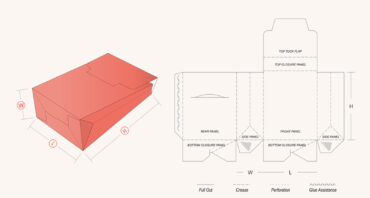
Finally, get inspired. Don’t just draw out a logo and slap it on a box. Look for a variety of box templates and additional box design tips to help you put some real thought into your presentation. Not only the elements that will appeal to your target audience but aesthetics that reflect a proud, thoughtful brand.
Consumers are themselves a thoughtful bunch. They can sniff out a company going through the motions versus one that cares about what they do and how they present themselves in an instant.
Seemingly small changes like spot UV, embossing and debossing, and matte or gloss lamination can all add up to big differences in the perception of your brand’s packaging.
Whether you cast yourself as environmentally friendly, modern and progressive, or merely a no-frills shop that offers a fantastic product, make it clear what you stand for and incorporate it into your packaging’s overall design.
Where To Find A Designer For Packaging Box Design
Now, coming up with packaging box design is one thing. Or, at least, knowing which elements you want to include in your scheme. Actually turning those ideas into something tangible is quite another.
Admittedly, you may not have the time, skill, or desire to develop your own packaging design ideas. If that sounds like you, don’t worry. There are many options to help you find the perfect designer for your needs and budget.
Here are some places to start your search:
- Design agencies: These tend to be more expensive, but if you’re targeting a large market, you might find a designer that can come up with a killer packaging design concept.
- Freelance portfolio sites: Check out sites like Behance and Dribble to peruse all kinds of creative work.
- Crowdsourcing: On these websites, designers compete for your business. It’s low risk for you since you’re not locked into hiring someone. Check out sites like 99designs, crowdSPRING or DesignCrowd to get started.
- Freelance marketplaces: Freelance networks like Upwork or Fiverr are another way to go.
- Word of mouth: Gorgeous design is everywhere, so if you see something you like, don’t be afraid to ask about it.
It’s important to note that just because you engage a third party to help with your packaging box design doesn’t mean you’re entirely letting go of it. (Of course, that option is available if that’s your preference.)
Instead, partner with an individual or group that understands your needs, what you hope to achieve, and can easily translate your ideas into workable designs.
Your designer doesn’t necessarily need to specialize in your product segment or industry. While it can help, a general track record of winning, sellable designs is more important.
One point that is critical is when you’re checking out design portfolios, remember to look for those who have experience specifically with box design.
The Practical Details Of Box Design
So that’s the artistic side of packaging design.
Box design and packaging presentation, however, is more than a pretty look.
You also have to keep in mind the practical aspect of your box design and how it plays into your customer’s overall experience.
To be sure, this isn’t the sexy, flashy side of product presentation. It is, however, critically important to building your brand, increasing customer satisfaction, and increasing your bottom line.
Everything from the type of boxes you use to the interior fill to exterior labels plays a role in crafting a complete design and unboxing experience.
The Box (or Boxes)
For example, with the hat or the t-shirt, not much protection is needed. A simple box, sized appropriately, is all that’s necessary. You can enhance the otherwise utilitarian vessel with a nice logo and include a few inserts like promotions or coupons along with the standard packing slip.
The breakable statue, on the other hand, requires a bit more thought. It might call for a thicker material, different types of boxes, or even multiple boxes, each with their own branding needs.
The statue’s main container might call for extra padding, while the shipping box might need very little. Or, for a particularly fragile item, it could need more.
Not to be forgotten, the block of cheese, being food and refrigerated food at that, requires its own special boxing considerations.
Additionally, is your product an awkward size? Does it come in separate pieces, requiring assembly? Or does it demand multiple levels of packaging? All of these considerations will change the look and feel and size of your retail packaging needs and overall design.
The point is to take equal care with the actual boxing needs for your products as you would for the design that goes on them. Customers will appreciate the attention to detail. And that their purchases are kept safe and sound.
Internal Packaging
Speaking of keeping things safe and sound, you’ll want your packaging to be durable and protect what’s inside.
You may want to try a custom top-fold box with inserts to cushion your goods and display them in a pleasing way. Or if you’re shipping perishable items – you know, the proverbial block of cheese – the interior design of your food packaging will need to encompass a means of keeping the product fresh or cold.
Perhaps, you have to deal with shipping oddly shaped items. Beyond the size, weight, and shape of your boxes, you’ll need to account for how your products are packaged.
Commonly referred to as infill, this is the protective stuffing used to cushion your products against the rigors of shipping or overaggressive store employees.
Materials such as Kraft paper, bubble wrap, packing peanuts, or air pillows all fall under this moniker. Typically, these are not subject to the same design standards as your boxes or labeling.
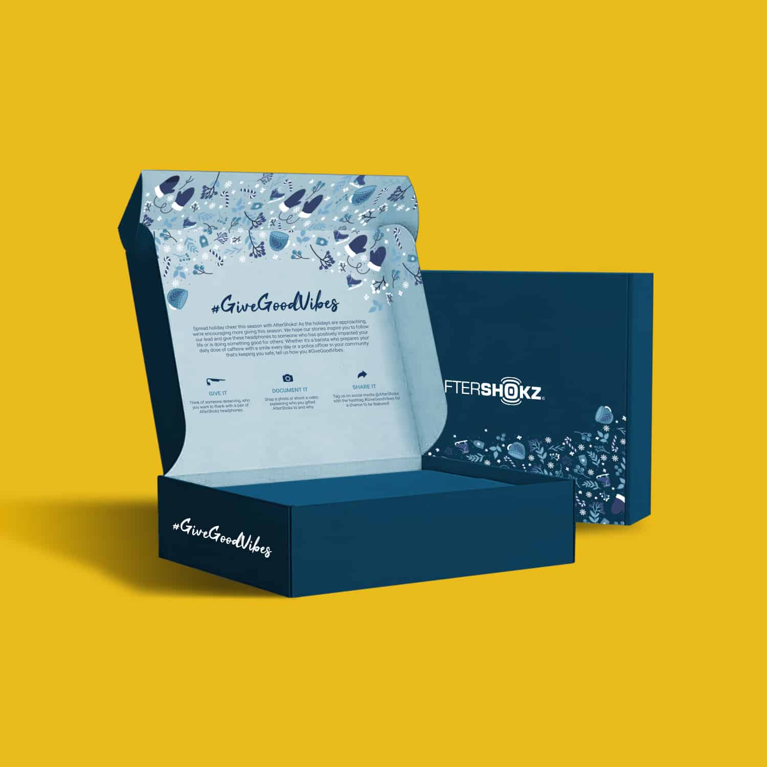
You do want to account for how your loyal consumers might respond to the additional packing. Decorative infill like tissue or crinkle paper or string can enhance a lifestyle brand or unboxing experience.
If your brand professes an environmentally friendly business approach, steer clear of materials commonly frowned upon in the eco-conscious community, such as packing peanuts.
It may not feature the design demands of other packaging elements, but infill is a vital cog in the design wheel. Don’t overlook it.
Logistics and Costs
Would you believe that packaging design should accommodate your storage and distribution capabilities too? You don’t want to have to store a bunch of oddly-shaped boxes that are cumbersome and waste space if you don’t have to.
There’s also always that pesky matter of your budget. Logistics become even more critically important if you have an extensive product line or sell products of differing sizes and weights. The more you customize your packaging, the higher you can expect your costs to go.
Work with your third-party logistics provider to narrow down your packaging needs through a robust shipping strategy. If your audience cares more about what you sell than how you are packaging it, you can forgo some costly design elements. However, if the experience does matter, then the additional dollars could be worth it.
Identify necessary boxing and infill requirements early to avoid costly storage and waste later.
If you’re trying to keep costs down, you won’t want to go overboard with your use of colors, your design’s intricacy, or custom made boxes.
Streamlining boxing or infill needs – fewer materials to brand or store – will also help keep your expenses under control. Of course, don’t forget that size and weight impact shipping and fulfillment costs.
All of these elements carry an indirect impact on your design. Removing a single component to save money – whether its storage or shipping costs or to uncomplicate an unboxing process – may affect your overall scheme.
One tweak can lead to another and another. Be mindful of your needs and wants early on and strive to create a compelling and flexible design.
Intangibles
There are also technical aspects of your design to keep in mind. You want your design to look good when it’s printed, so be sure to check that your file requirements will work with your print shop. If you’re unsure of the requirements needed, start chatting with custom print companies for some advice.
Work out your desired images beforehand. Account for placement and where and on what materials they’ll be used – corrugated box, tissue paper, plastic packaging? And how – black and white, color, large or small?
As noted, file types and box sizes might change as the material does.
Another piece of the packaging puzzle directly impacted by your design is your approach to labeling and inserts. The main focal points in both instances involve your copy.
For labeling, it’s critical to set your packaging apart from others in the marketplace while fulfilling the need to inform your customers about your products or brand. Ensure you give the same attention to descriptions and instructions as you do to your brand, logo, and central messaging or themes.
Another aspect here is your shipping labels and packing lists or invoices. Though what goes on the outside of the box for shipping purposes is relatively straightforward, you can get creative with the necessary shipping details on the inside.
In addition, inserts – freestanding pieces like coupons, promotions, thank you notes, or even freebies – should follow your design scheme if you want complete uniformity. However, it’s okay to break from consistency if you aim to draw attention to a cross-purchase, future product, or upcoming promotion.
Don’t sleep on your required copy, either. Some products will necessitate adding nutritional information, ingredients, expiration dates, safety warnings, governmental requirements, or industry or association specific verbiage. All this should play into your overall design as well, so that it is both well-conceived and accessible for your consumers.
In all cases that involve copy, write, edit, and lay it out exactly as you want it to appear long before it heads to the printer. Make sure that multiple stakeholders review and check your copy for any errors, typos, or false statements.
The Unboxing Experience
By this point, you might be wondering if excellent product packaging design is really that important. One needs only look at the popularity of product unboxing videos on social media to know the answer is yes.
More than that, though, great packaging is an opportunity to connect with customers and expand your brand.
Certainly, selling people a standout product is your primary goal. However, giving them a standout experience is what will keep them coming back to your brand over and over. It also gives them a reason to extoll that experience to their friends and family.
Ultimately, any company can offer consumers a great product, whether purchased online or in a store. What truly separates great brands from the merely good or just okay ones is the overall experience they provide.
Get Designing
While it may seem overwhelming, developing great packaging is nothing to fear. Understanding the process is more than creating a nice logo, or picking the right size box puts you well ahead of others in your position.
Take the time to contemplate how your packaging will enhance your brand, accentuate and protect your products, and impress your consumer base.
Remember, it’s not one single element – the logo, colors, boxes, infill, or copy or images – that make beautiful product packaging. It’s all of them working together, in tandem, to create a one of a kind presentation and unboxing experience.
So what are you waiting for?
Go ahead and have some fun with your design.
Done right, your packaging may be something your customers remember as much as the actual product.
Ready to think outside the box? Let's get started!
Get in touch with a custom packaging specialist now for a free consultation and instant price quote.


.svg)








Share