What is the Pantone Color Matching System (PMS)?
The Pantone Matching System (PMS) is a standardized color system that identifies nearly 5,000 various subtle color shades and variations. This detailed color numbering system allows designers and printing manufacturers to standardize and match colors correctly, to overcome the common variation of printed colors when using CMYK.
What comes to your mind when you think of the color “red”?
Maybe you think of a dark red, like crimson, or a bright red, like a stop sign. In the printing world, just saying “red” isn’t enough. There are subtle differences even between shades and hues, which brings us to the Pantone Matching System (PMS) – a global “language” for understanding and matching colors.
The History of the Pantone Matching System
Pantone was a commercial printing company started in the 1950s by two brothers, both advertising executives. A few years after its founding, the brothers hired recent college graduate Lawrence Herbert, who used his chemistry knowledge to categorize and systematize the company’s collection of printing inks and pigments.
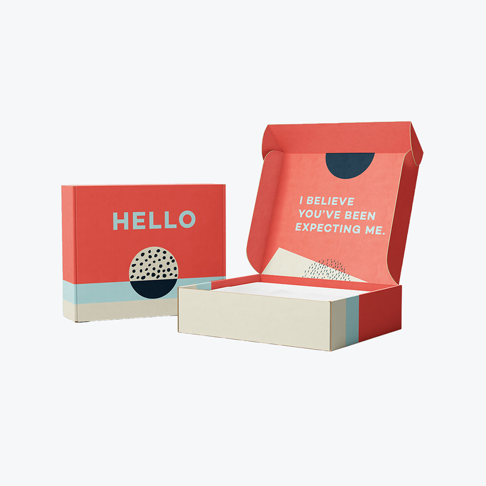
Imagine you have a product. Your logo will be printed at one location by one printing company, and your custom packaging is being produced at another printing company across the country.
How can you be sure that both printers will use the exact shades and coloring in your logo and packaging to create perfectly identical versions?
The Pantone Matching System (PMS) is how. Pantone set out to create a system that allowed for a consistent color numbering system, as there is often a variation in printed colors when using CMYK.
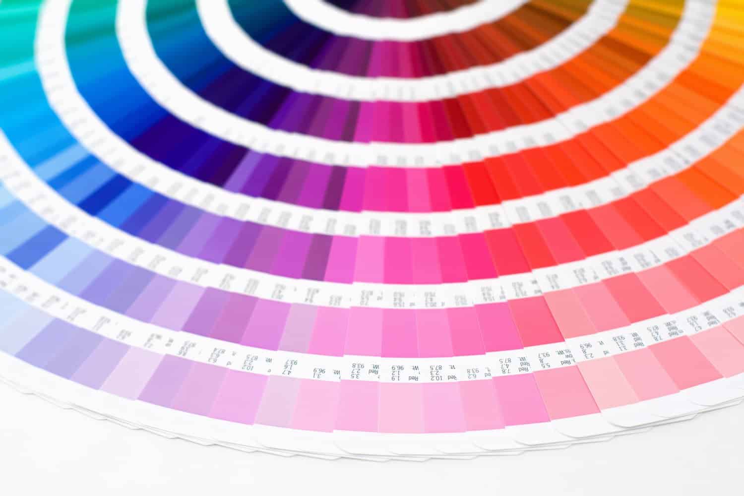
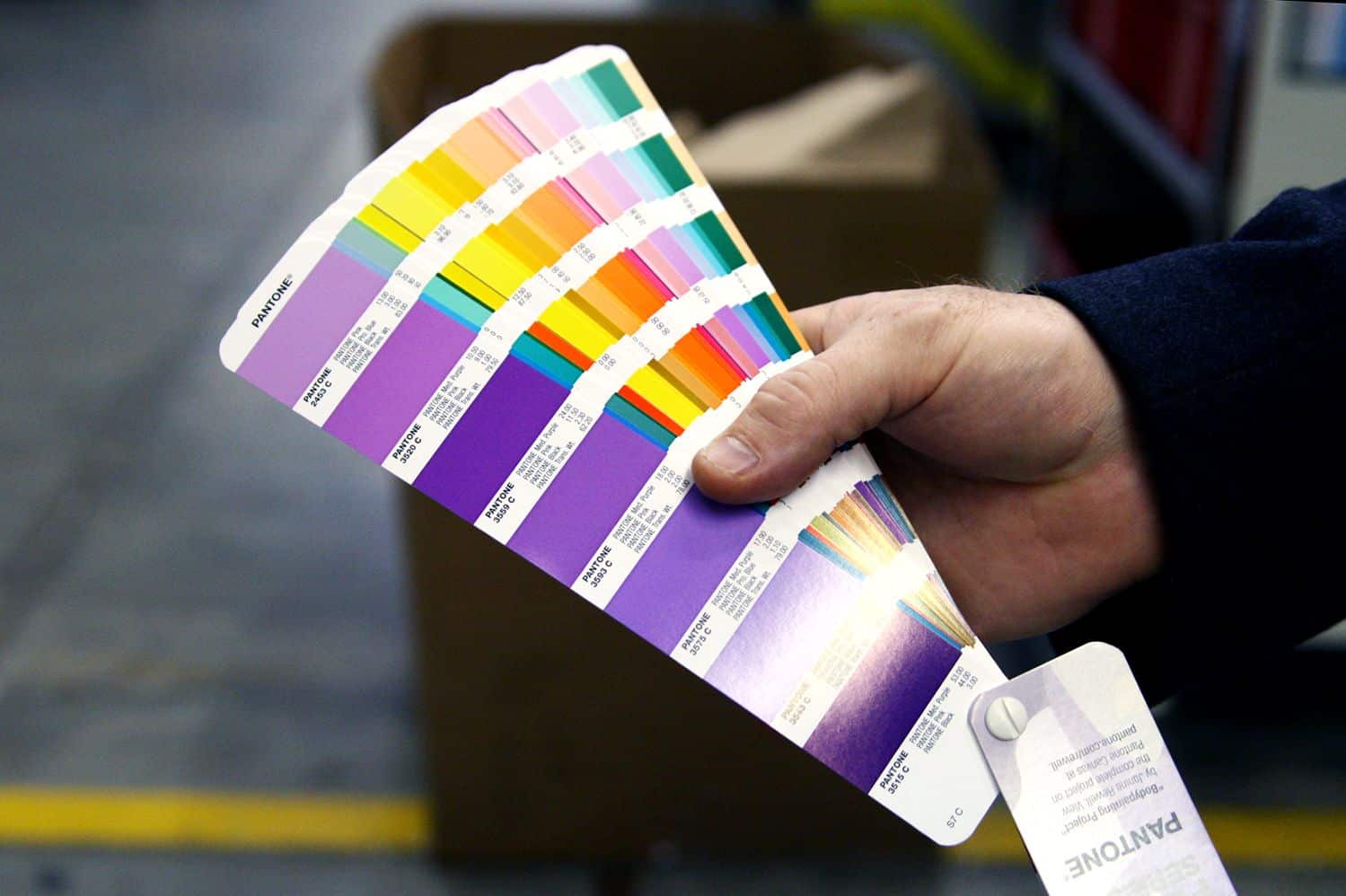
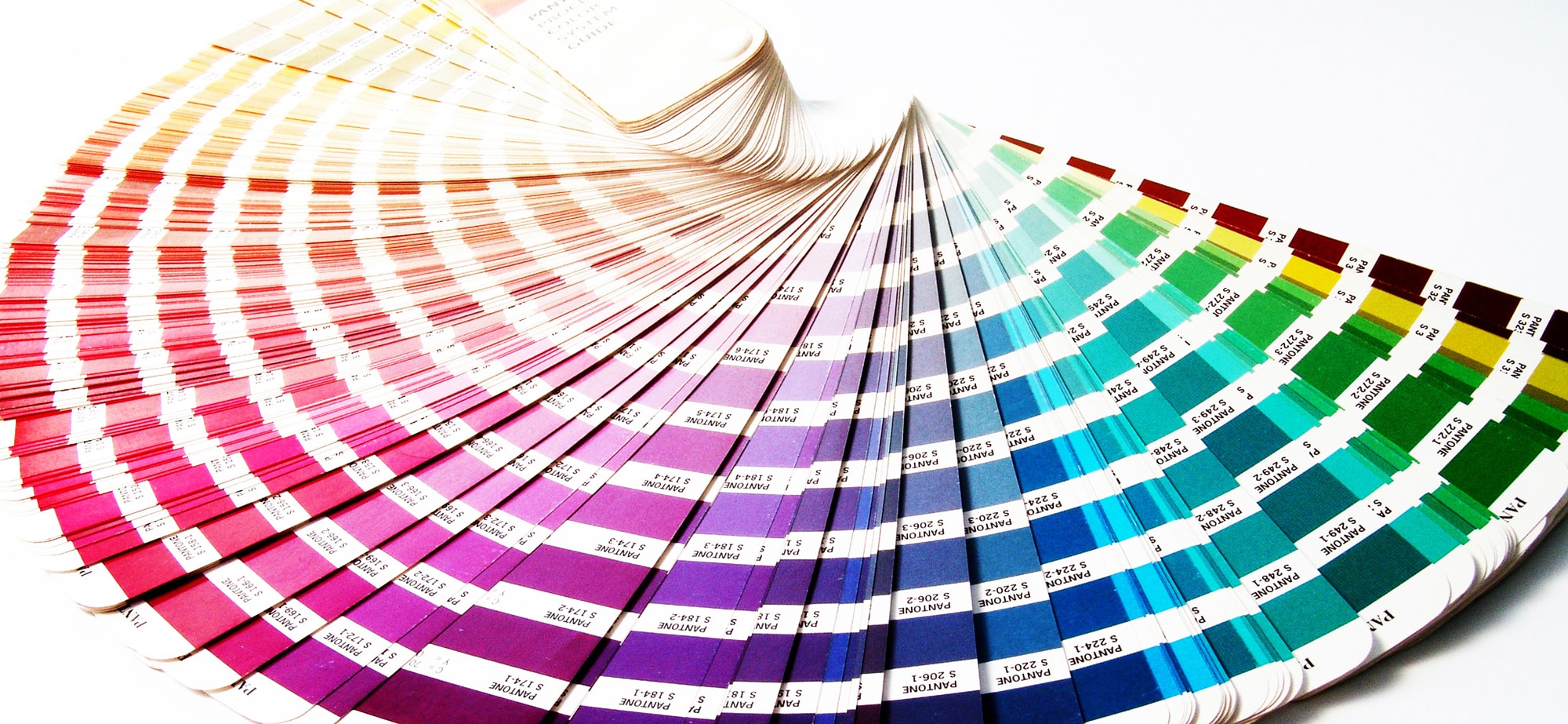
In the PMS, entire sheets can be devoted to a single color in various subtle shades and variations. Several of these sheets can be put together into a “fan”. They are coded by numbers and allow print designers, wherever they are, to standardize their printing and match colors accordingly.
The Two Pantone Matching Systems
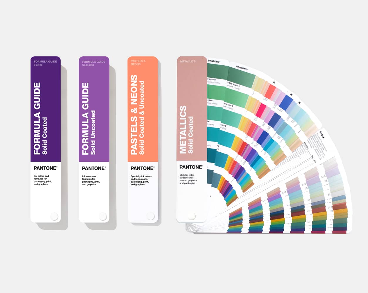
Pantone actually has two different matching systems: one for packaging design, and one for product design.
There are nearly 5,000 Pantone colors in total. The reason the color system is split in this way is to allow what Pantone calls “market-relevant colors”. For example, product design may use varying shades of black, white or neutral colors, while retail packaging might need colors that stand out on shelves and grab customers’ attention.
What’s more, the way a color looks will depend on the material that it’s printed on.
Depending on the material, some colors don’t show up at all, or they look absolutely awful and not at all what a product creator would want. That’s why Pantone decided to separate their PMS into two distinctive systems, so that print and graphic designers know not only which colors can be reproduced on which materials, but also that they’ll show up brilliantly when they are printed.
Pantone Matching System (PMS) Palettes
Depending on what you’ll be printing onto, there may be a PMS palette to match.
For example, there’s a Pantone solid palette, a process palette, a textile palette and a plastic palette. You’ll want to consider what you’ll be printing onto in order to determine which colors you can use, and which you should avoid.
Using the PMS offers a number of benefits. Most notably, because it is the most commonly used color matching system in the world, you can take your printed material almost anywhere to be reproduced, and the printers can match those colors to their Pantone color code easily – guaranteeing consistent results.
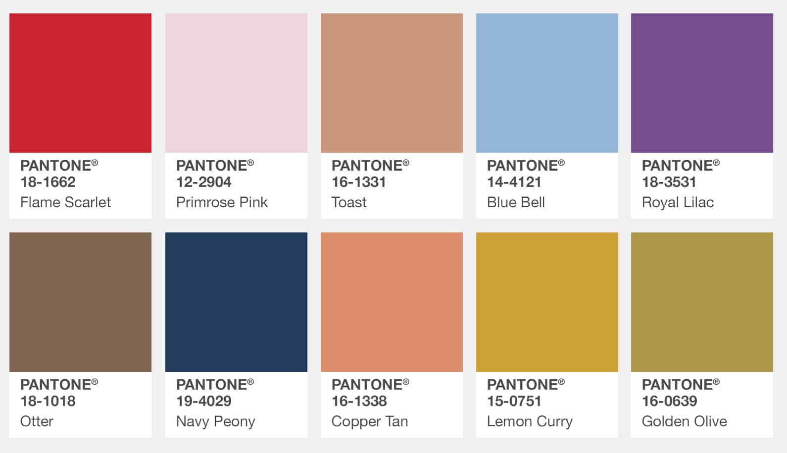
In addition, the PMS has an excellent color range. Although there are other systems out there, none of them come close to matching the accuracy and precision of the Pantone system. Pantone’s system is so popular, that every year, a new color is selected to represent that year. With vibrant names like “Tangerine Tango” and “Mimosa”, they sound like they could be flavored cocktails instead of colors. But when you stop to think about it, they really are like cocktails – eclectic mixes that are like flavors for your eyes.
What is the Difference Between PMS and CMYK?
In order to understand the difference between PMS and CMYK, it’s important to first understand the difference between spot color and process color. A logo is an example of something that uses spot colors. For example, the distinctive bright yellow of McDonald’s Golden Arches is a specific Pantone color name or number that can be matched on a printing press.
CMYK colors, on the other hand, are created using a mix between Cyan, Magenta, Yellow and Black. The differences between printing presses and a host of other factors means that one cyan, for example, may not match another, which leads to considerable differences in color.
That distinctive yellow, for example, may look washed out, or even dirty, depending on the printer, the experience of the press operator, and any other number of issues. Depending on if your printer is using digital printing or offset printing will also play a factor in what your printed colors ultimately look like as well.
CMYK colors are not guaranteed to be uniform between printers or even print jobs, whereas Pantone colors are, because they can be selected based on a certain and globally understood name or color code.
Can You Convert from Pantone to CMYK? Can You Convert from CMYK to Pantone?
This can be done, however, it can be a challenge.
Graphic designers know that the two systems are markedly different and complete, identical matches can’t always happen. With that being said, however, printing with Pantone inks can be expensive, and it’s common that companies prefer using CMYK to help them save money even if their logo coloring differs slightly.
At the same time, Pantone has practically perfected assigning specific codes to the whole spectrum of visible color, so a company that wants to invest in the absolute best and ensure premium output at every stage of the process may want to switch from the CMYK four color process to Pantone.
If you want to convert from Pantone to CMYK and vice versa, Pantone sells conversion guides that can help you find the best possible match for your colors. You can use commonly available graphic design programs like Adobe Photoshop or Adobe Illustrator to simply open up the color swatch and convert the colors.
If you’d like a quote or have questions about switching your print job from CMYK color to Pantone or vice versa, contact us for a custom estimate.
Have Questions About Working with the PMS?
Our A-Z guide about packaging definitions can help you get up to speed with industry terminology as you create your own custom boxes.
On the surface, PMS is a simple system, yet its impact on the industry is clear. Working with the PMS gives you the highest quality color and exact color matching so that you can transfer your design from material to material with consistency.
However, we also understand that you may still have questions about working with the Pantone Matching System, converting CMYK to PMS and vice versa. Fortunately, product packaging design using both CMYK and PMS is our specialty.
Whether you have a small print job or you want to scale your printing to accommodate a variety of styles, at Refine Packaging, we have the knowledge, experience and expertise to help guide you from concept to completion. Our professional packaging designers, printers and graphic artists can work with you every step of the way to create and print a design that truly exceeds your expectations.
We invite you to contact us today to learn more about how we can use the PMS to help bring your product to life with beautiful packaging that is affordable and exemplary in every way.
Ready to think outside the box? Let's get started!
Get in touch with a custom packaging specialist now for a free consultation and instant price quote.


.svg)








Share