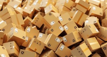
Did you know that by deciding to ship or display your items in a cardboard box, you’re already ahead of the game? Yup, people are loving cardboard these days.
A recent survey conducted by Ipsos found that:
- 71% of those surveyed said they were more likely to buy brands that package their products in paper or cardboard, rather than other materials like bubble wrap or plastic.
- 63% of those surveyed said that paper and cardboard packaging makes a product seem premium or high quality.
Ok, so you’ve made the smart decision to package your goods in cardboard boxes, but is that enough to get your products noticed? Nope.
You can’t just throw your goods in a nondescript box and call it a day. No – in today’s world of unboxing videos and endless social media diatribes about the whole package opening experience, you’ve got to go above and beyond with ideas for your box design to stand out from the competition.
Today’s consumers have so many options. They no longer have to rely on what’s available in their town – or even their country. They’re looking for a complete shopping experience – whether they’re checking out a store shelf, or browsing an ecommerce site. And they want the boxes their products come in to wow them.
Think about what makes you buy a certain brand. Perhaps it’s word of mouth, or maybe loyalty, but more than likely packaging is also a major consideration.
So, just how important is box design to your bottom line? Well consider this:
- A study by Ipsos found that 72% of Americans’ purchasing decisions are influenced by packaging design.
- 66% of those surveyed by WestRock said that they tried something new because the packaging caught their eye.
So, don’t leave box design as an afterthought.
It’s important to come up with a creative, yet practical, box design so you can fully leverage this powerful marketing tool.
Functionality Counts When Reviewing Box Design Ideas
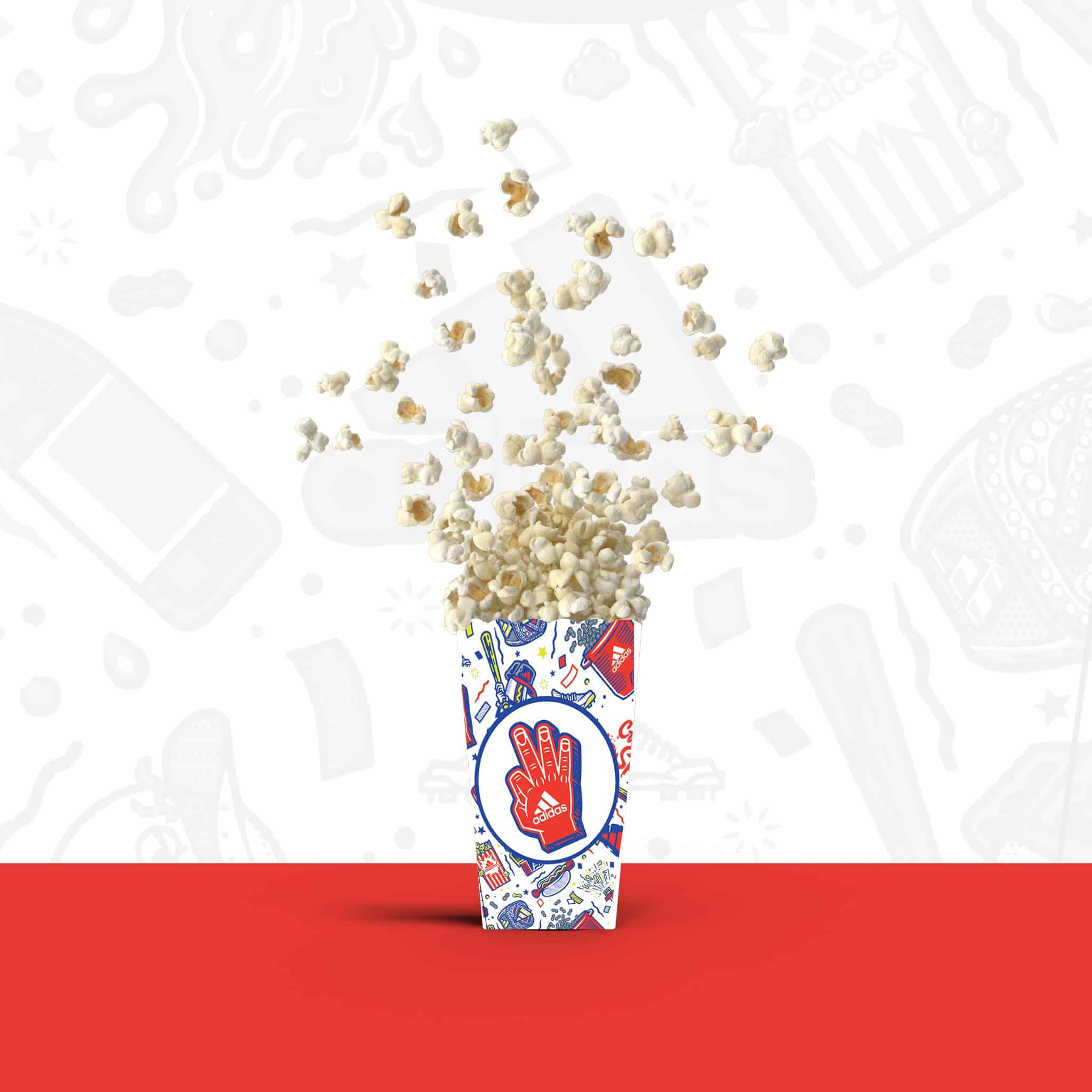
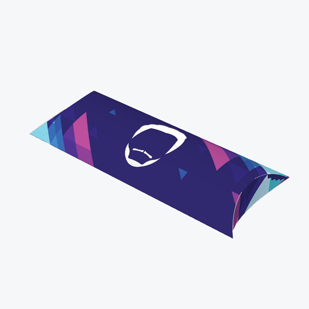
Successful box design, like the custom boxes pictured above that we produced for Adidas, is much more than choosing your favorite colors to splash across the sides (albeit that is an important element).
When coming up with your box design ideas and overall design plan, it’s essential to first understand the main functions of a box.
Here are some fundamentals you don’t want to ignore with your box design when reviewing box design inspiration:
Your Box Must Protect What’s Inside
First off – and most importantly – your box needs to effectively protect what’s inside.
If nothing else, you’ve got to make sure your custom box design keeps the items inside safe during shipping.
This means your box needs to be sturdy and tamper-proof. No one is going to appreciate a beautiful box if their wine glasses arrive in shards, or their poster arrives crumpled. You want your items to get to their destination intact.
Your Box Should be Efficient
The structural design of the box can play a large role in your bottom line, as well. When deciding on a design think about things like shelf and storage space. You don’t want to have an oddly shaped box if it’ll be difficult to store in your warehouse.
Also, consider transportation costs when designing your box. The box size and weight of a box can unnecessarily jack up your shipping costs if you’re not careful.
Your Box Should Be Informative
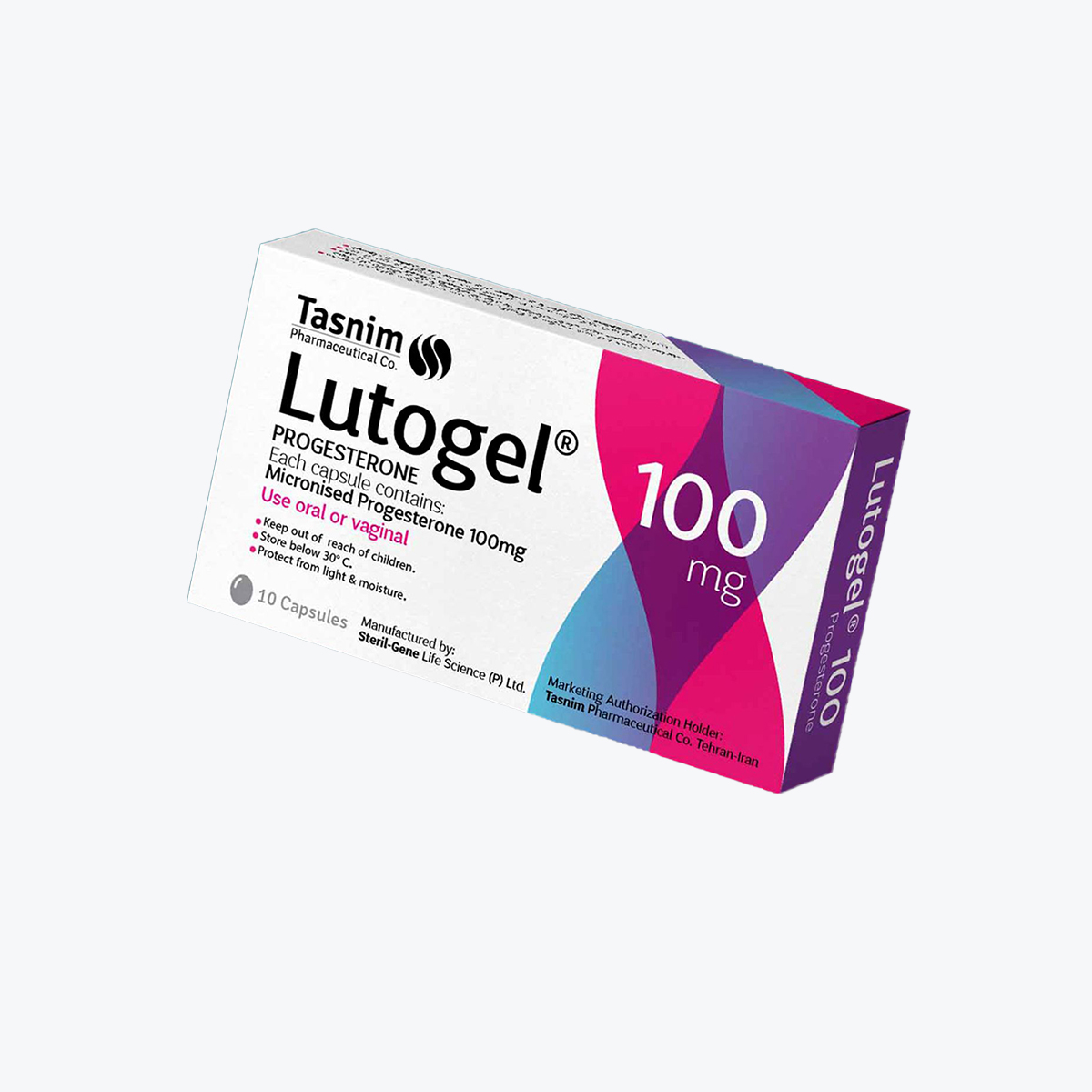
It’s important that your box clearly labels what’s inside. When people pick up a box they want to know what’s in there, so, if there’s room, go on and include information about the contents, such as ingredients, expiration dates, or instructions on how to use the product.
Packaging boxes are also a great place to add specific company information. A custom box has only so much marketing real estate, but you can point consumers to other marketing avenues, such as your website or social media channels, where you can offer more in-depth information about your company and products.
Your Box Should Reinforce Your Brand Identity
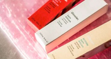
Yes, your box must offer protection, but that doesn’t mean you should ignore how it looks. Boxes are a great way to make a strong first impression and pump up your brand recognition.
The box design is not a place where you want to skimp. To fully harness this powerful marketing tool, you’ll want to have your logo stand out and make use of shapes and colors that represent your brand.
Make a Design Plan for Your Box
Once you understand the important functions of a box, it’s time to come up with a design plan. To help you formulate your plan, it’s helpful to ask yourself a couple of questions:
What are you selling?
Boxes come in all different sizes, shapes, and thicknesses, so to get the right box (or boxes), you’ll need to have a clear idea of what products you’ll be putting in the box.
The size of your boxes and weight of your items will dictate a lot of your box options. Heavy items may need to be put in strong reinforced boxes, whereas you may get by packing lighter, smaller items into thinner carton boxes.
You’ll also need to take into consideration whether or not the items are fragile. You obviously won’t want to pack a piece of stained glass in a flimsy, unpadded box. Likewise, it wouldn’t make sense to invest in double-wall corrugated boxes if all you’re ever boxing up is socks.
For most companies, it might be difficult to get by with a single size box since many sell products of various sizes and shapes. But even if you sell only one type of product, you should think about whether multiples can be packed together in the same box.
Who is your target audience?
No matter what products or services you’re selling you likely have an ideal customer in mind. Who are you trying to appeal to? Think of the demographics of your target market. Consider things like the ages of your customers, their income level, their geographic location, and what they consider important.
Maybe you’re looking to sell upscale cosmetics to millennials, or maybe you’re trying to market paper straws to eco-conscious customers? Whatever your product, your packaging needs to represent your brand.
Boxes are an essential component of your overall marketing strategy. You want to be consistent across all of your channels – including your website, social media accounts, and retail packaging.
Your customized box design should reflect what your brand stands for. Sometimes a box is your customer’s first interaction with your product. So your boxes need to represent your products in the best possible light.
Understand Some Basic Design Rules
Sure, you want your box design to be unique and stay true to your brand identity, but that doesn’t mean you can’t learn from other companies’ successes (and failures).
Here are a few tried and true design “rules” that will help get you started with your box design:
Color Counts
When it comes to marketing your products, color plays a huge role. Studies have found that color increases brand recognition by 80% and that 85% of shoppers say that color is a primary reason for buying a particular product.
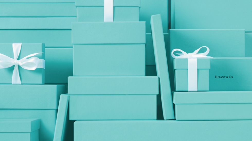
Some colors are so iconic that if you look at them you know the company without seeing a logo or other brand identifier. Think of the classic blue Tiffany box that’s synonymous with luxury. Tiffany & Co. trademarked their “Tiffany Blue” in 1998.
Other companies have also successfully trademarked their colors, such as T-Mobile (magenta), UPS (deep brown), Wiffle Ball Bat (yellow), and 3M Post-Its (canary yellow).
Of course, not every company has a signature color, but successful brands know that certain colors evoke specific moods. You want your box colors to reflect the vibe you’re going for.
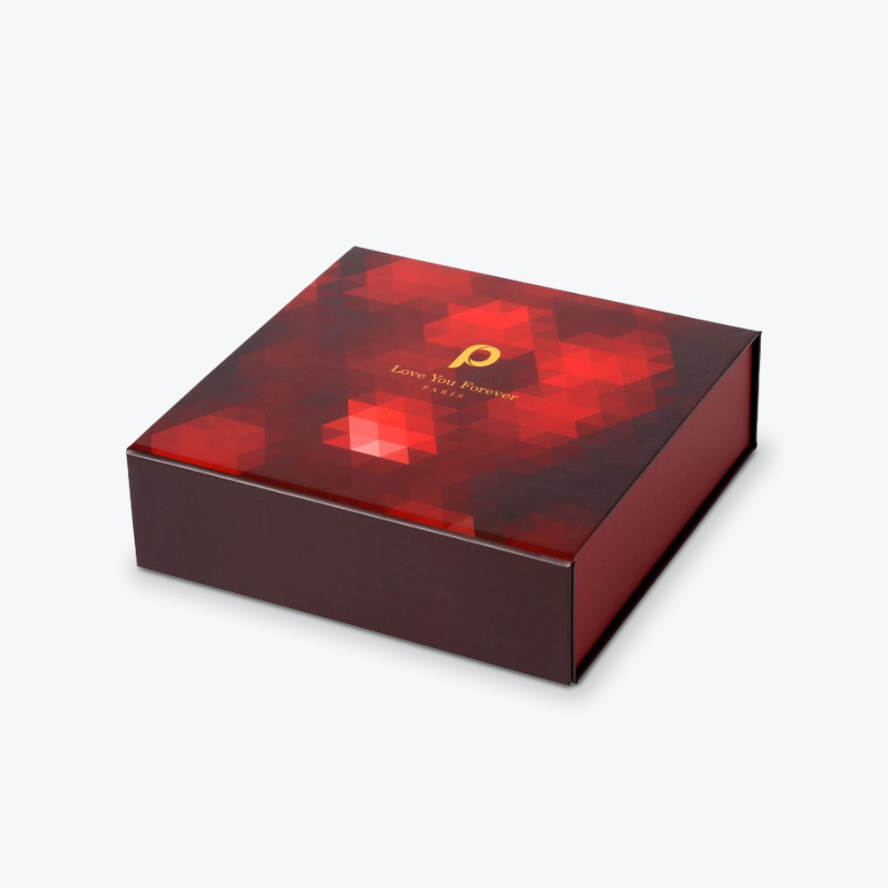
In general, go for darker colors if you want to project a more staid, established look, lighter colors and pastels will give off a cleaner, more youthful look, or choose bright, bold colors to grab attention.
Flonomics provides retail analytics to companies wanting to better understand how customers are interacting with their brand. They studied how different colors influence shoppers and their purchasing habits. They found that:
- The color red stirred up feelings of excitement, passion, and energy.
- Blue gave off a trustworthy and reliable vibe.
- Green was all about nature, earthy feelings, and freshness.
- Orange was playful.
- And yellow was reminiscent of sunshine and evoked a warm mood.
Put Some Thought Into Your Typography
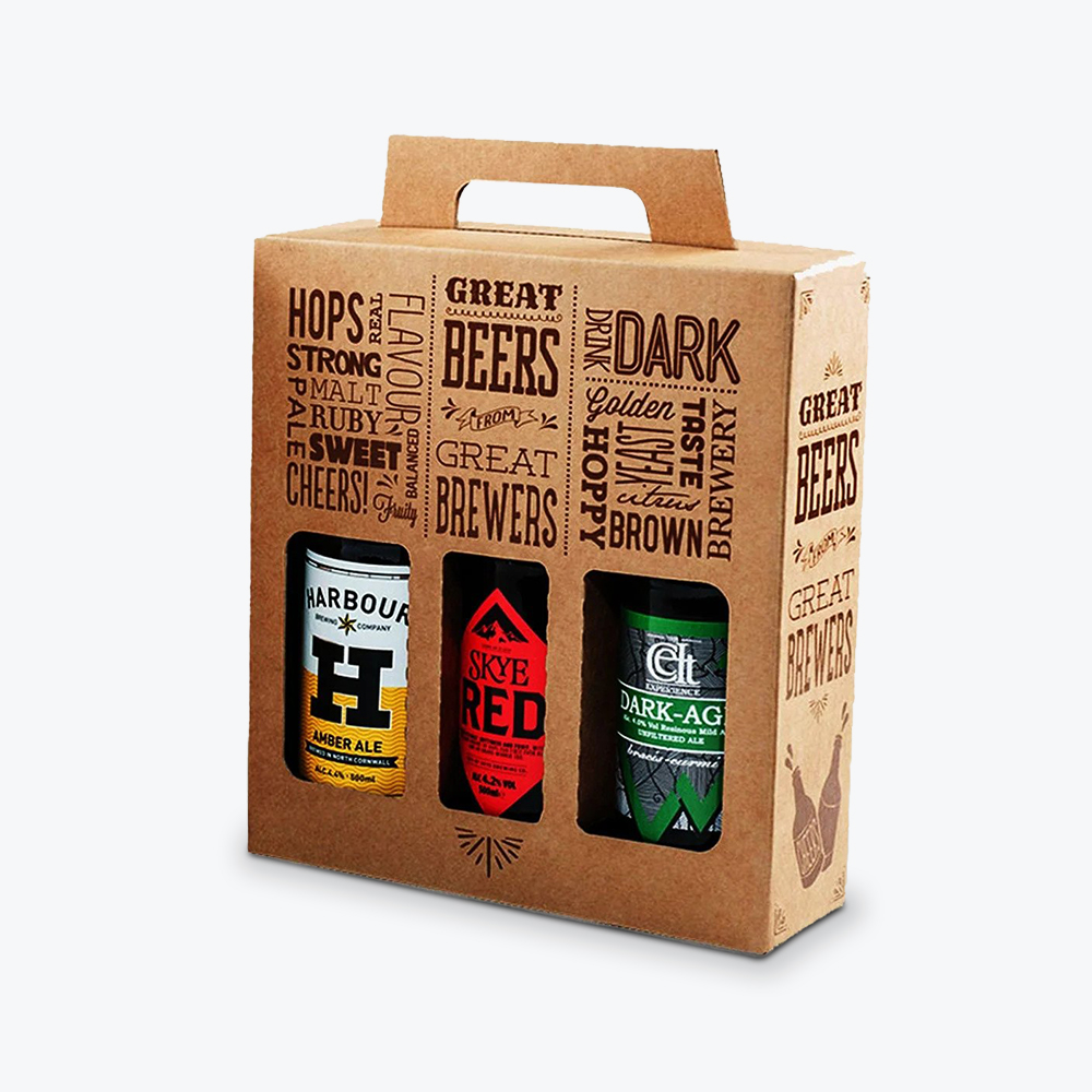
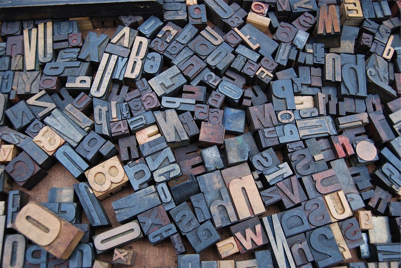
How often have you seen a box with absolutely no words on it? They’re out there, but pretty rare. Most product box design involves some sort of typography. Typography is the arrangement of letters and words. It includes things like font sizes and styles.
It can be fun to get creative with your font choices, but remember you want your words to both look good and be legible. Don’t overdo it with too many competing font styles. That can just end up looking messy and clouding your message.
Pay Attention to Quality
Put some thought into your materials. Flimsy, poor-quality paper packaging may be cheap, but is that the best look for your product?
Definitely not, if you’re aiming to impress. Think about what you’re selling and have your boxes mirror the quality of your goods. Customers will expect their high-end purchases to come in a quality box.
The same goes for graphics. A lot will depend on your budget, but try to use high-resolution graphics if you can afford it. An unintended, blurry image is not a good look.
Don’t Have Too Much Going On
It helps to start with a focal point. If you have too many fonts, competing colors, and a hodgepodge of graphics, your message will get lost in the middle. You don’t want to overwhelm your audience with too many competing design elements. Instead, let your design elements complement each other and give them breathing space.
Of course, sometimes design rules are meant to be broken. Look at these box design tips through the eyes of your customer. The most important thing is to know your target audience and what look will appeal to them.
Don’t Be Afraid to Get Some Help
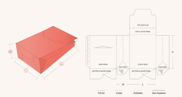
If all of this feels too overwhelming, seek another pair of eyes to look over your design, or hire a professional. Box templates (known as dielines) can often be found online, and you can find designers at almost any price point to help you come up with a captivating box design.
If you’re on a super-tight budget, try Fiverr, or if you have a little more to spend try 99designs, Dribble, or Behance.
If you need one-on-one box design support, the graphic designers at Refine Packaging are here to help. Contact us today for a free, no obligation quote on your custom box packaging needs and we’ll work with you to create a look and a package that brings together the very best of your brand personality, social appeal, and quality product design to create a look that is unmistakably your own.
21 Box Design Ideas You Can Adapt for Your Own Packaging
Ok, you’ve got your plan and have a grasp of some basic design elements. Now, it’s time for the fun stuff. Let’s check out some box design eye candy.
Here are twenty-one examples of companies who got their custom box design right by implementing various strategies:
Box Design Idea #1: Tell a Story
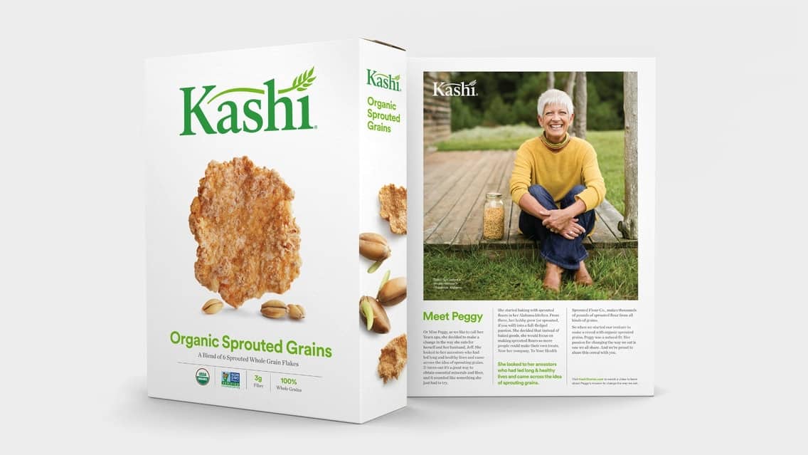
What better way to develop some rapport with your customers than to introduce yourself and tell your story. Stories are a great way to connect with your customers on a more personal level. Tell them who you are, where you came from, and what’s important to you.
In 2016 organic breakfast cereal company Kashi introduced “stories,” on the back of their cereal boxes. These little vignettes had full-color photographs and explained how the food was made and where it came from. They highlighted real people, such as farmers, millers, and others involved in the process of making the cereal.
Of course, you can squeeze only so much copy on the back of a cereal box. That’s why Kashi also included a link to their website where the interested consumer could watch a more in-depth video on the subject.
Box Design Idea #2: Use Patterns
Try using various patterns on your retail packaging boxes. Chevron, stripes, polka dots, and herringbone are popular options. Use them on their own or in conjunction with other images.
Box Design Idea #3: Use All Available Space
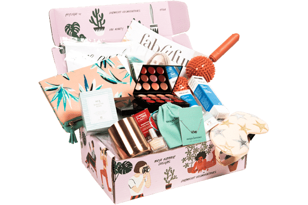
A custom product box is more than a single side. Why not get more bang for your buck and cover the entire box with meaningful graphics, sayings, or information about your brand.
There’s a reason, lifestyle brand FabFitFun’s subscription box designs are splashed all over Instagram and are featured in so many unboxing videos on YouTube.
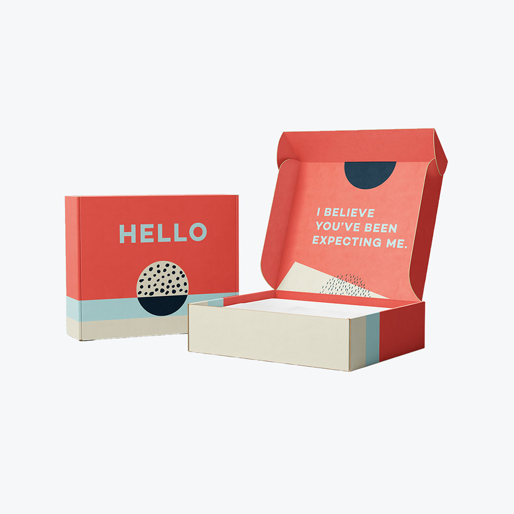
They change up their mailer boxes depending on the season, but they usually use bright graphics and take full advantage of the entire box – inside and out.
Box Design Idea #4: Keep it Simple
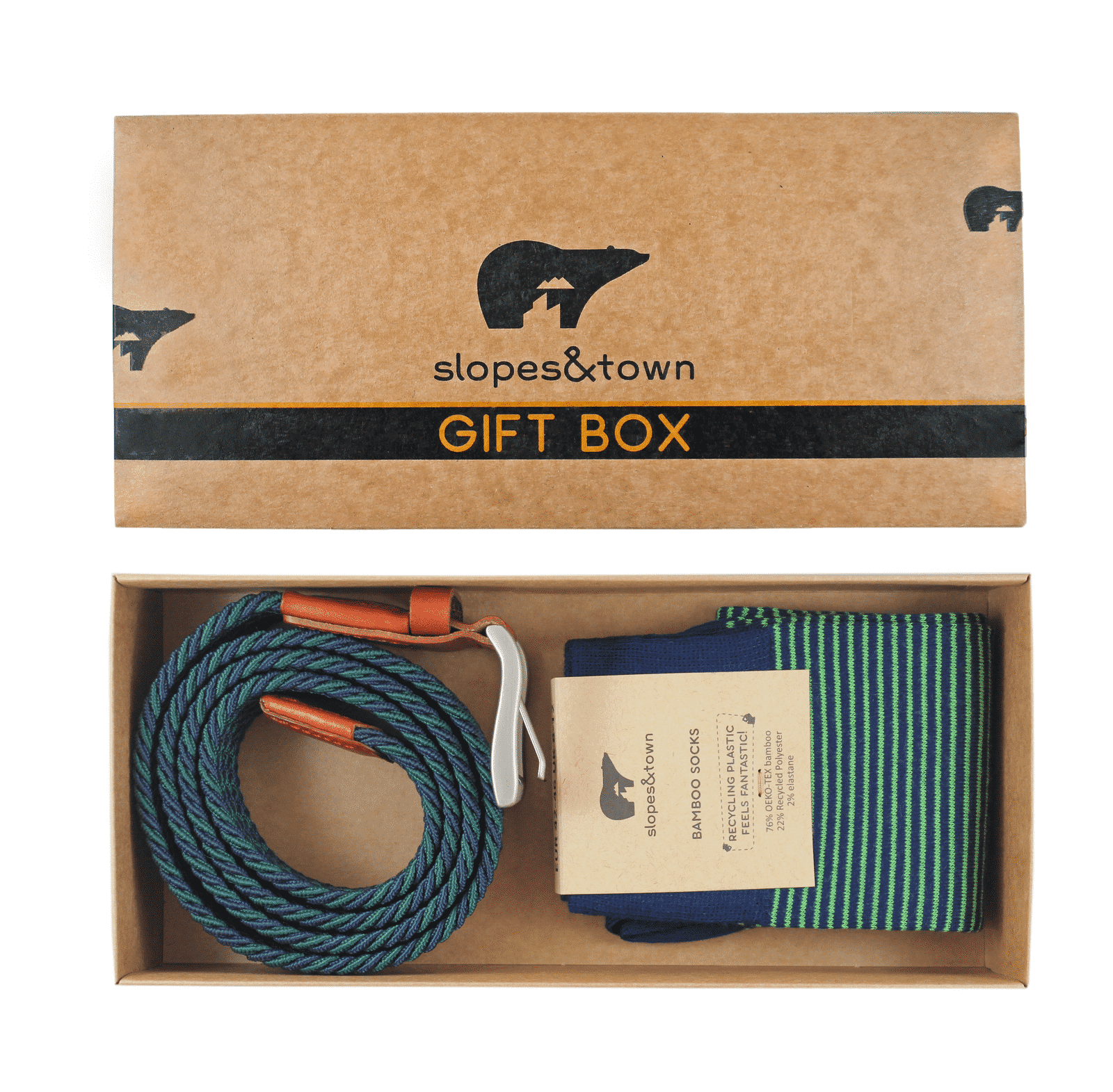
Dutch company Slopes & Town sells accessories, such as multi-purpose belts and socks made from bamboo fibers and recycled plastic.
The company’s mantra is an emphasis on sustainability and keeping waste to a minimum. This includes its eco-friendly packaging, which is often made from kraft paper. There’s no excess with their custom boxes.
Box Design Idea #5: Don’t Forget the Inner Sections
The outside of a box may give the first impression, but that doesn’t mean you should ignore what’s inside.
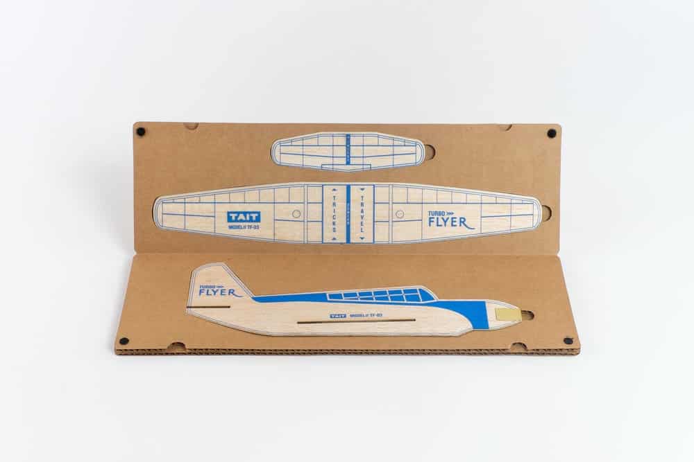
Tait Design Company’s Turbo Flyer comes in a box that doubles as a cardboard carrying case. The multiple pieces of the balsa model airplane kit fit neatly inside. So, whether you want to store it in your closet, or take it to the park, you know your airplane will be secure.
Box Design Idea #6: Use an Interesting Shape
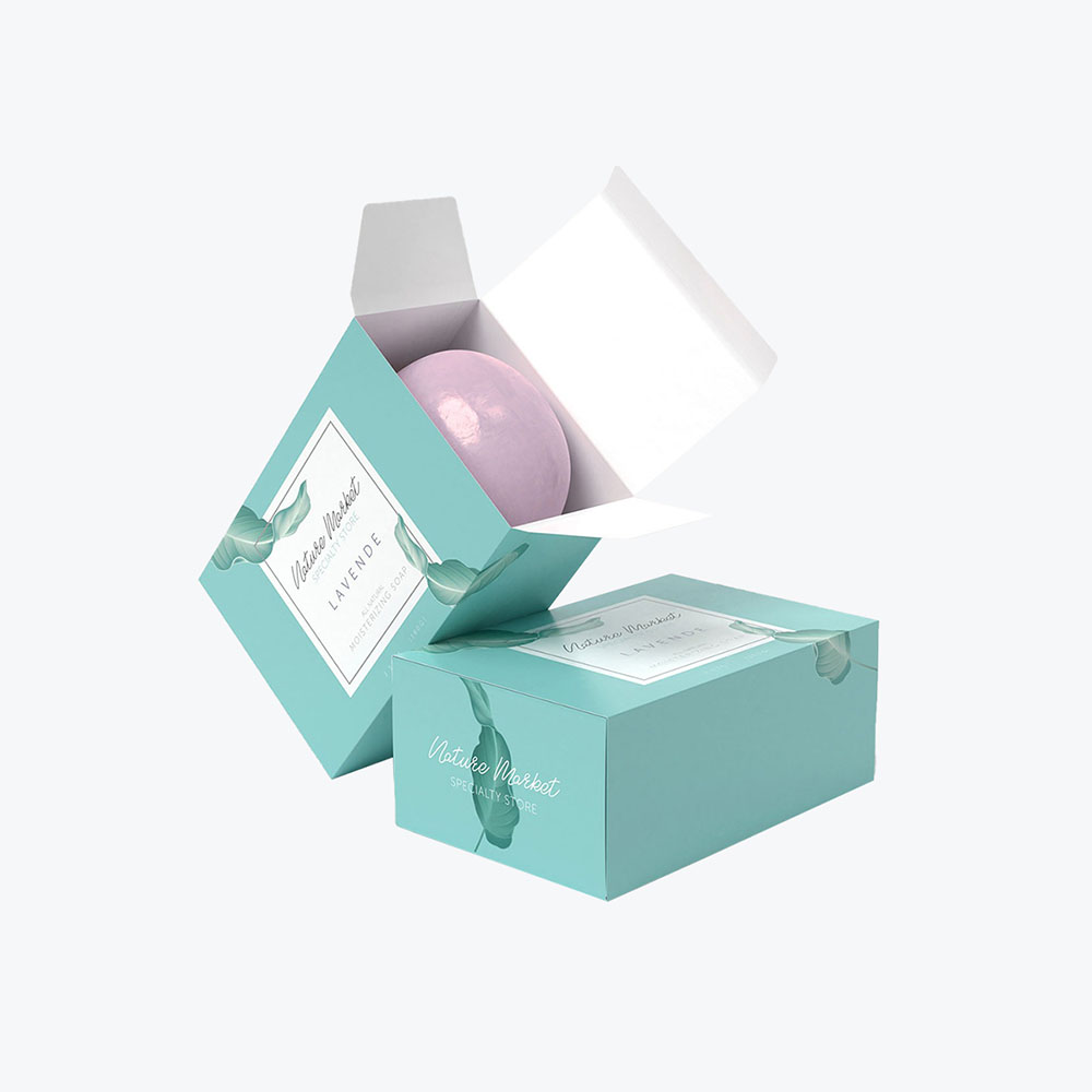
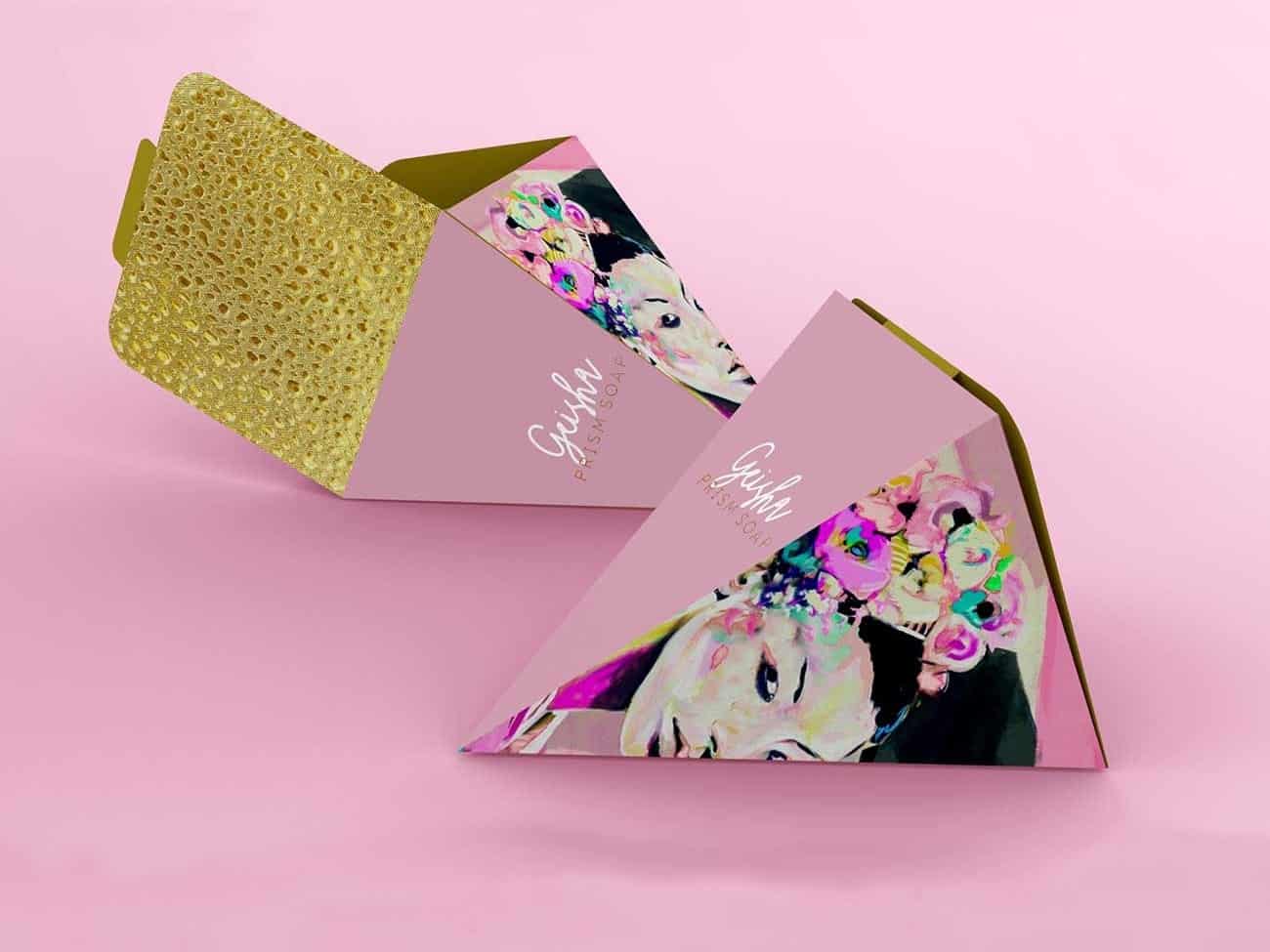
Boxes don’t have to be cuboids. They’re usually rectangular for ease of storage and transport, but there’s no hard and fast rule saying you can’t have a triangular, hexagonal, or whatever-shaped box. Below is a prism-shaped box concept for a soap company.
Box Design Idea #7: Remember Your Product
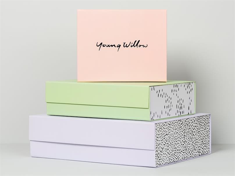
Always keep your product in mind. Your box and packaging should reflect what’s inside. Take, for example, the Australian company, Young Willow, which specializes in stylish, high-end baby gifts, including clothing, bibs, books, and little toys.
One glance at their website and you can see the sophisticated look they’re going for. There are no garish primary colors to be had with this brand – everything looks soft and subtle. Their boxes further reflect their brand image.
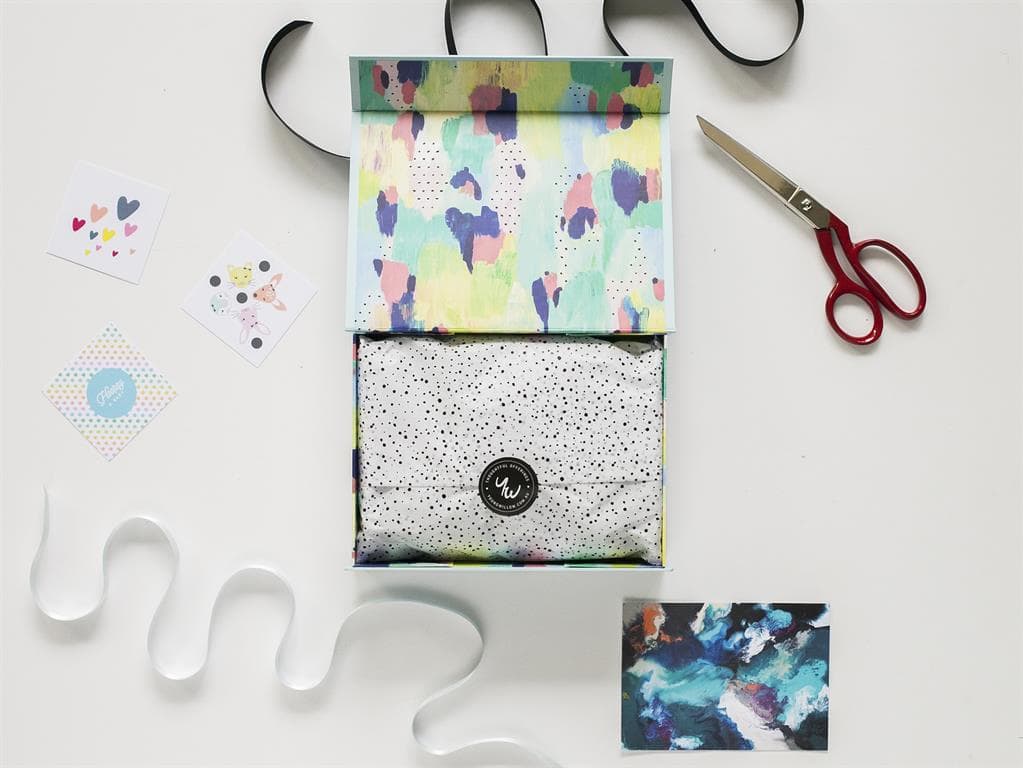
Baby showers are big business and what better way to elevate the gift experience for that mother-to-be than to present your gift in a gorgeous box. Young Willow’s gift boxes are so pretty, they sell them as a separate item on their site.
The custom packaging boxes come in soft muted colors, such as lavender, green, and pink pastels, with the brands’ name embossed on the top. Pop open the box and the muted color scheme continues inside. This is a box that will not likely be casually tossed in the recycling bin.
Box Design Idea #8: Add Some Fun
Depending on what you’re selling a little frivolity can go a long way. A nice warm plate of cookies can bring out the inner child in anyone. Thelma’s decided to have some fun with their cookie boxes.
Instead of packing their cookies into one of those ubiquitous, pink pastry boxes, they went for something much more memorable, a distinct oven box. I can almost smell those cookies.
Box Design Idea #9: Go Bold
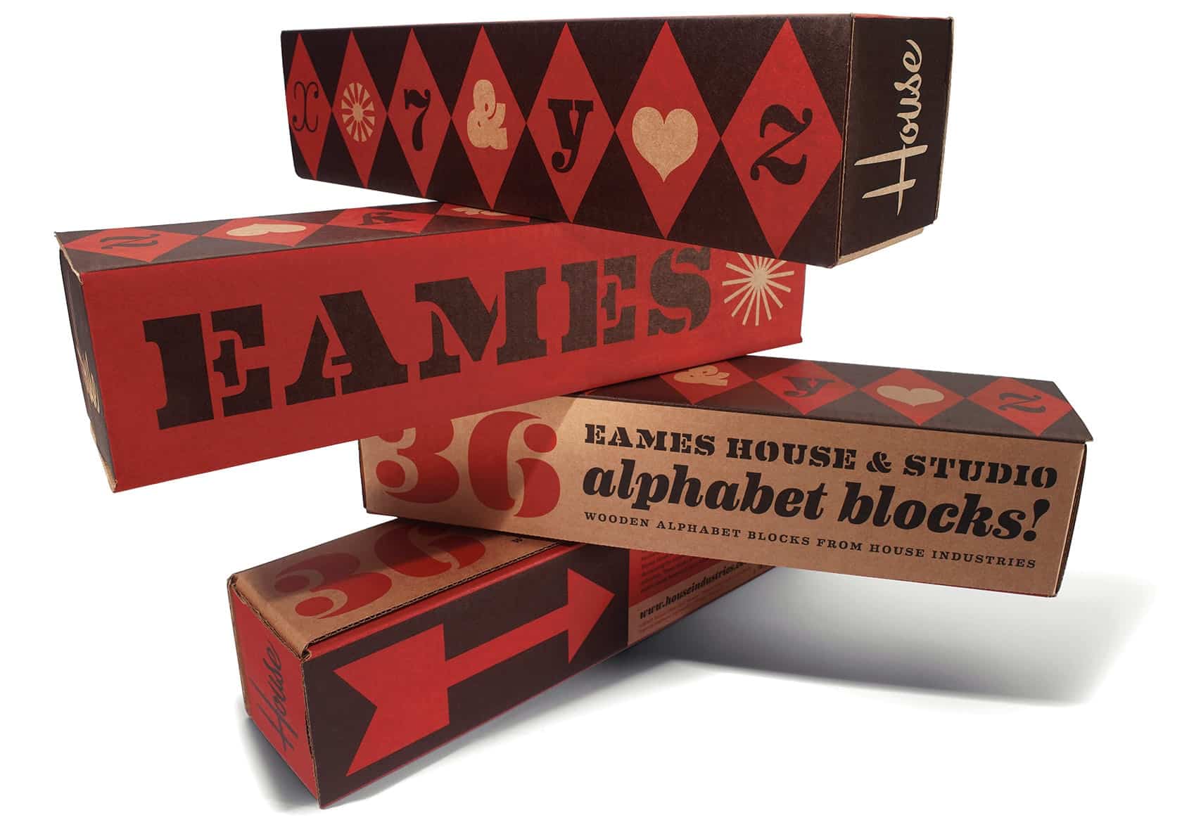
When you think of mid-century modern design, iconic industrial designers, Ray and Charles Eames likely spring to mind. They received numerous design awards and their furniture has been exhibited in museums throughout the world.
So, it’s no surprise that a lot of thought went into the customized boxes housing a product as simple as children’s building blocks.
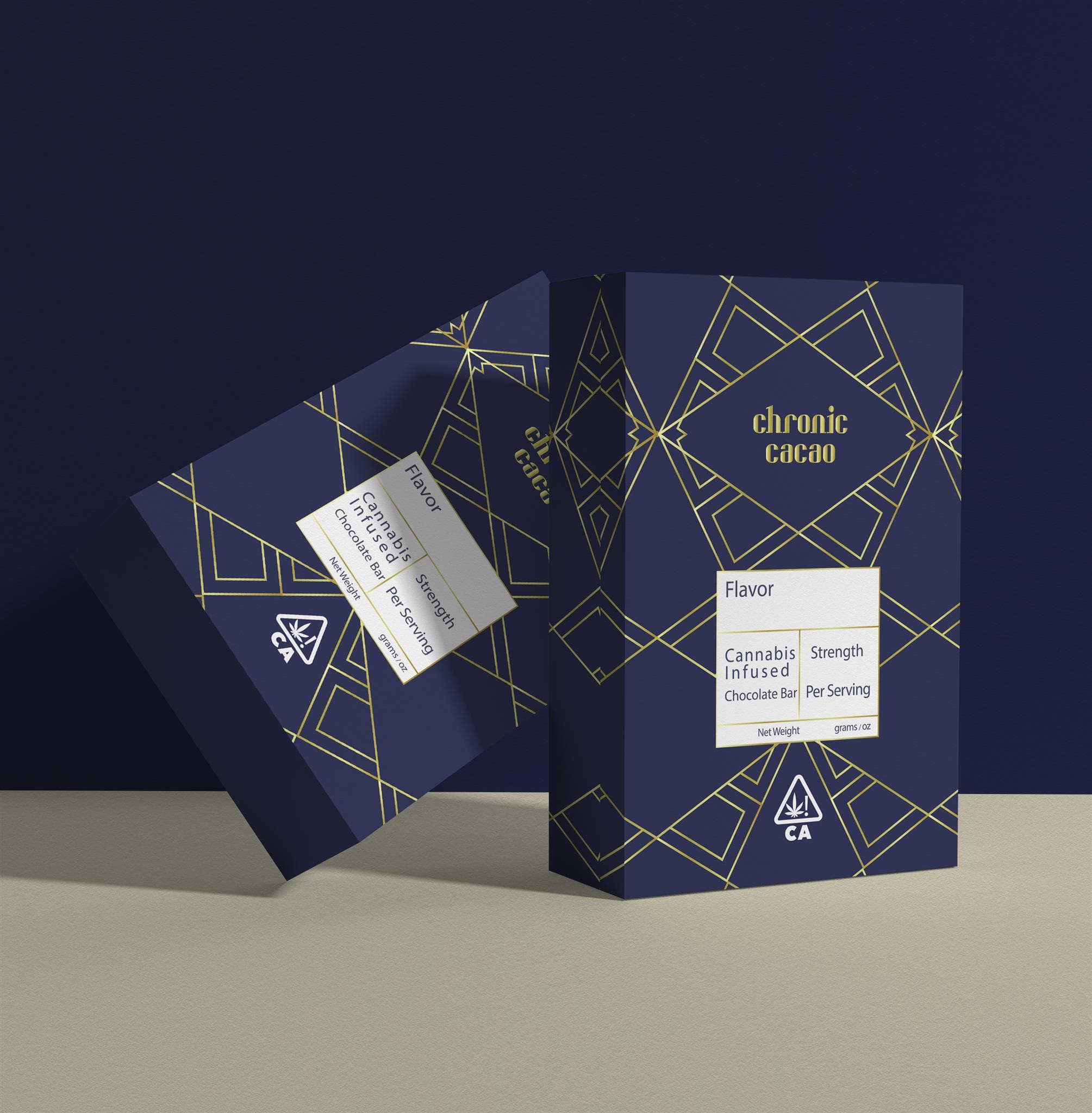
Eames House Blocks are packaged in a carefully designed box that reflects the Eames’ sophisticated, but non-fussy brand. The box is a simple shape and the graphics aren’t very complicated, but it gets its boldness from the sharp geometric shapes infused with strong red and black colors.
Box Design Idea #10: Make it Gift-Worthy
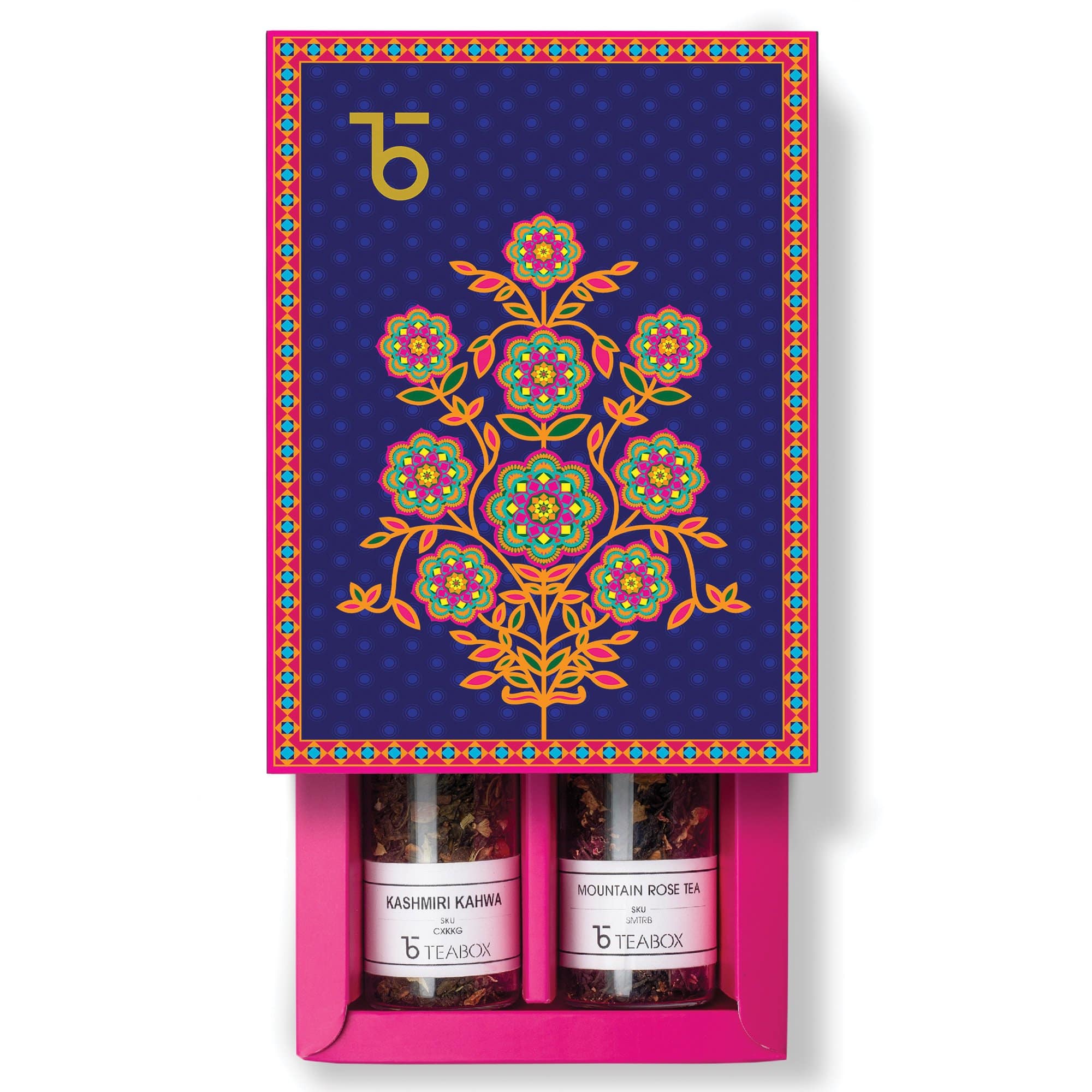
Sometimes a beautifully designed custom box is as much a part of the gift as what’s inside. In many cultures, tea drinking is a ritual. Teabox brings this experience into people’s homes with an assortment of beautifully appointed gift boxes.
Slide open the beautifully illustrated box and you’ll find two gourmet blends of Indian tea in glass vials nestled inside. The gift-like box design elevates the experience for the recipient.
Box Design Idea #11: Use a Single Bright Color
You don’t have to use a rainbow of colors to capture attention with your box. A single color can make a bold statement.
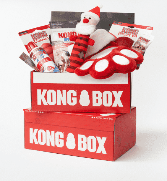
Kong Box sends out monthly boxes full of dog toys and treats. The goodies are shipped out in bright red boxes. You’ll also find this same vivid color throughout their website.
Box Design Idea #12: Add a Packaging Sleeve
Often a company will use a packaging sleeve in place of a box since it can be a more affordable option. You’ll often see these sleeves used on a bar of soap or a pair of socks. But some companies incorporate this element into their overall custom box design.
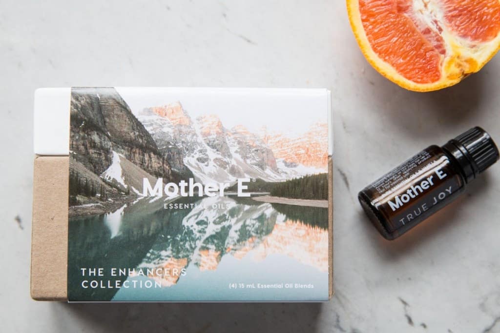
Mother E Essential Oils uses a standard box design to store their essential oils. Where they mix it up is with their packaging sleeves. They use different sleeves depicting various nature scenes depending on what essential oils are in that particular box. If they ever want a new look, a sleeve is much easier to change up than a whole box redesign.
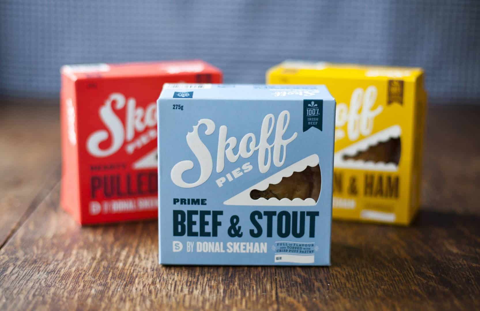
Box Design Idea #13: Experiment with Fonts
Something as simple as using an interesting font can elevate the look of your custom box design. You can go modern or vintage, quirky or traditional, winsome or staid – just be sure to make it memorable and unique. The right font can help boost your brand recognition.
Skoff Pies used several different fonts that compliment each other to come up with a retro vibe for their comfort food pies.
Not sure where to get started? The internet is a treasure trove of fonts. Check out sites like Google fonts or Behance to find free ones, or, for a wider variety, splurge a little and buy one from Creative Market or MyFonts.
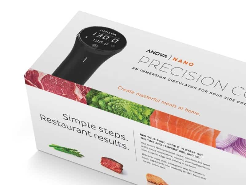
Box Design Idea #14: Use Product Photography
Photographs are a great way to showcase your product. If you decide to go this route make sure to use high-quality product photography.
Anovo used a picture of their product, as well as small pictures of fresh-looking food, including steak, salmon, and asparagus on their nano precision cooker boxes. But the photos aren’t overwhelming. Anovo went with plenty of white space to make the colorful photos pop and appeal to both your eyes and your taste buds.
Box Design Idea #15: Try Some Humor
Humor can be a little tricky since we all find different things funny. But when it works, it works. Just remember to keep your target customer in mind. You don’t want to offend anyone.
Box Design Idea #16: Give ‘em a Sneak Peek
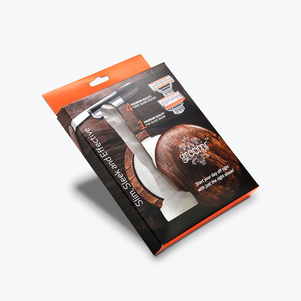
Cutout windows offer your customers a glimpse of what’s inside, and sometimes the option to touch your product. Cutout windows, which are accomplished through the window patching process, are often used for food items so you can see what you’re buying. Who wants to splurge on expensive cookies, if you discover they’re a crumbled mess when you open the box.
Cutouts are also a good option if you have a colorful or textured product. Zandra Beauty sells a variety of artisan soap bars that come in different scents and colors. Each variety of soap is a different color and comes in different cosmetic packaging.
The little cutout gives you a glimpse of the colorful bar of soap inside. You could make quite an attractive display on a store shelf with all of the different colors peeking out.
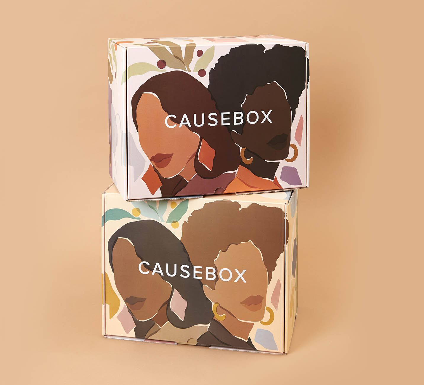
Box Design Idea #17: Make it Multi-Purpose
Sometimes the box is a work of art. Check out the latest beautifully illustrated box from CauseBox. CauseBox is all about curating socially conscious items for their subscription boxes. You’d feel bad tossing this box in the recycling. It would make stylish storage for old letters or other small mementos.
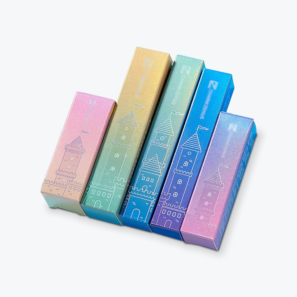
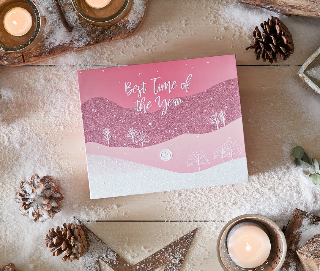
Box Design Idea #18: Use a Limited Color Palette
You don’t have to use every color in the rainbow to make your boxes interesting. For a softer and more sophisticated look try different shades of the same color.
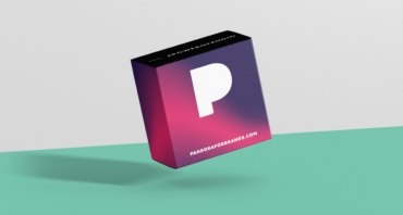
One popular design trend for custom boxes that’s been incorporated in everything from painted walls to cakes and hair dye is ombre. Ombre is when you blend one color hue to another, usually going from light to dark. Why not try it in your product box design for a current look?
Glossybox is a subscription beauty box service. They frequently redesign their ecommerce packaging boxes depending on the season. Their current holiday box beautifully blends different shades of pink for a cohesive look.
Box Design Idea #19: Use a Custom Stamp
Sure, it would be great to have custom beautifully designed boxes with your logo embossed on the sides or printed in an array of colors. But that’s not feasible for every company’s budget. But don’t fret, there are affordable design elements just about any business can incorporate in their cardboard box design.
If you’re strapped for cash, or you’re just looking for a simple aesthetic – then consider a custom stamp.
Etsy shop, HeirloomHomeStudio, designs and produces porcelain tableware that’s inspired by the farm-to-table movement. Their brand stresses simplicity and their products have a vintage look. This vibe is beautifully reflected in their understated stamped boxes.
Box Design Idea #20: Seal Up Your Boxes with Something Pretty (or Practical)
Another affordable packaging box design option is colorful, or branded packaging tape. Packaging tape can be used for brand promotion, handling advice, reducing theft, or to advertise other products. Since you can order packaging tape in small quantities, any company can take advantage of this affordable, low commitment option.
Box Design Idea #21: Use Custom Labels or Stickers
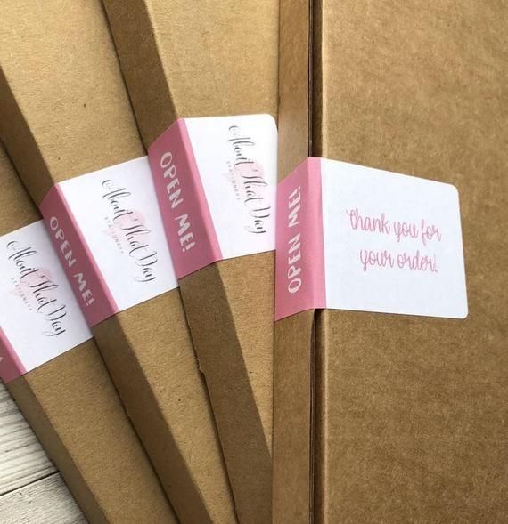
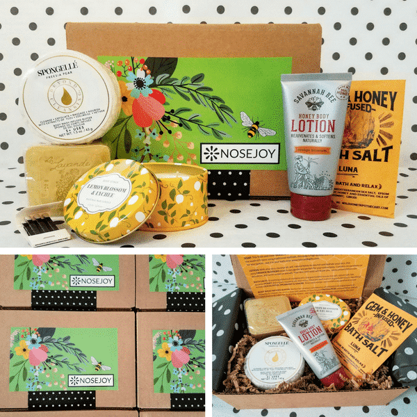
You don’t have to print your graphics on the actual box to get a professional, attractive look. Maybe you don’t feel like committing to a single product box design. A well-designed sticker or label will look good and allow you to easily change the look of your boxes depending on your mood.
Nosejoy is a fragrance subscription box service. Each month, they send out four to five scent-filled items, such as candles, soaps, or lotions from upscale boutique brands.
They completely change the look of the box each month by using a different sticker on the front. One month it might be deep blues with a mermaid picture, the next month might be all about bright yellows with pictures of lemons.
Get Designing and Bring Your Box Design Idea to Life
Your custom packaging should never be an afterthought. Boxes and other packaging materials are far too important a marketing tool to ignore. Thoughtful box design strategies like the ones mentioned above can help you attract new customers and retain your current ones.
Keep in mind that various box design elements aren’t mutually exclusive. You can incorporate several into your design – just don’t let it look too cluttered. You may need to experiment a little to find the right fit. You want your message to shine through and be consistent across all of your marketing materials.
Everyone from small Etsy stores to giants like Amazon put a lot of thought into their shipping box designs. Quality design doesn’t have to cost a fortune. It can be as simple as a sticker, or as fancy as a multi-colored embossed high-quality box. The important thing is that your product box design reflects what’s important to your customers and your company.
Ready to think outside the box? Let's get started!
Get in touch with a custom packaging specialist now for a free consultation and instant price quote.


.svg)






Share